“The integration of the Beautiful and the Useful”
- Paul Rand
I take pride in being a graphic designer. Communicating with visuals is impactful, visuals impact our experience, and this is why I enjoy design, because the goal is to create a moment that opens an awareness, captures the eyes, pauses time and enlightens us with some clarity.
Nike has recently sponsored Italo Ferreira 2X World Champion Brazilian Surfer, but have not announced their return to surfing. The advertising of Nike surf never really gained respect from the locals and Nike left the sport of surfing in 2010.
So I decided to do a campaign advertising Nike’s return to the ocean and surfing. I designed a brochure, a poster, and a billboard introducing and welcoming Nike’s return to the ocean. I created a new Nike Surf logo along with a Nike’s Surf Slogan “Find your Wave” to encourage the people to find their drive and enjoy their path.
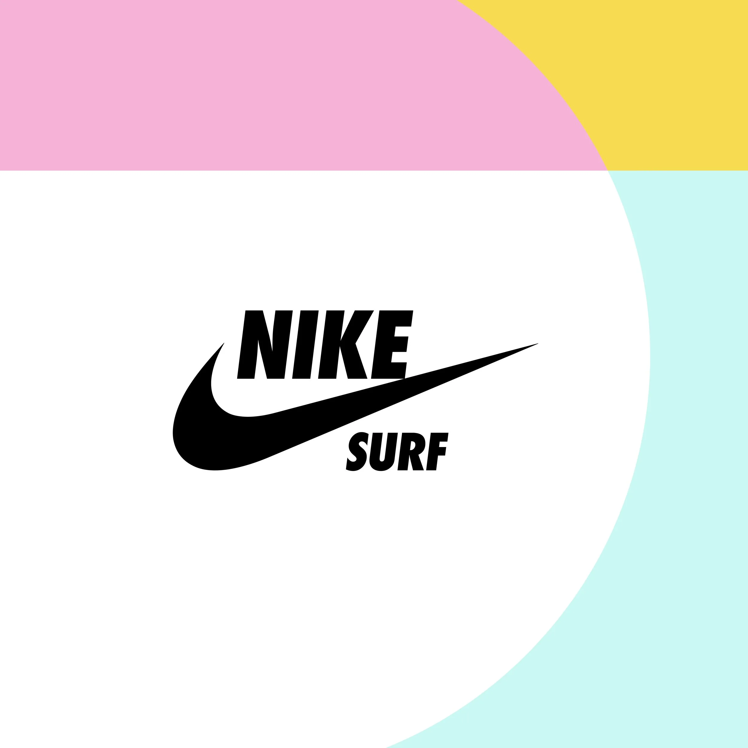
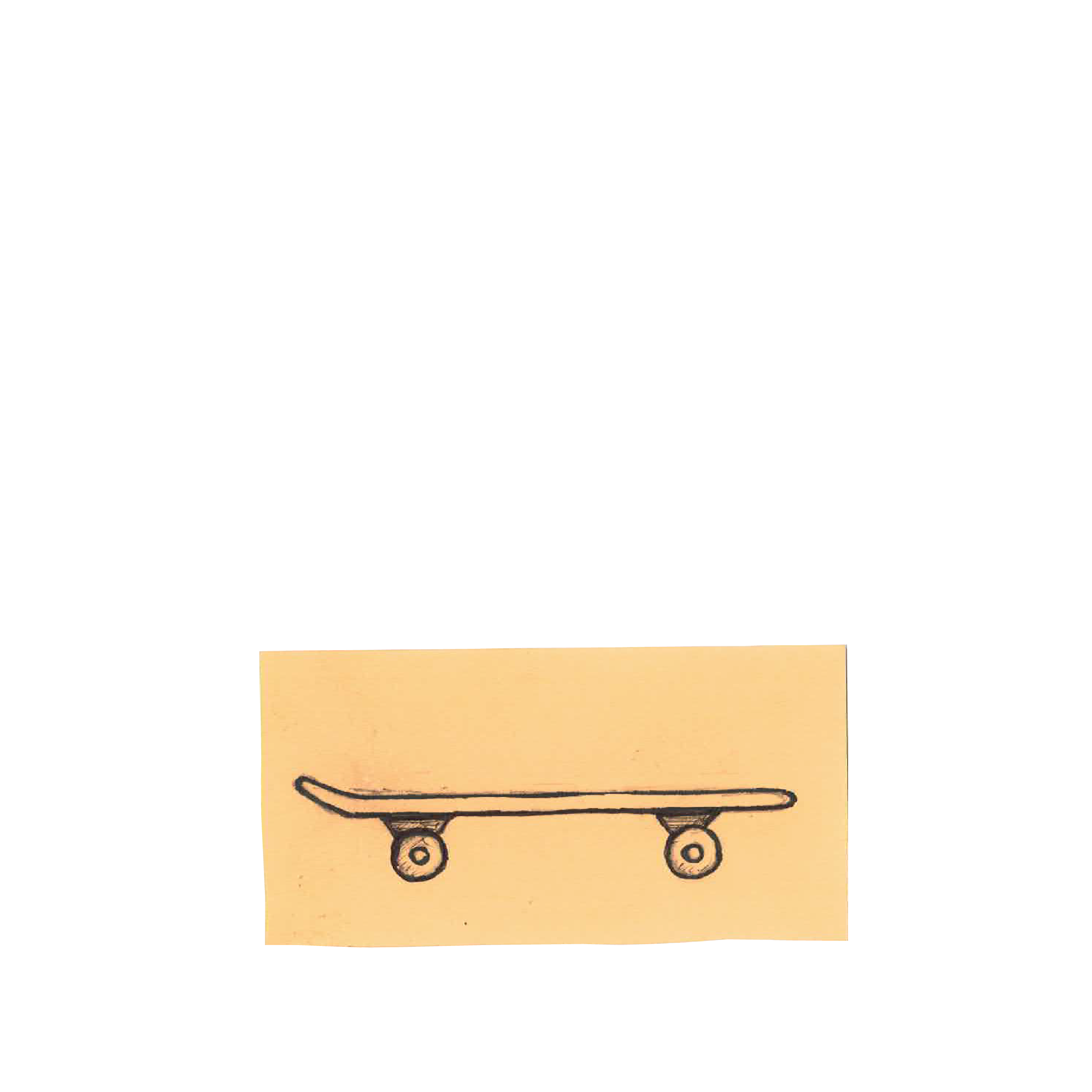
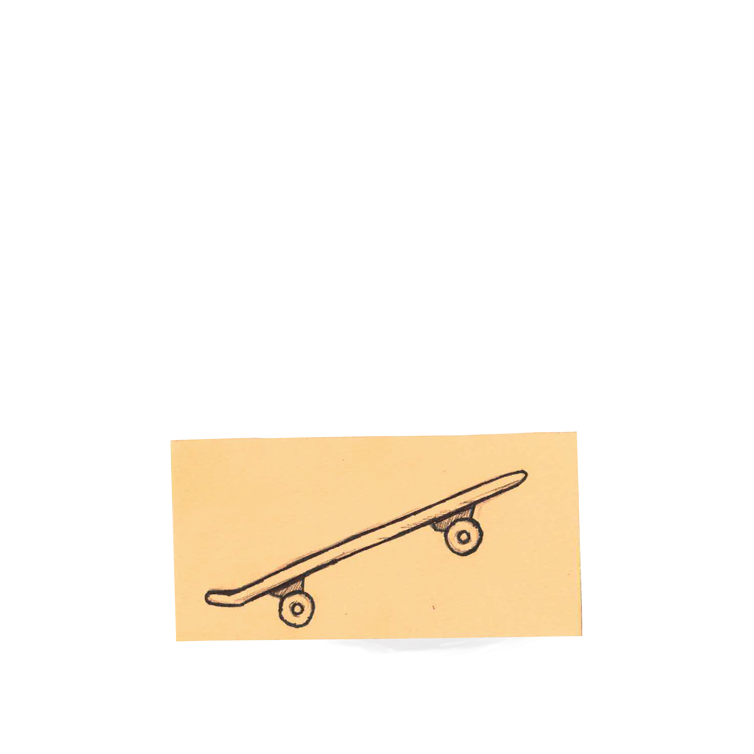
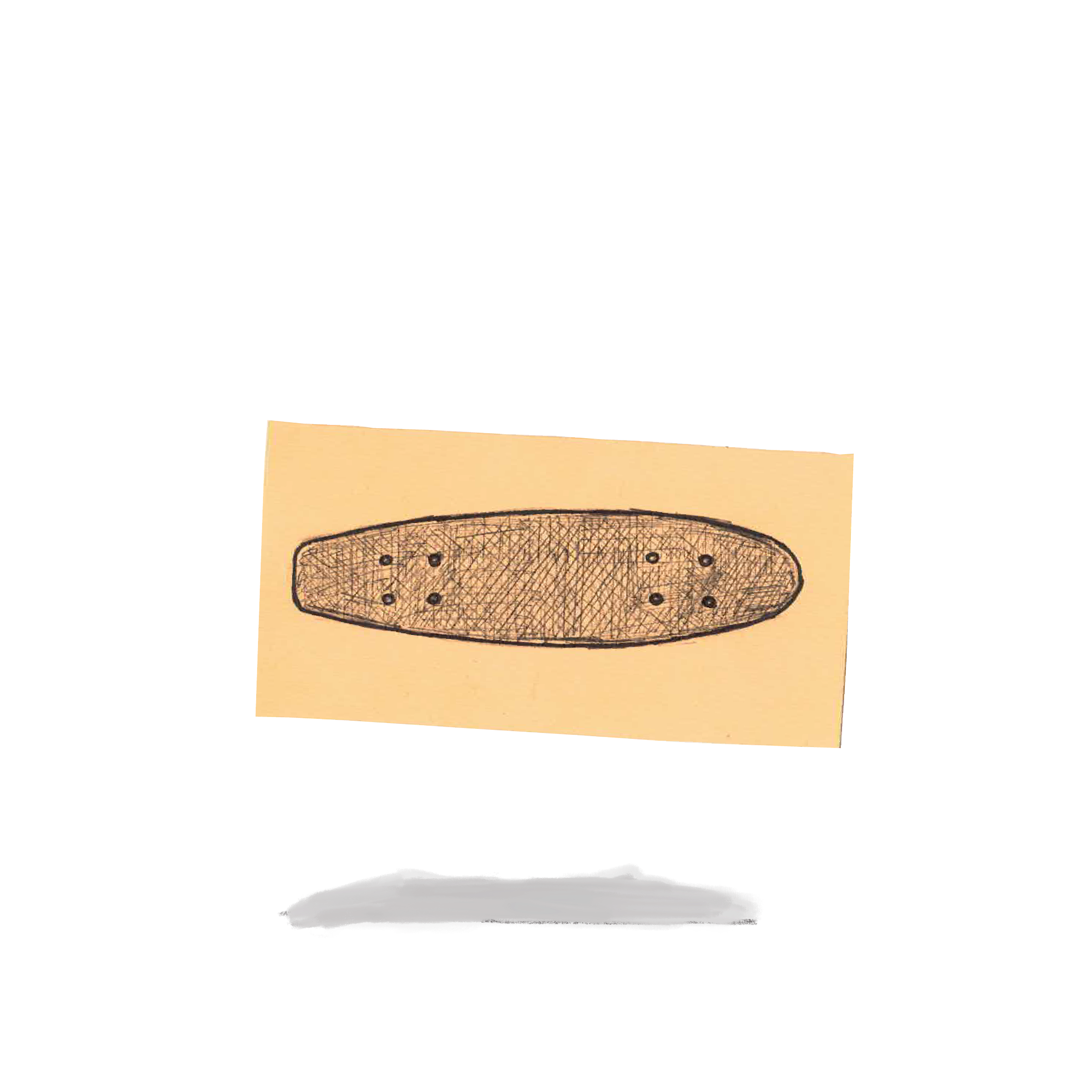
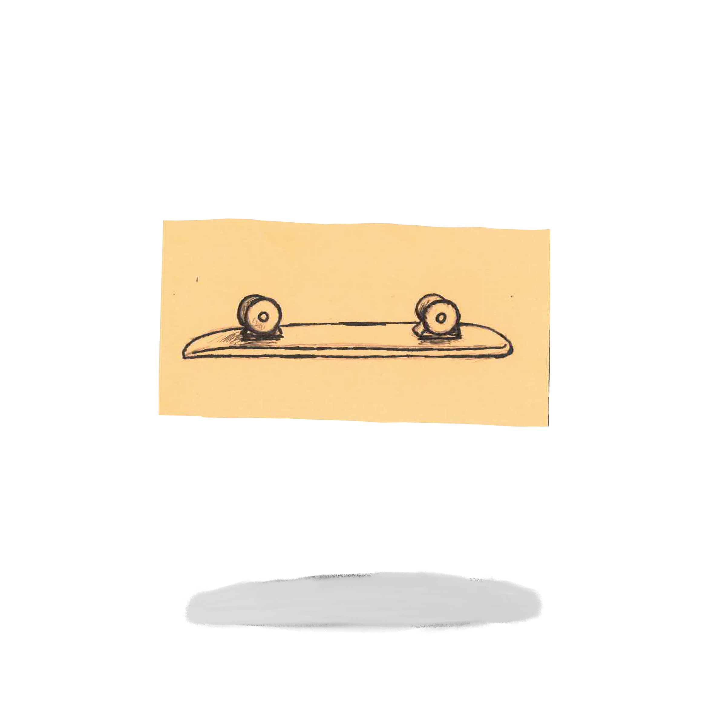
Nike Surf Logo

Blueprint Brochure Design
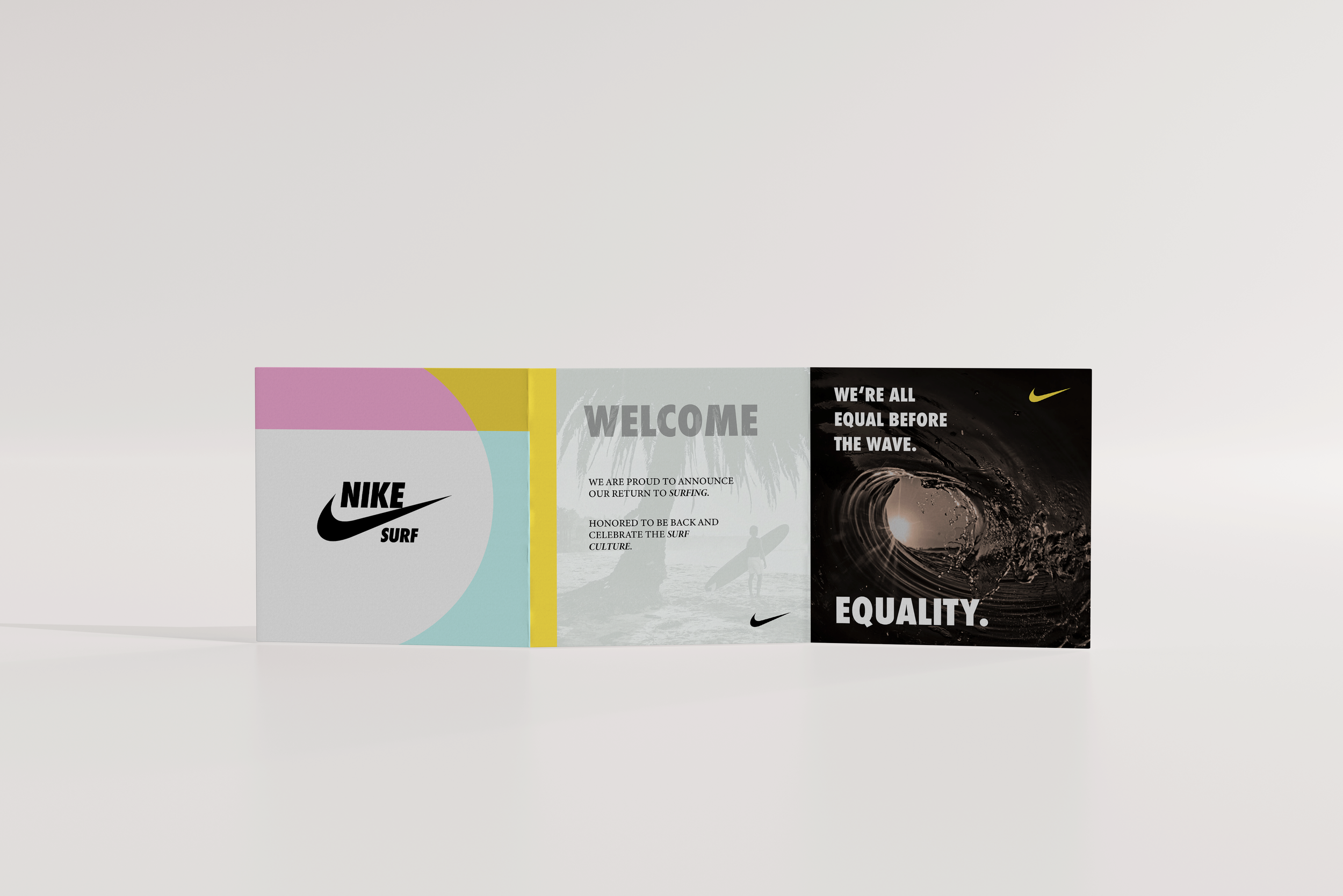
Nike Brochure Mockup. With Front Cover
Nike Brochure Mockup. With Back Cover.
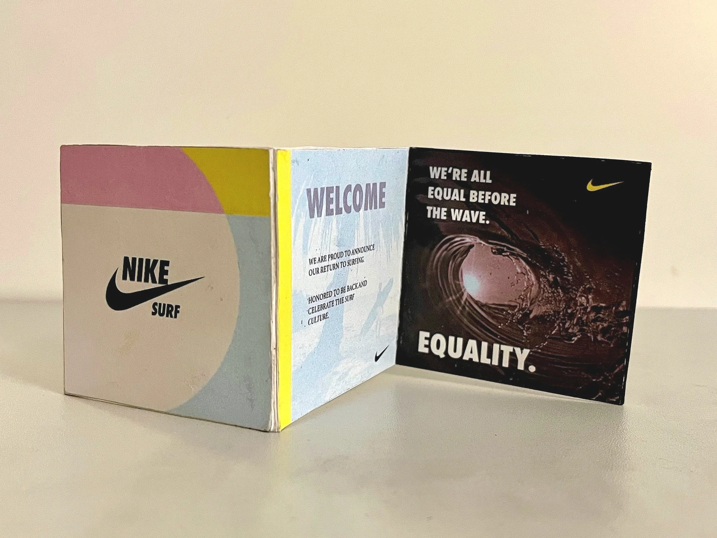
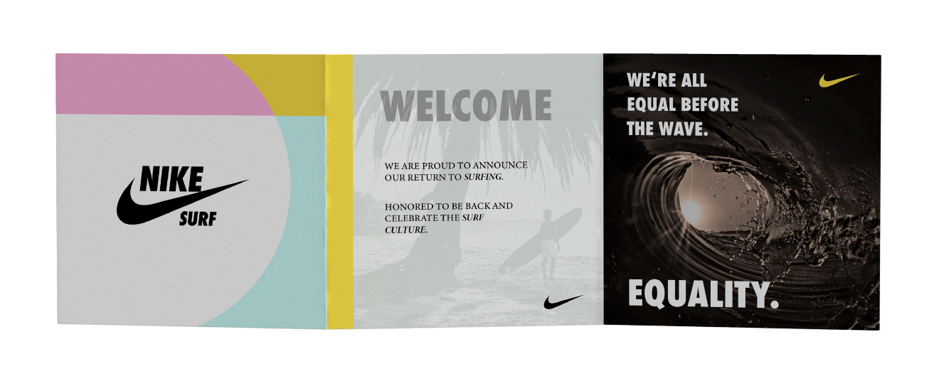
Nike brochure, title pg. With new Logo.
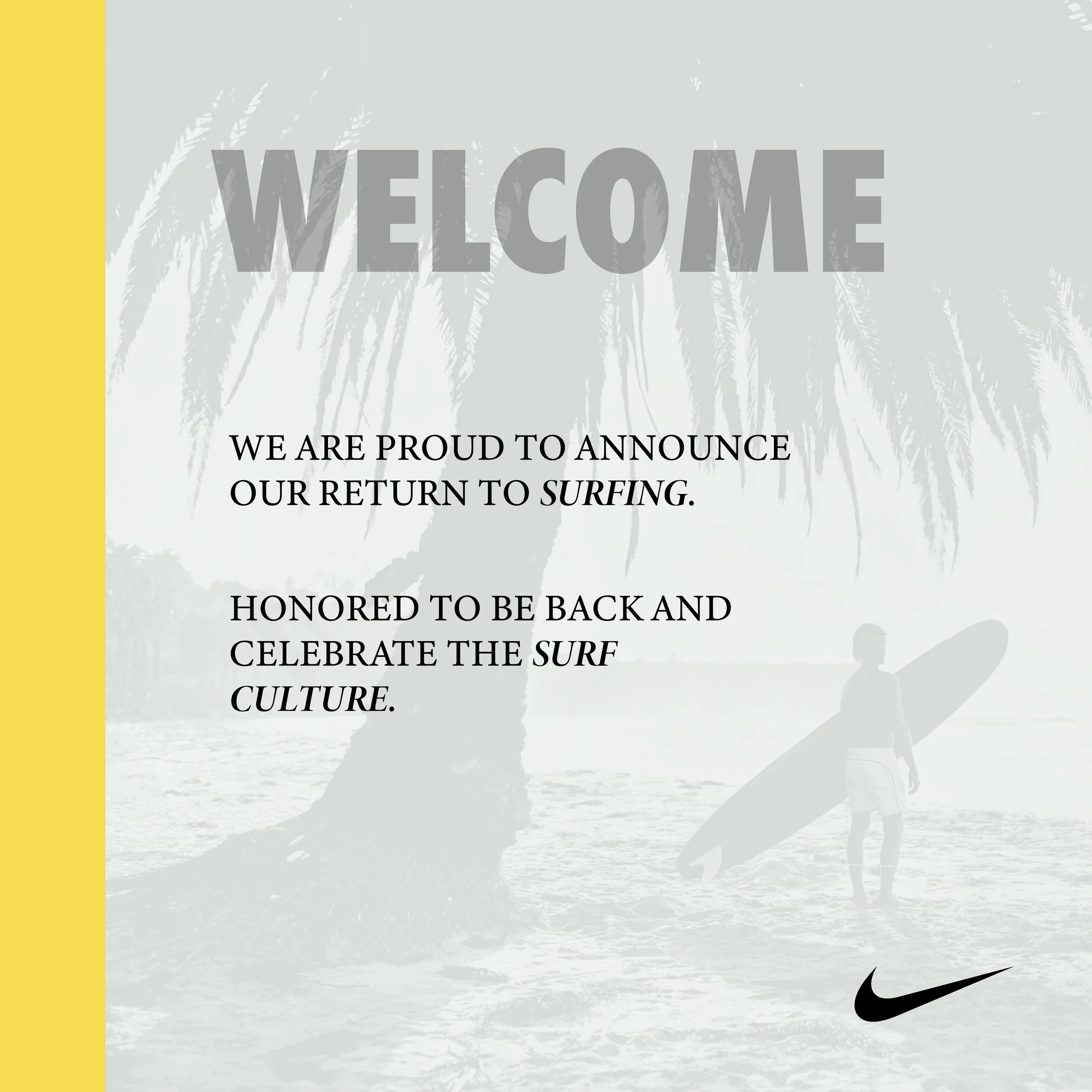
Nike brochure, welcome pg. Intro
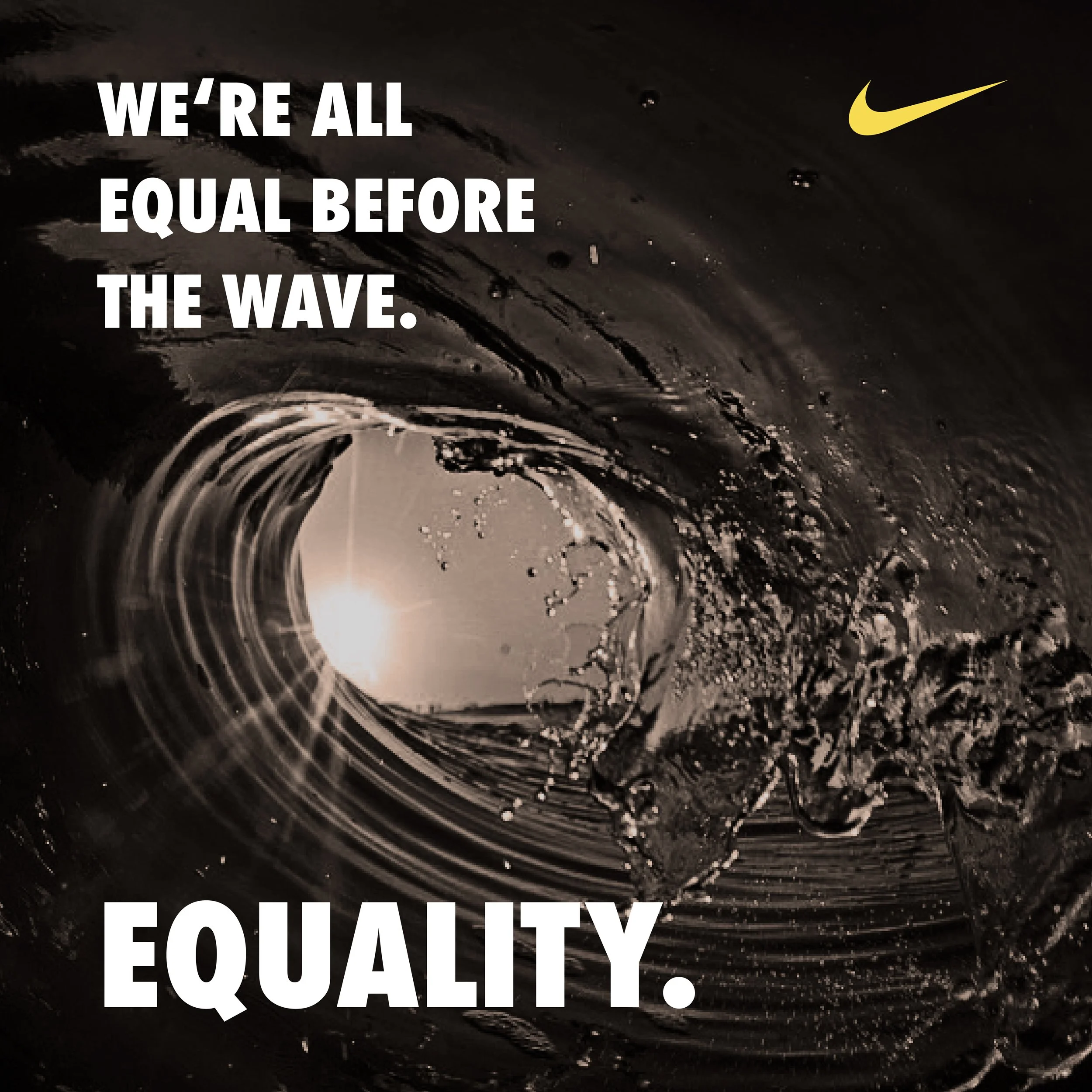
Nike brochure, activism and surf culture pg. Laird Hamilton quote.
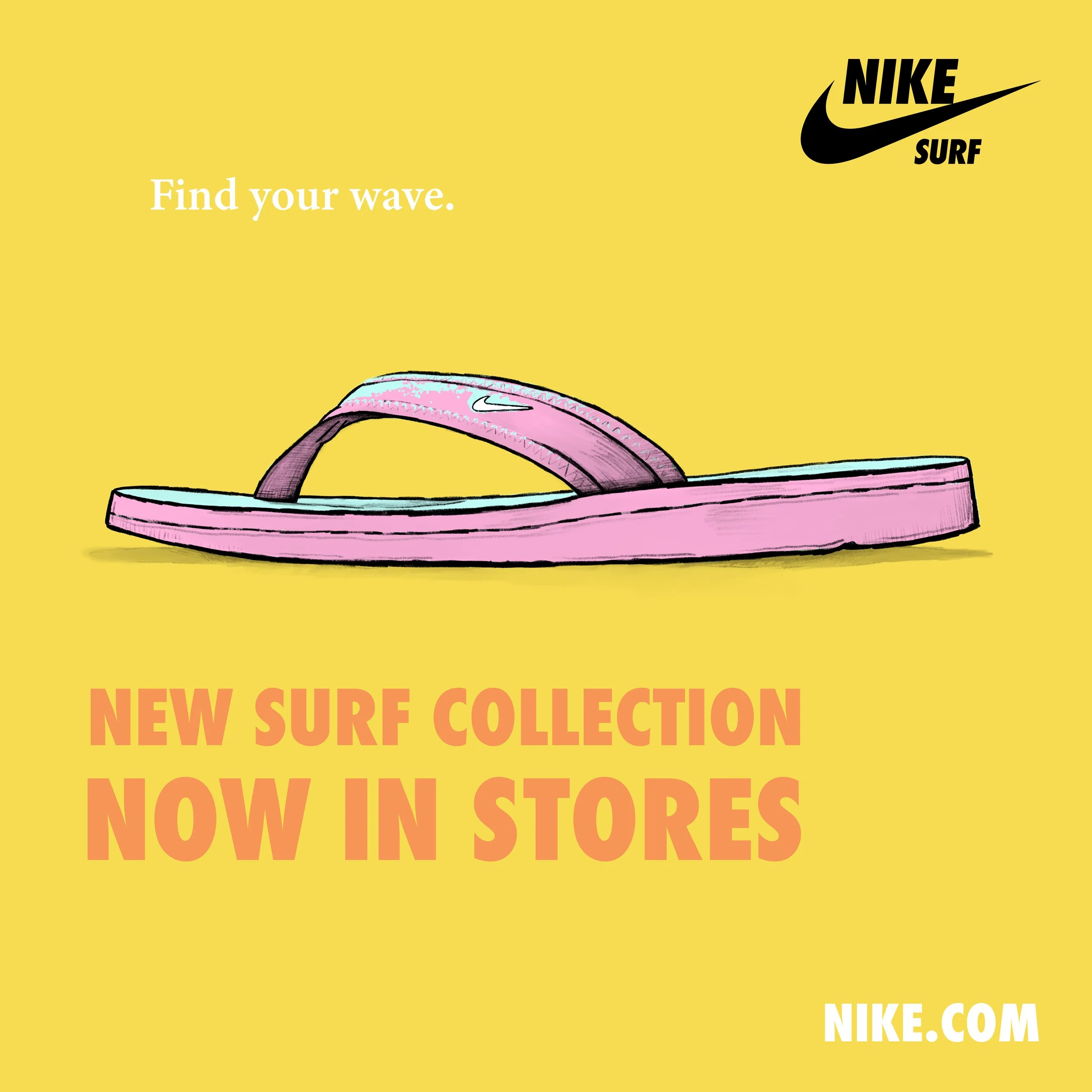
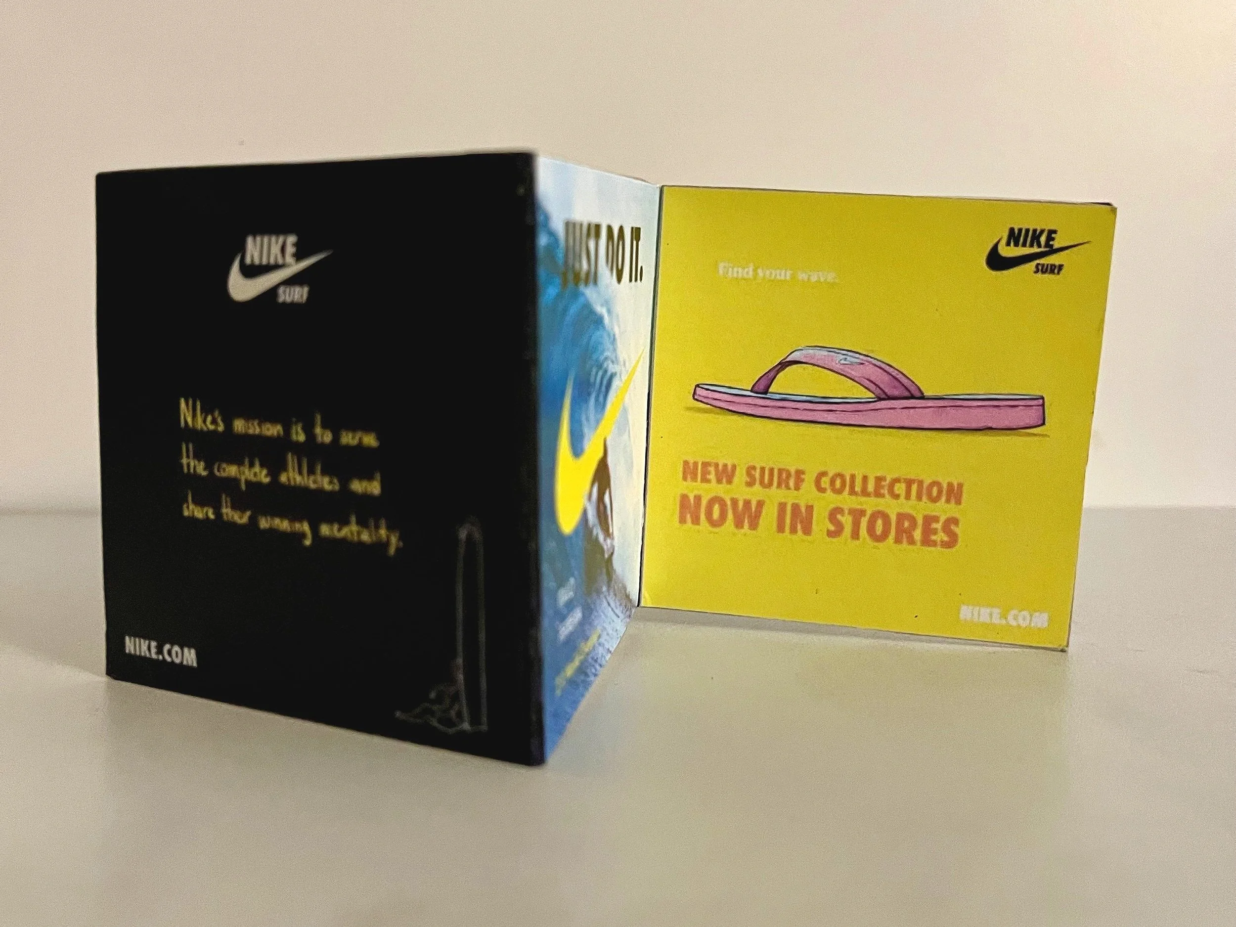
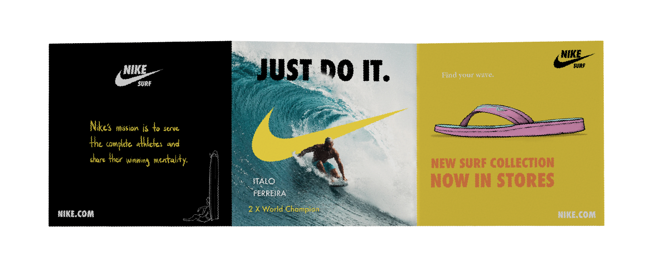
Nike brochure, Nike surf gear pg. With Nike Surf slogan "Find your Wave"
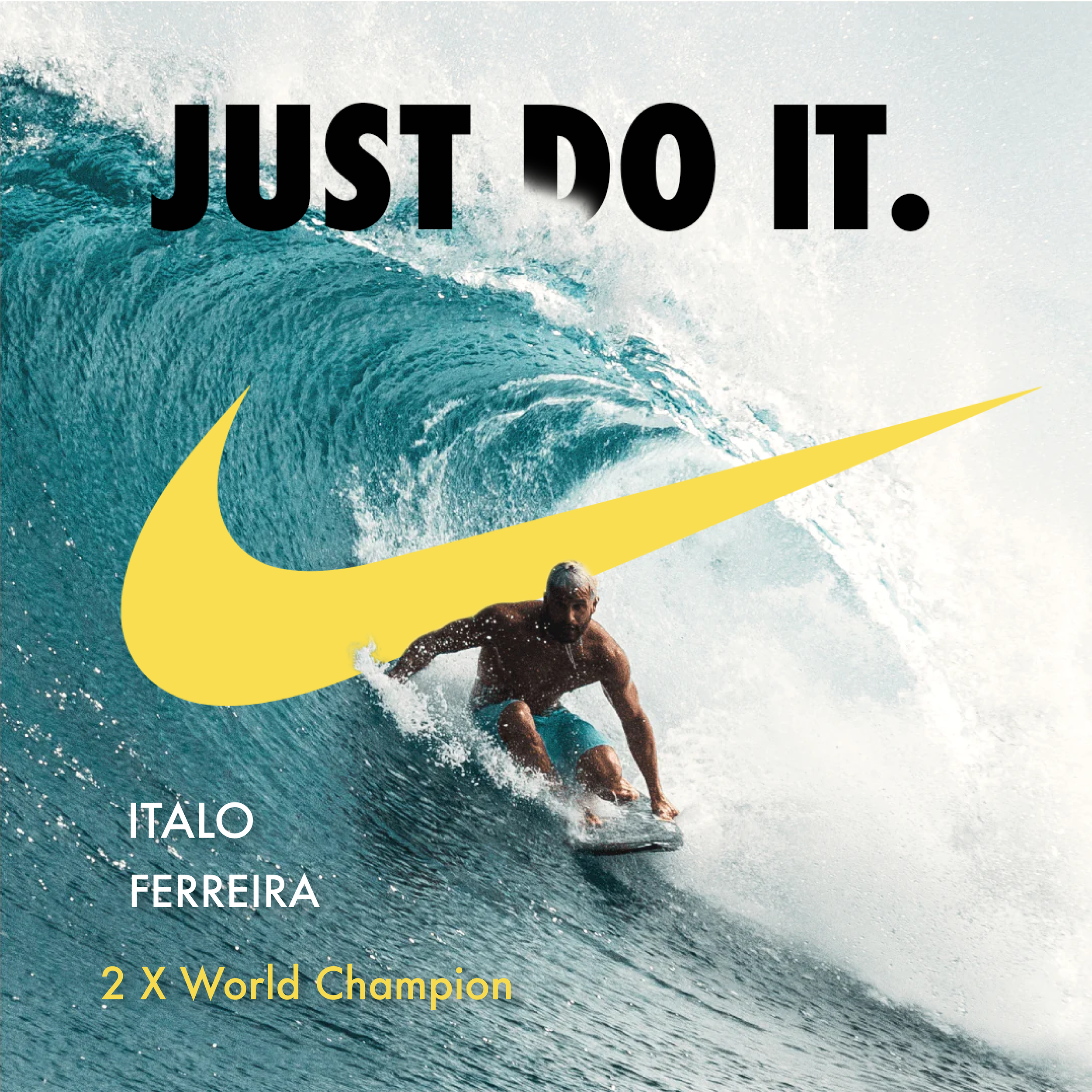
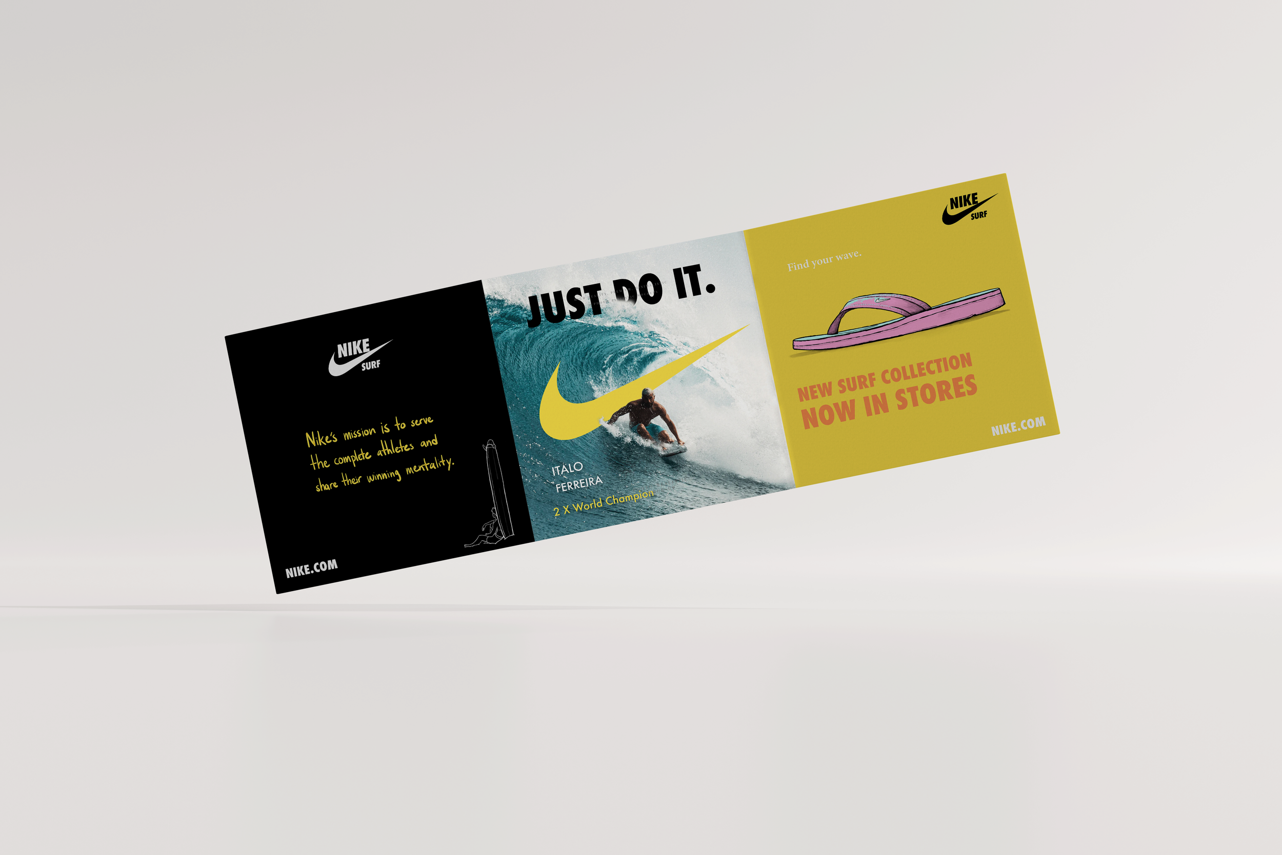
Nike brochure, Italo Ferreira pg. With Nike logo and slogan.
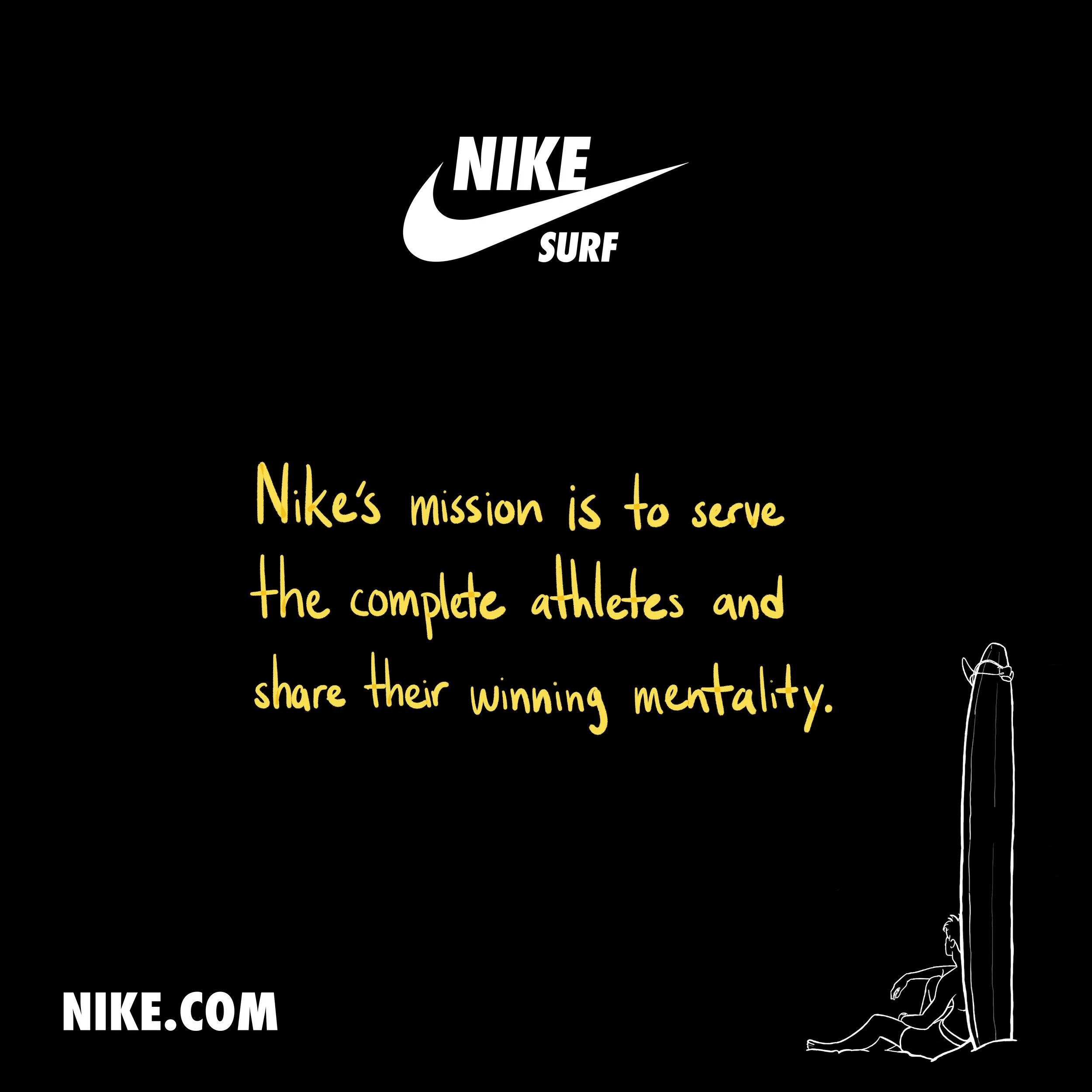
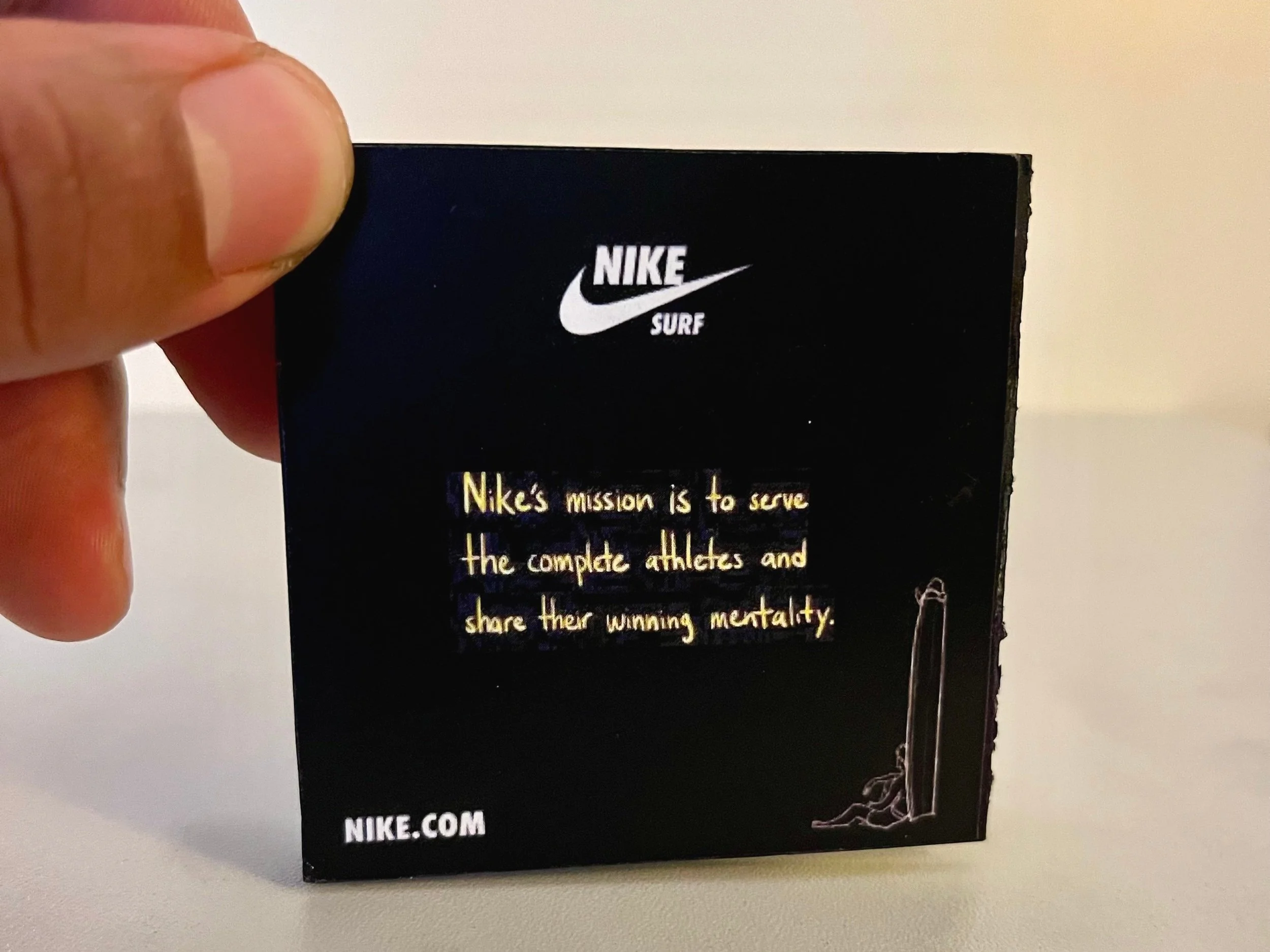
Nike brochure, back cover pg. With Nike's mission and new surf logo.
Nike Brochure Mini Sample. 2 x 8 inches.
Nike Brochure Mini Sample. 2 x 8 inches.
Nike Brochure Mini Sample. 2 x 8 inches.
Nike Brochure sample with title cover.
Nike Brochure sample with back cover.
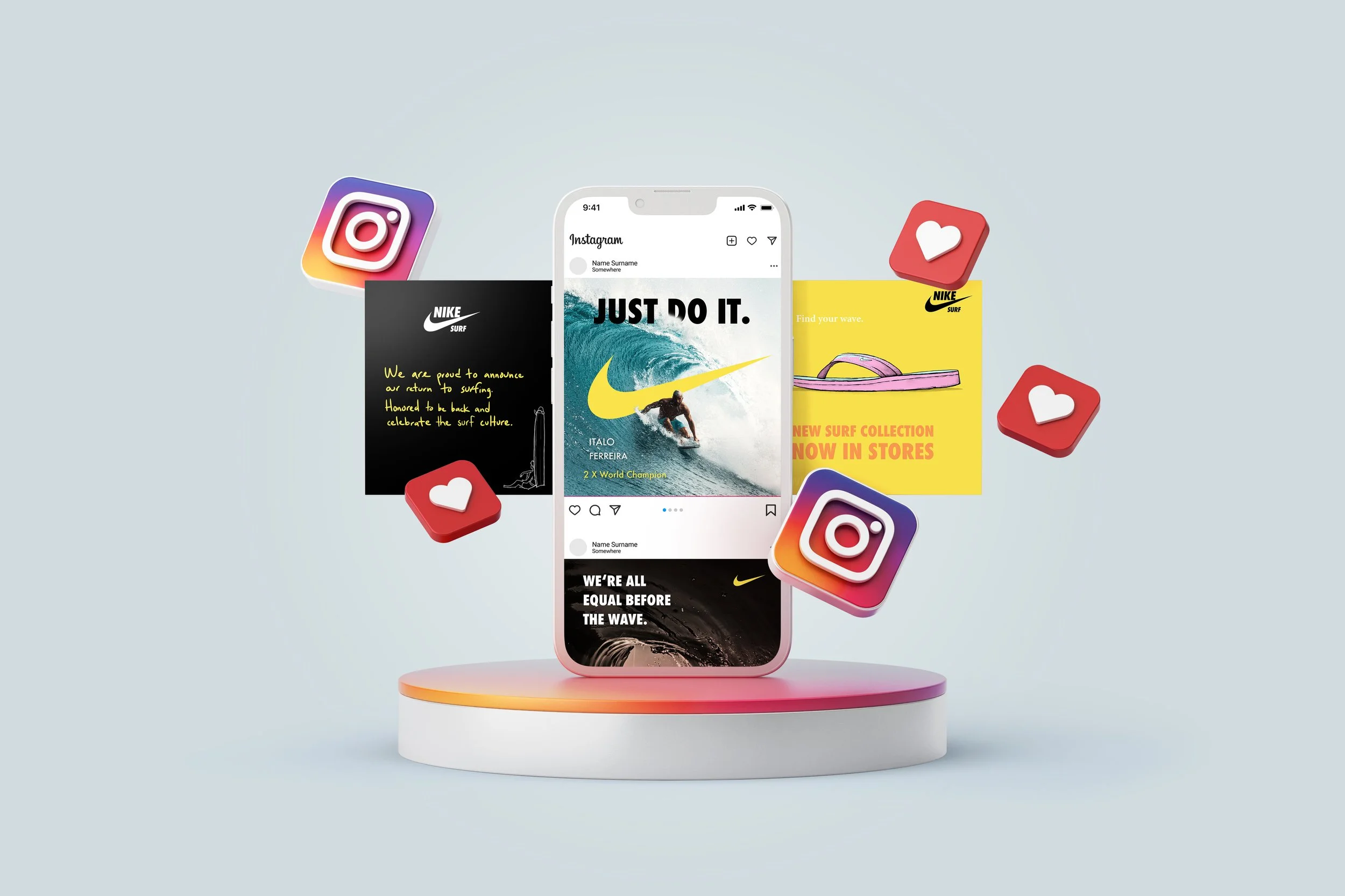
Social Post with Brochure
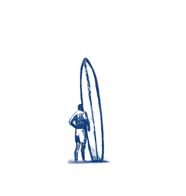
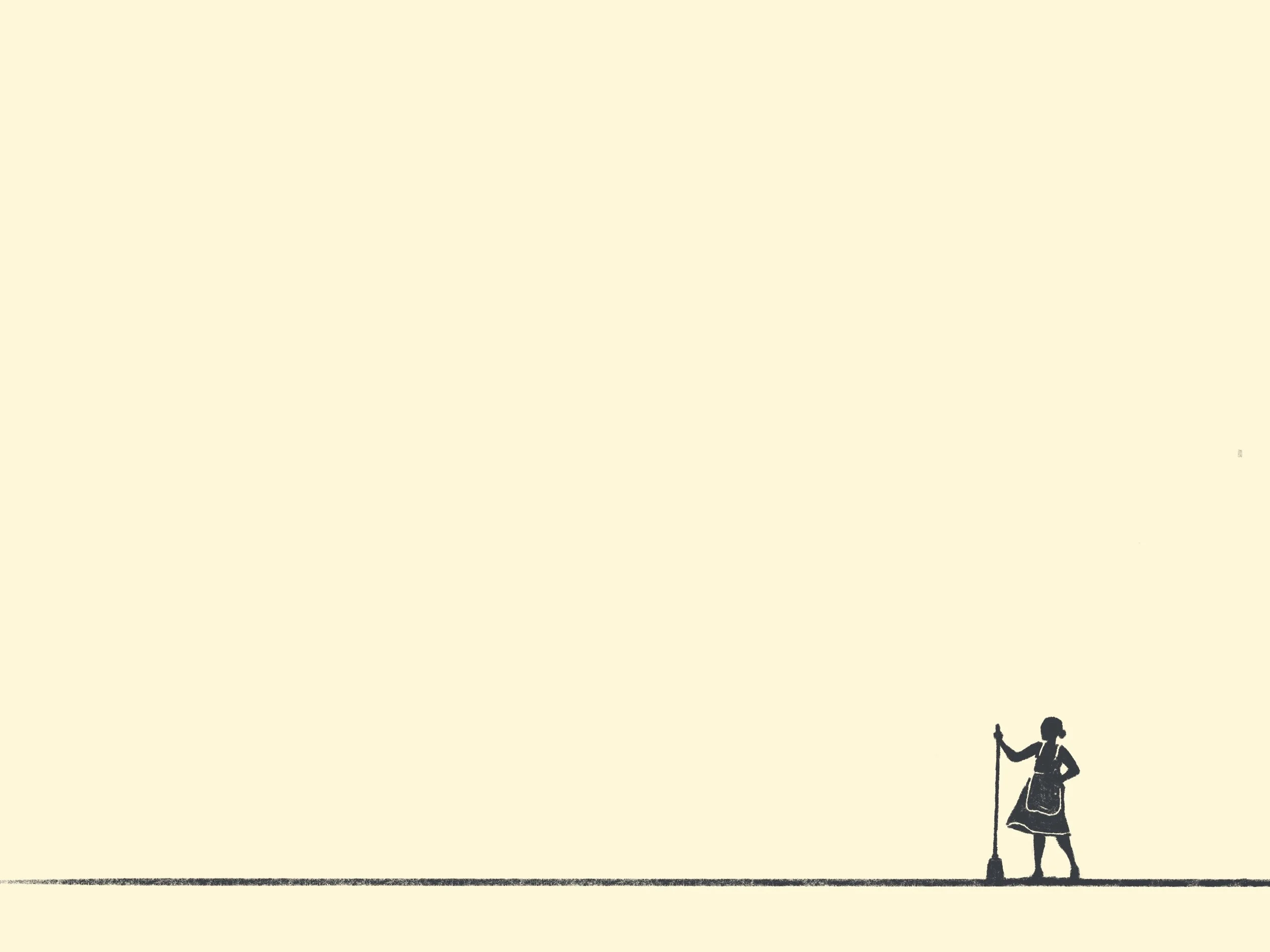
Og surfer admiring the day.
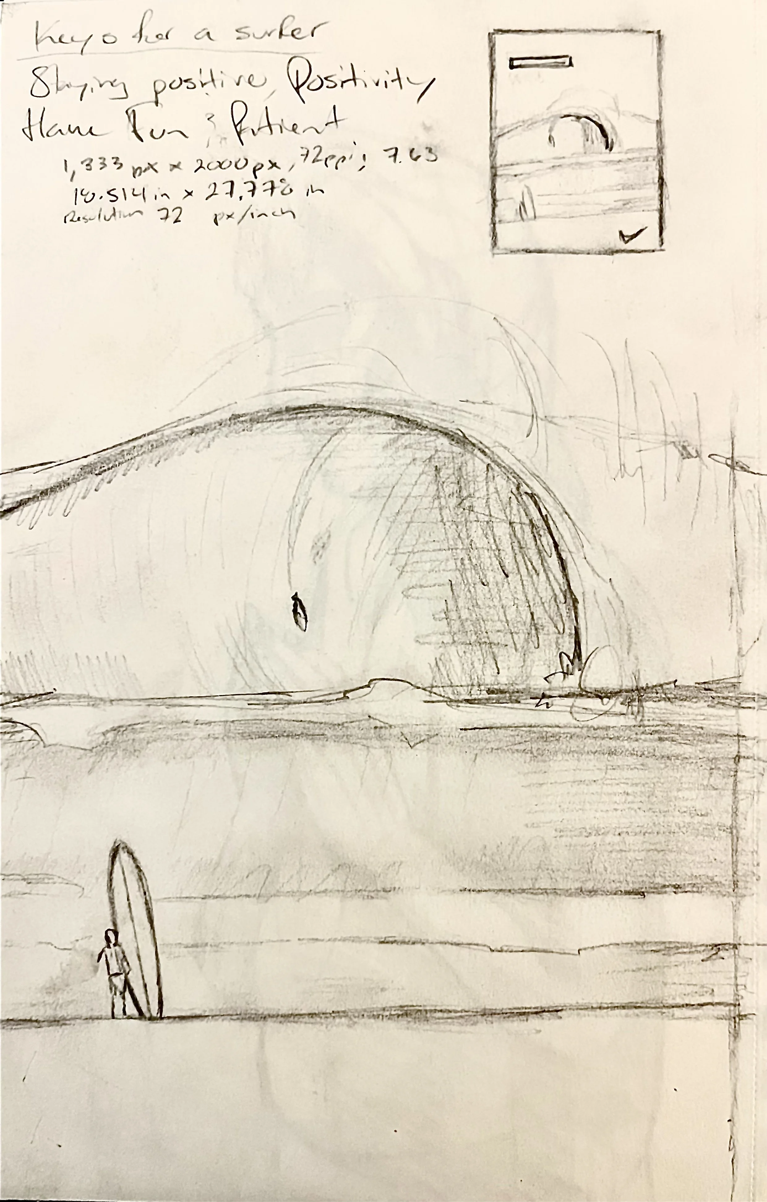
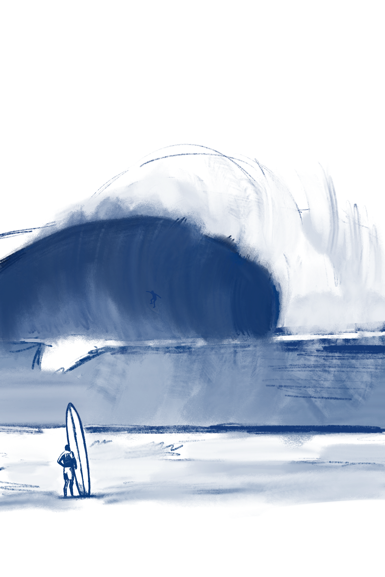
Poster Sketch 1
Admiration for Depth
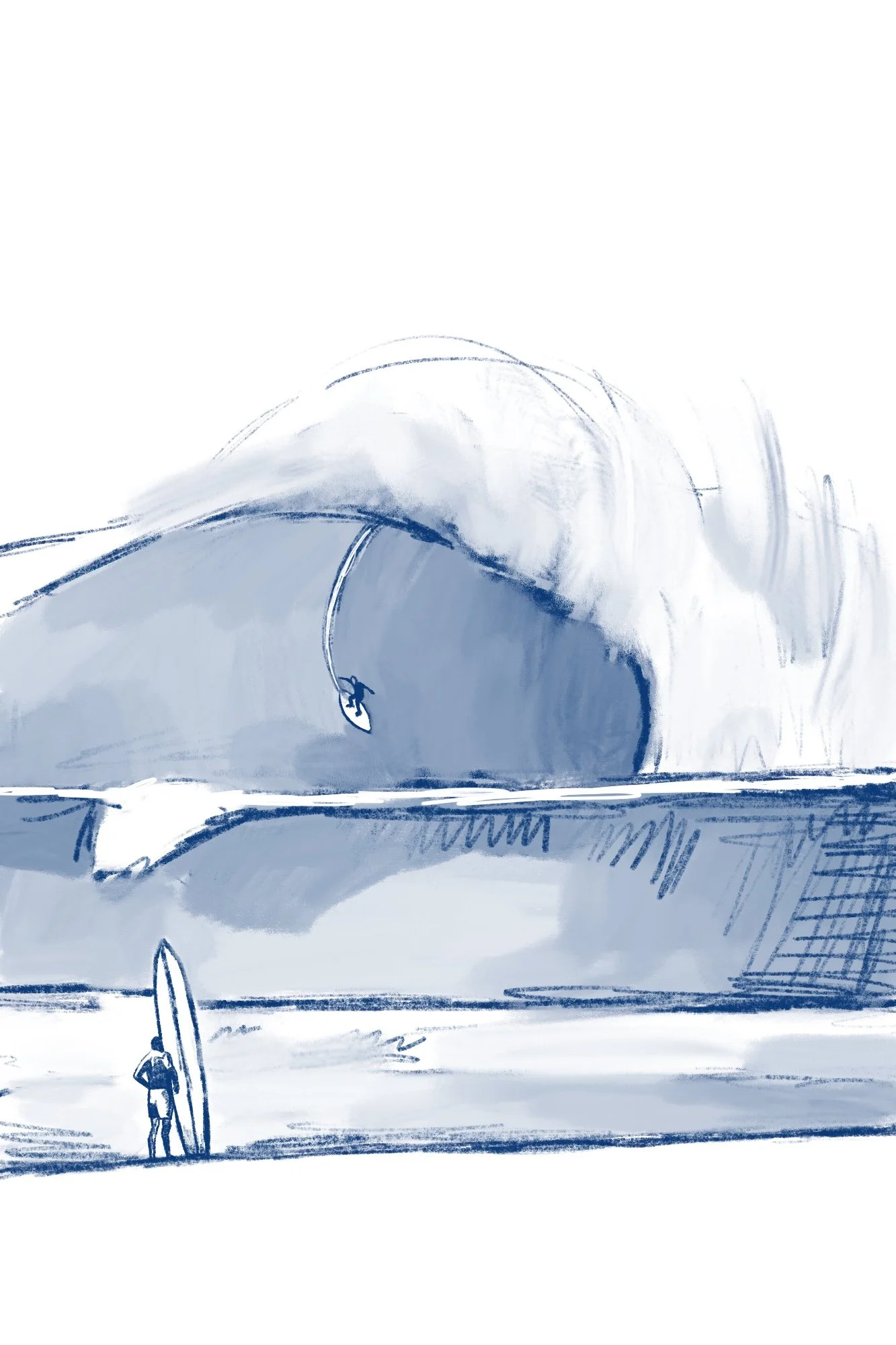
Poster Sketch 2
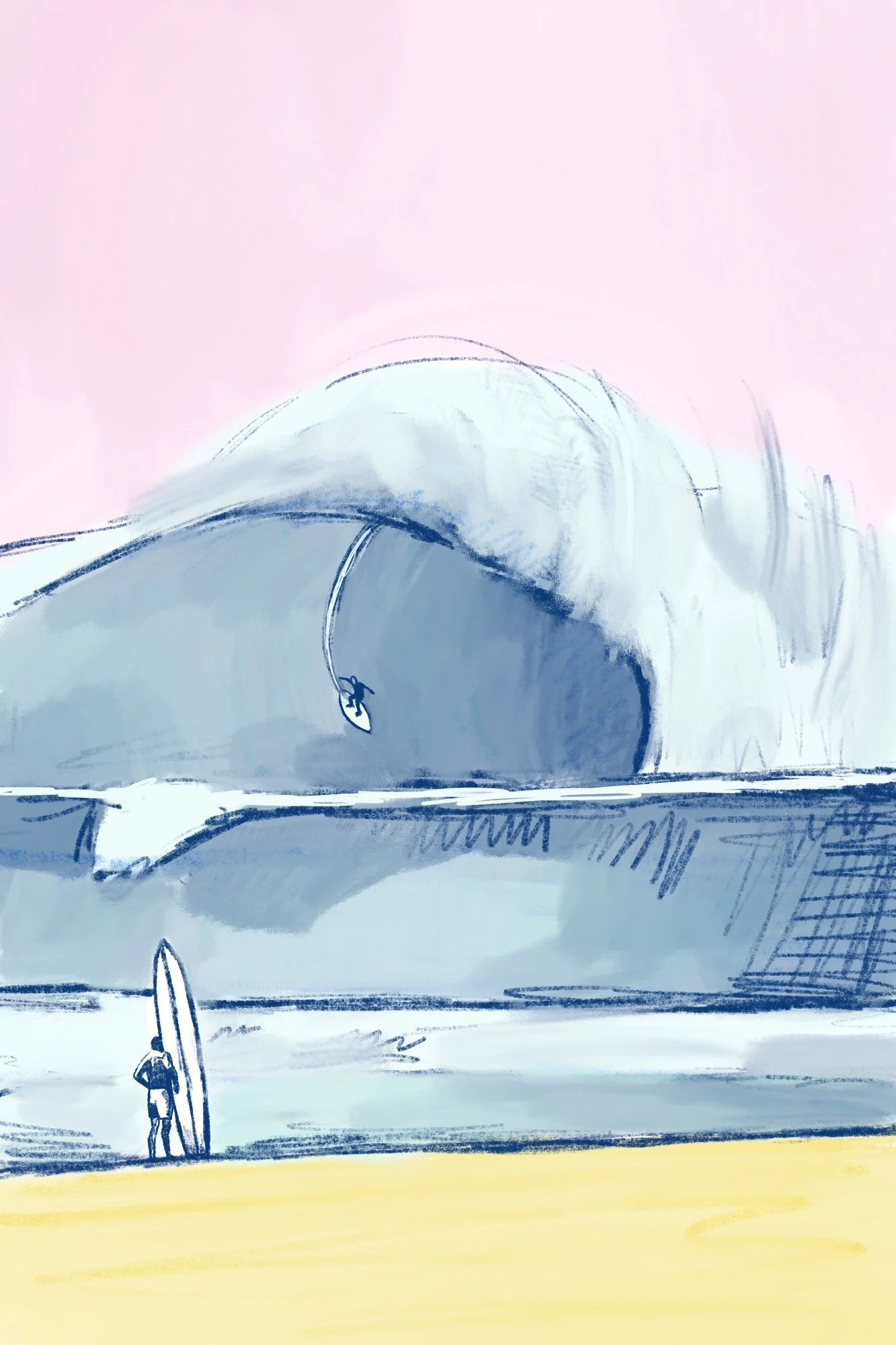
Poster Sketch with color palette
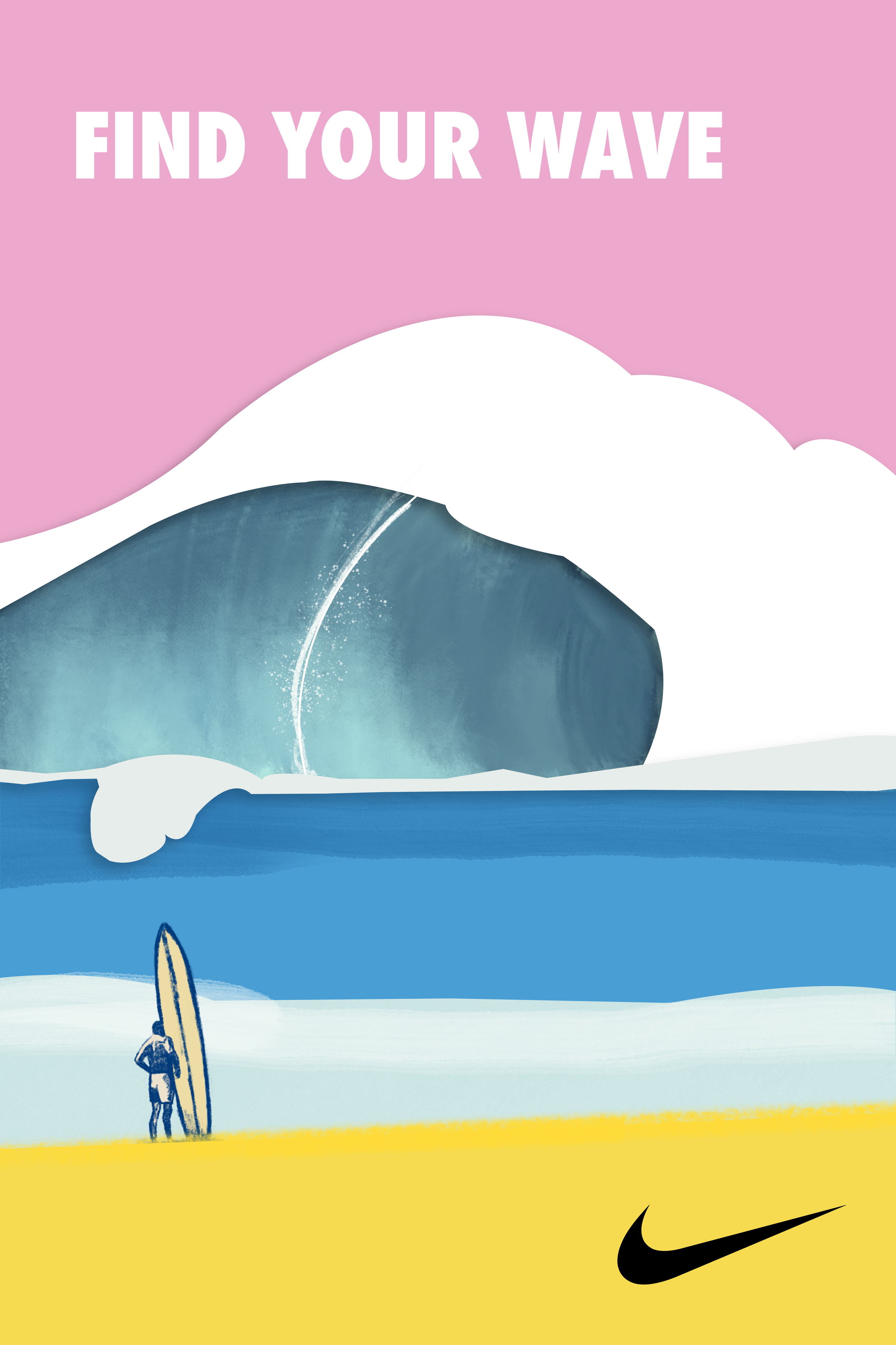
Official Design of Poster
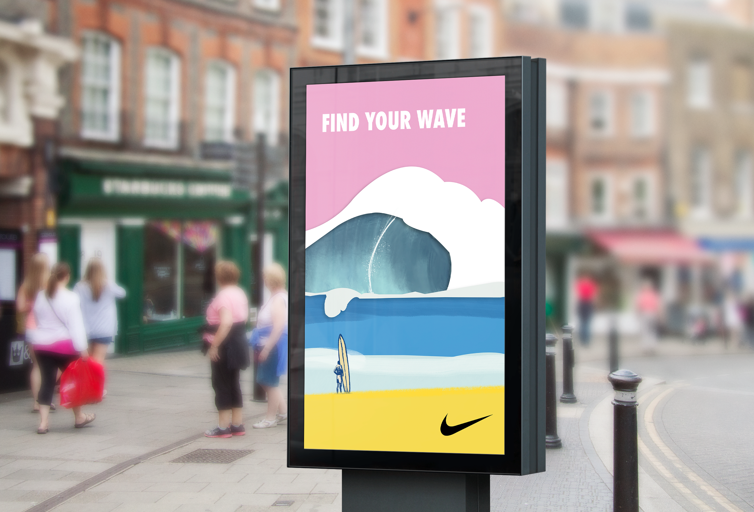
Poster Mockup
First attempt of Nike's footprint on the shore.
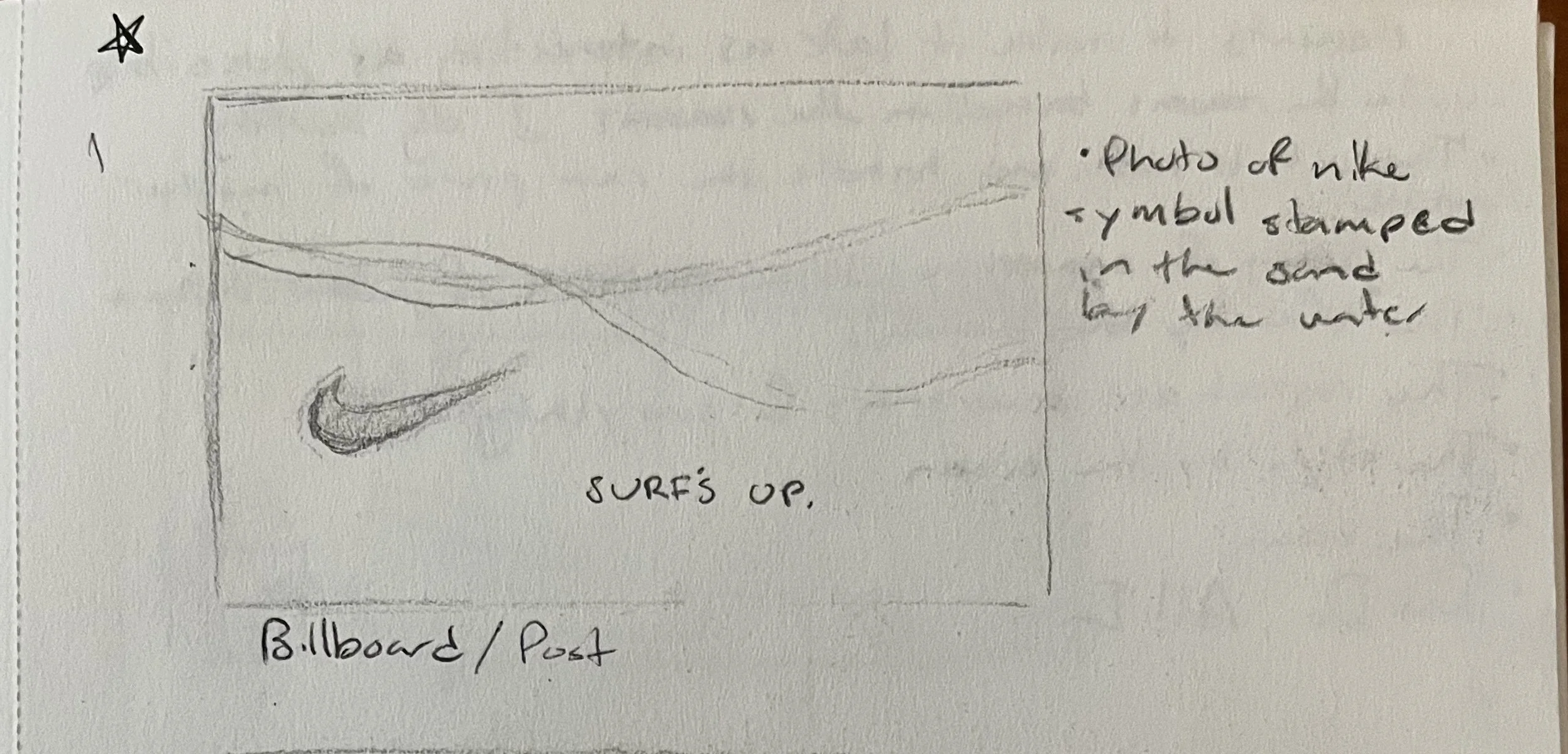
Nike Billboard Sketch
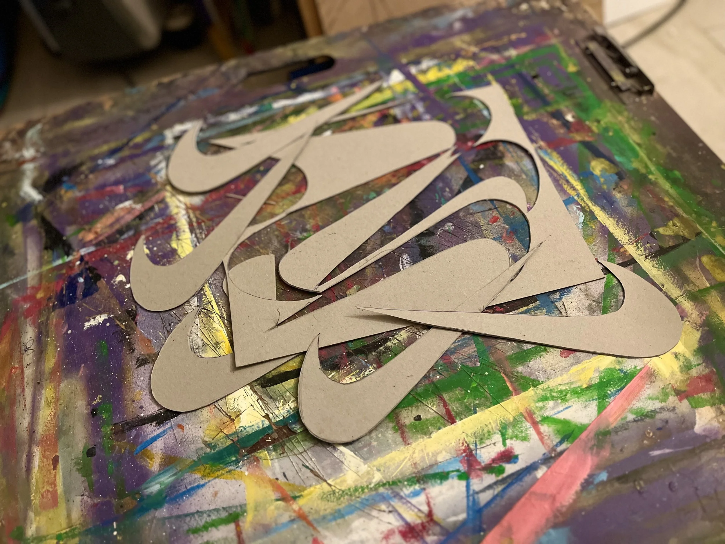
Creating the Nike Logo Stamp
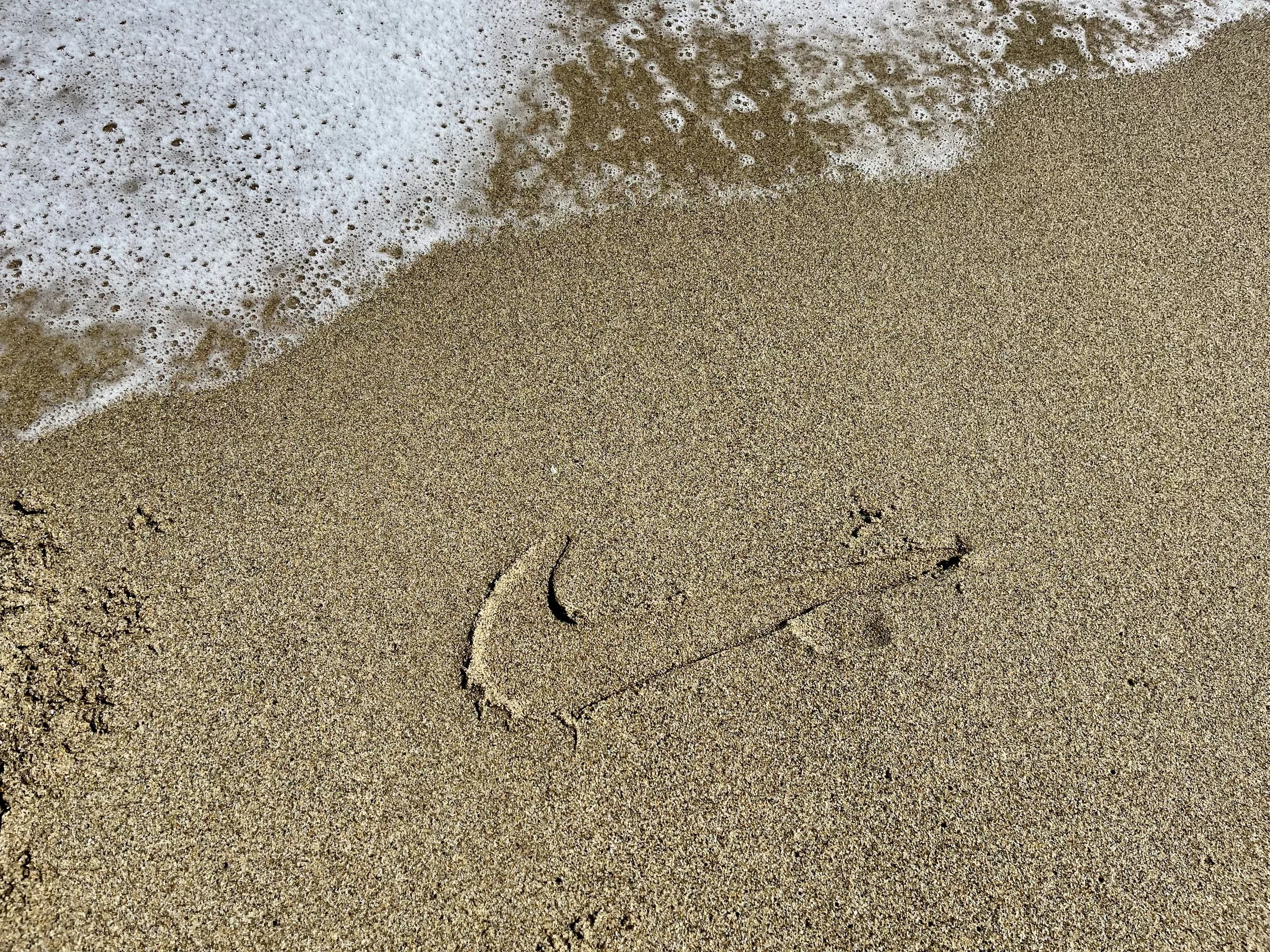
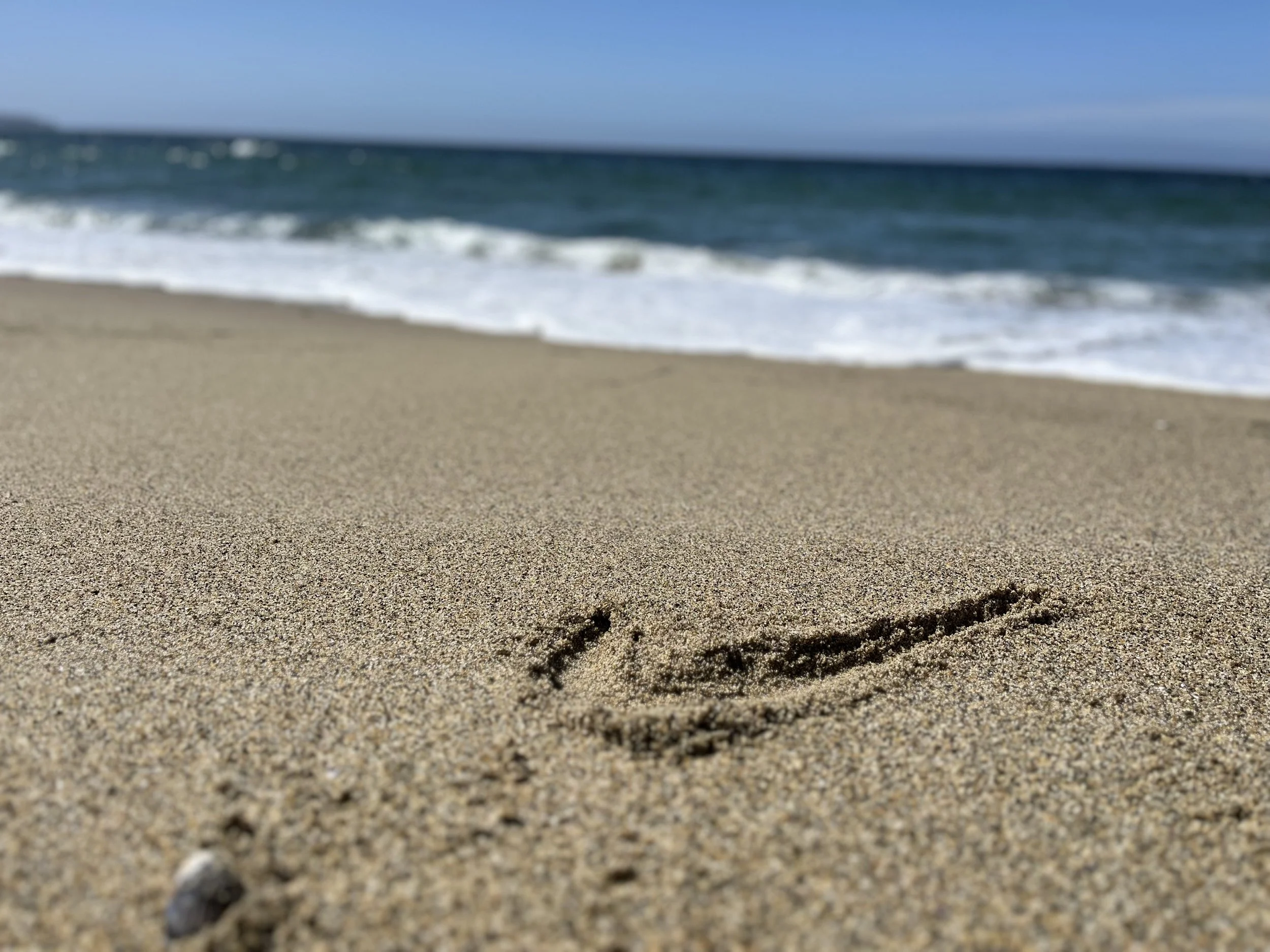
Photo of Nike's footprint on the shore
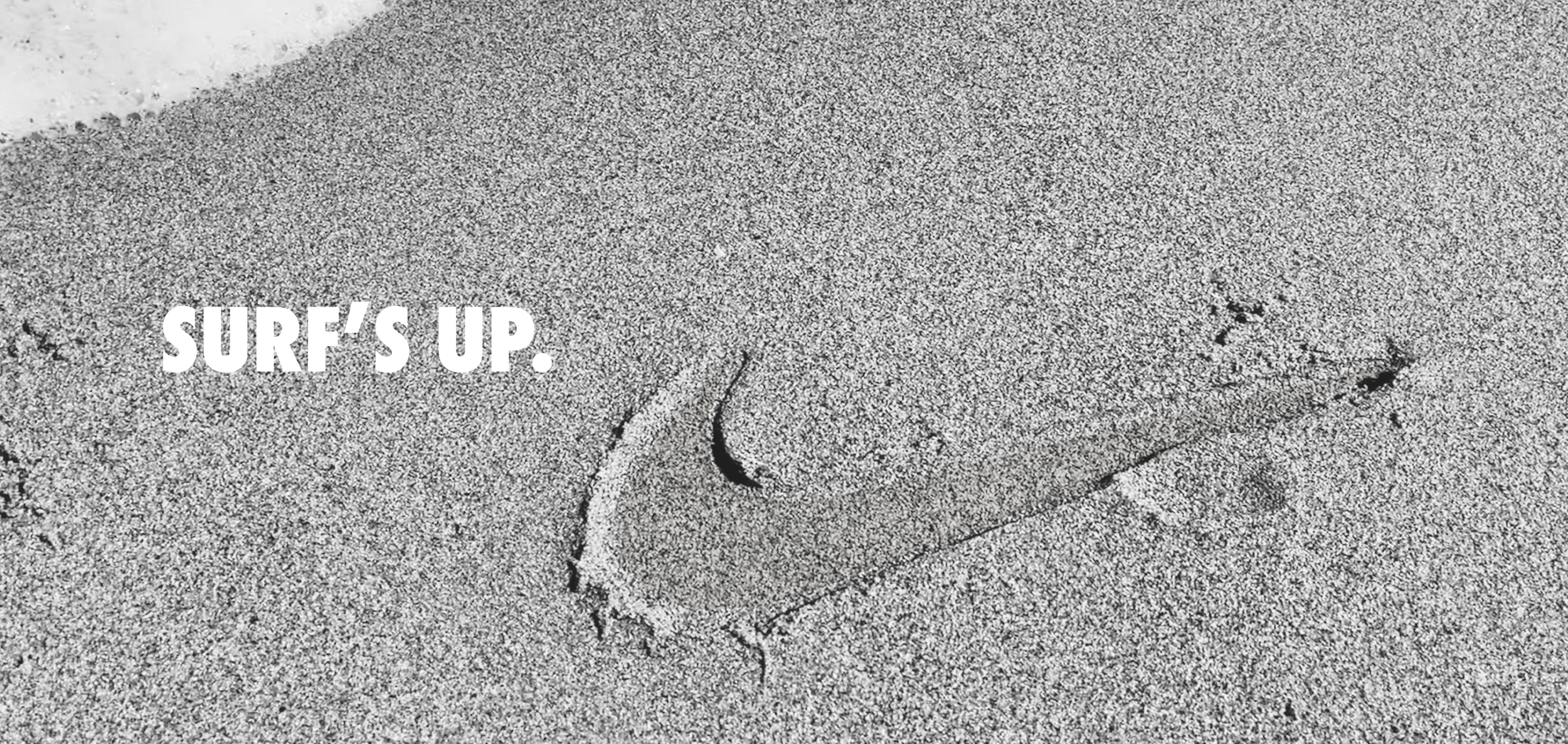
Official Billboard Design of Nike's return to the ocean and surfing.
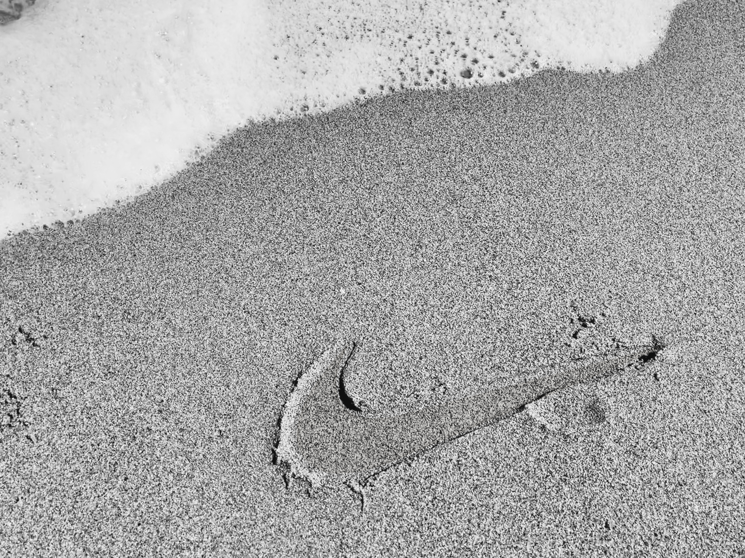
Edit of Nike's footprint photo.
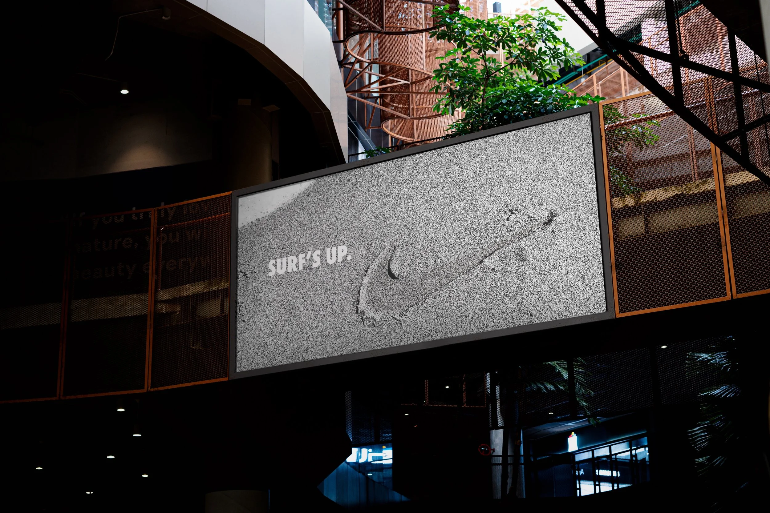
Mockup of Billboard Design of Nike's return to the ocean and surfing.
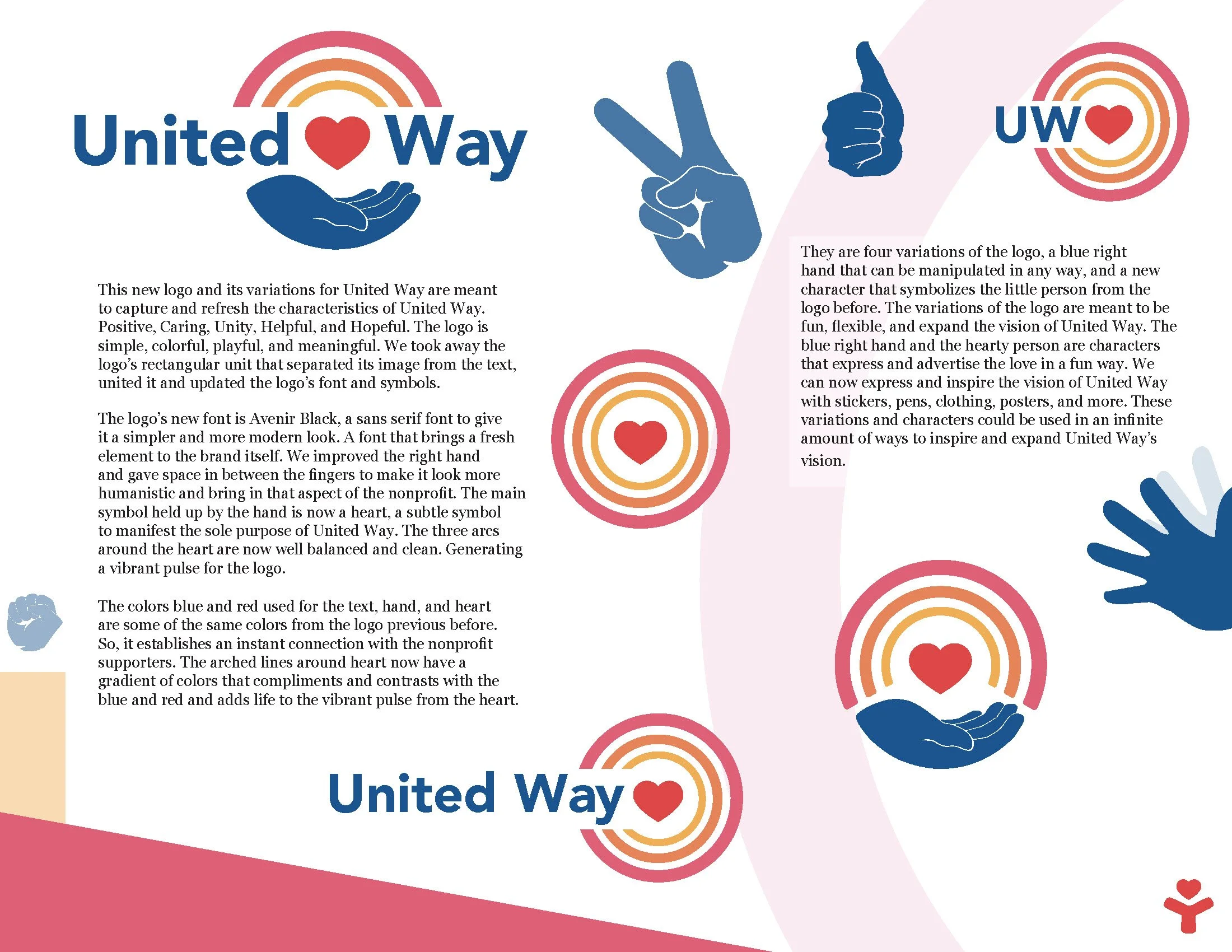
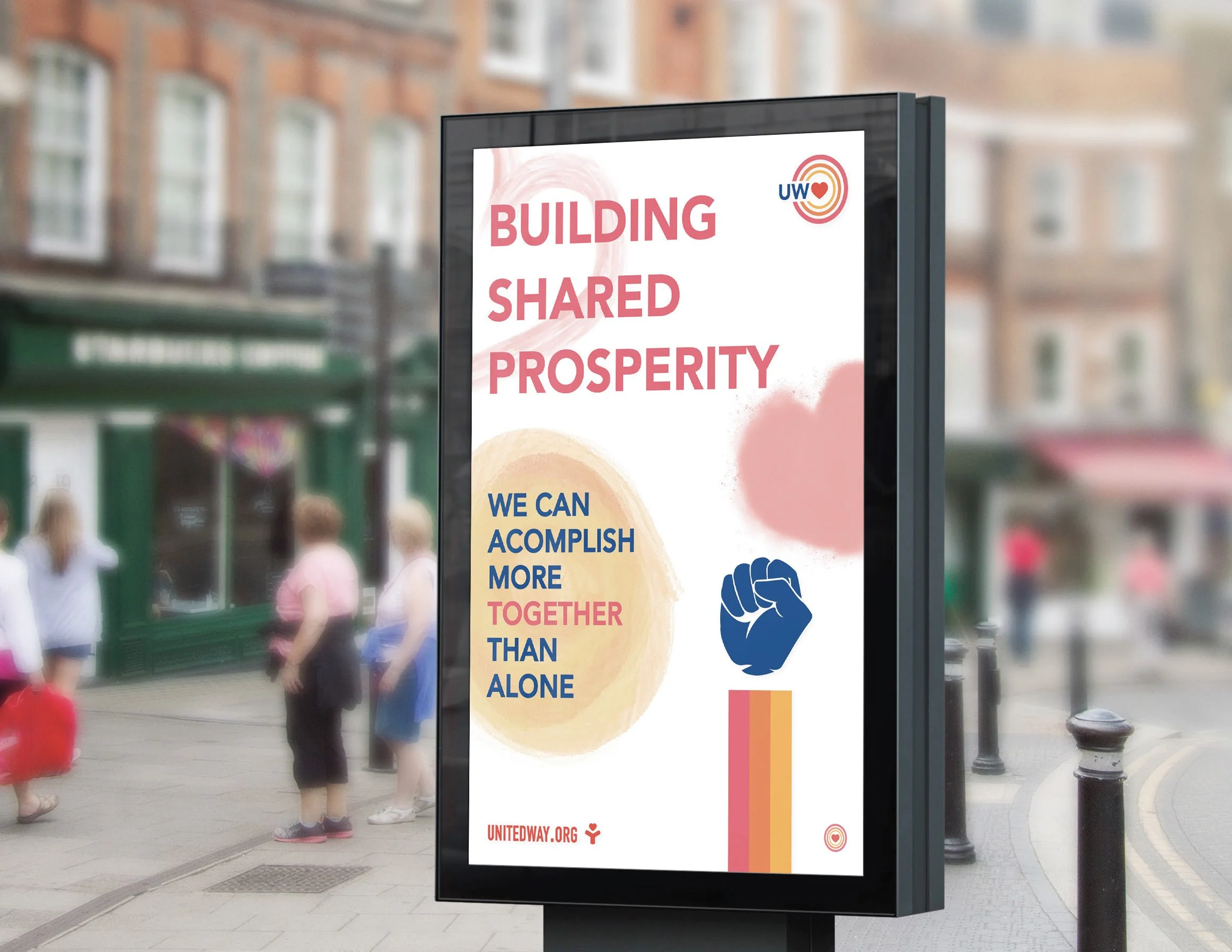
A refreshment of the logo for United Way, a non-profit organization that helps the community by aiding people with their basic needs. United Way’s positivity and hope for change was the inspiration for these new design.
Original Logo
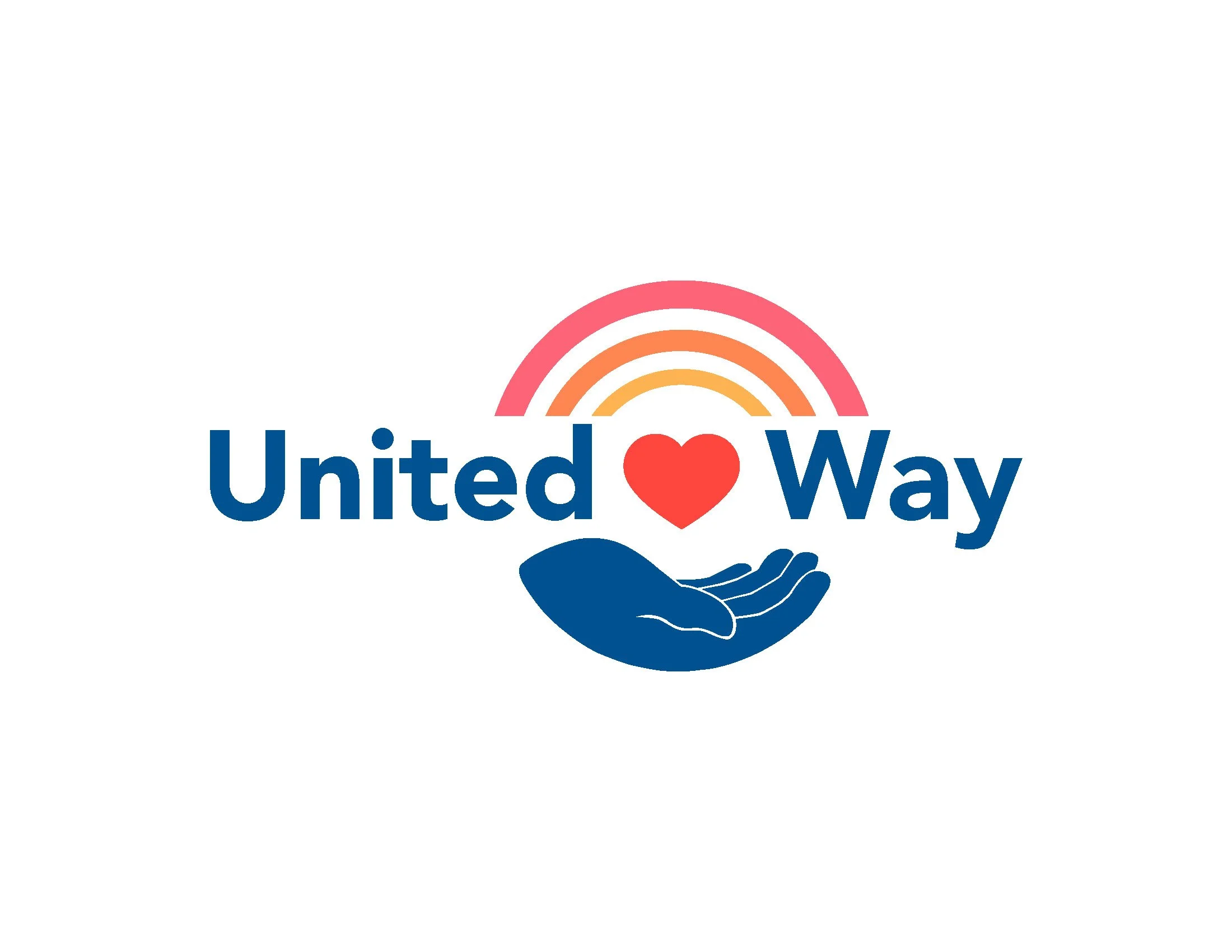
Refreshed Logo
Circular unification
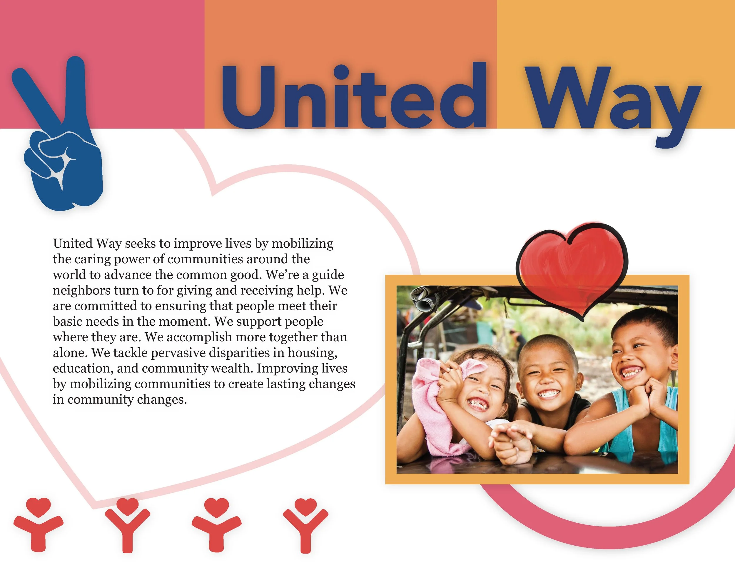
United Way
a little bit of love can inspire
Introduction
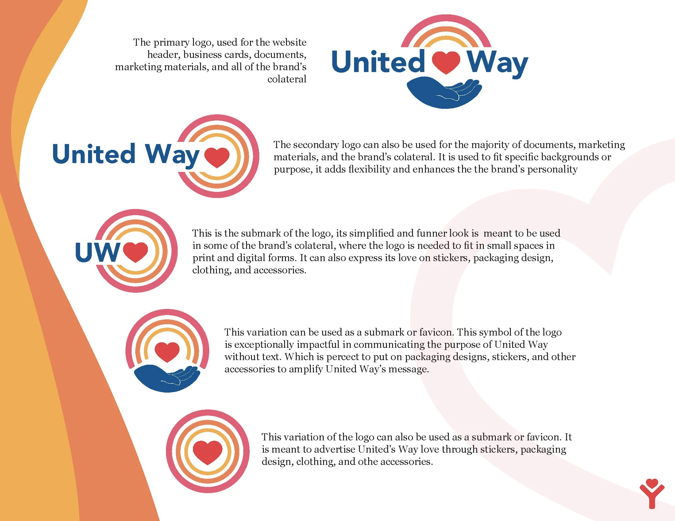
The logo variations
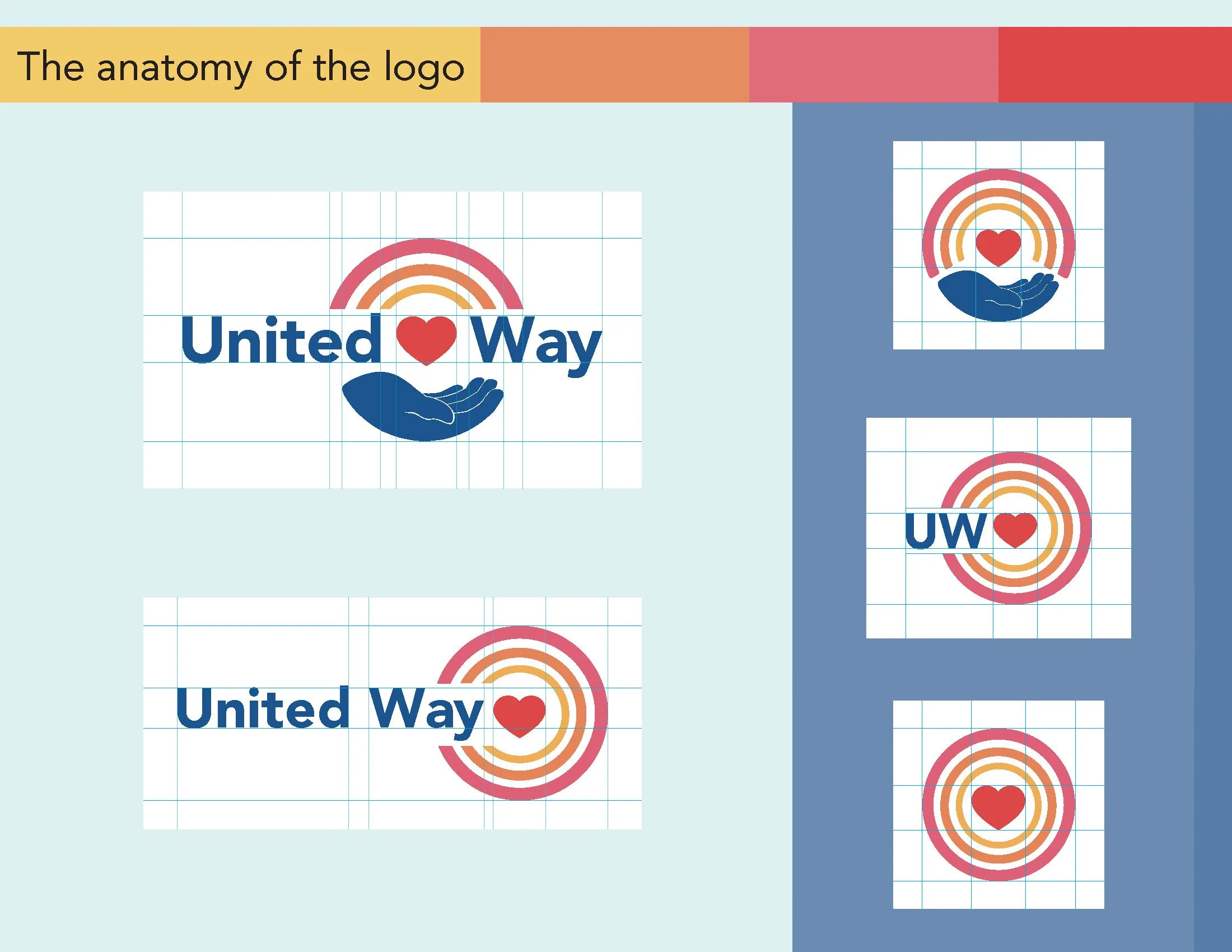
anatomy
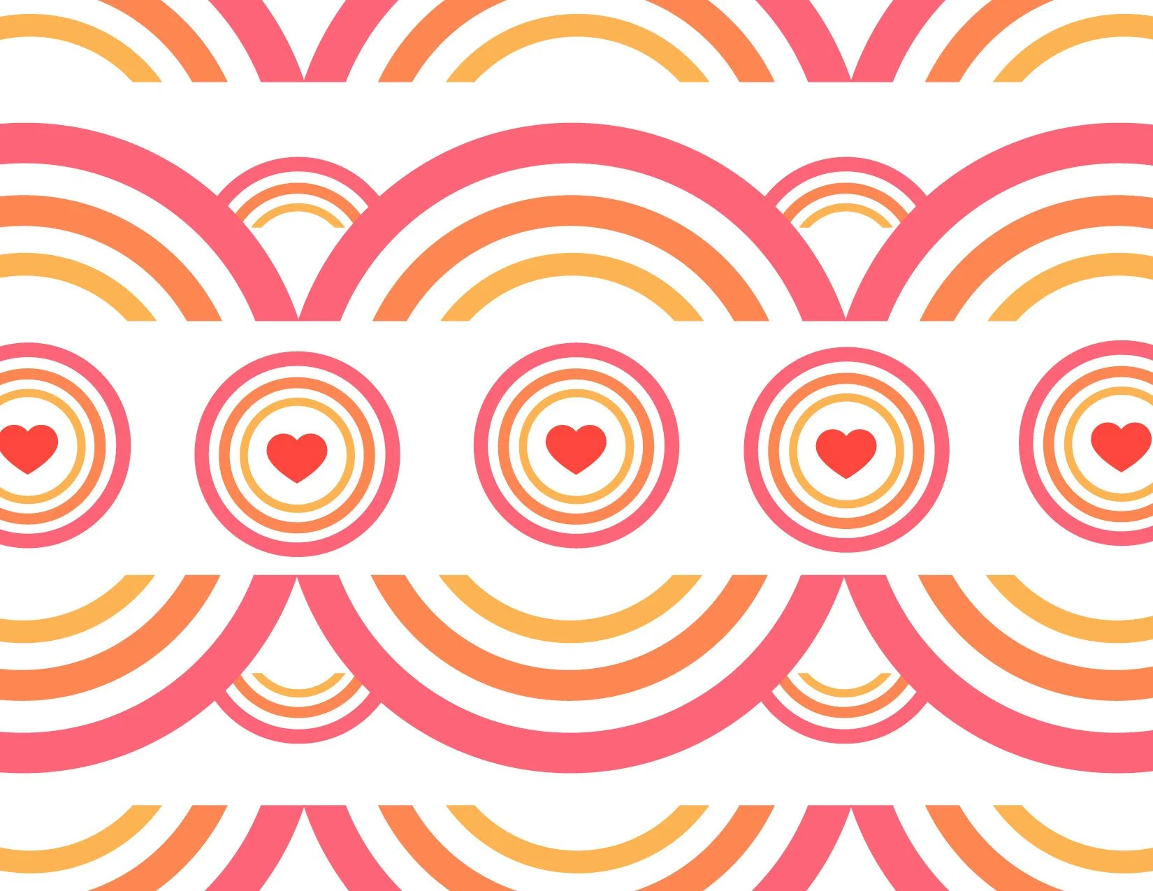
the power of love
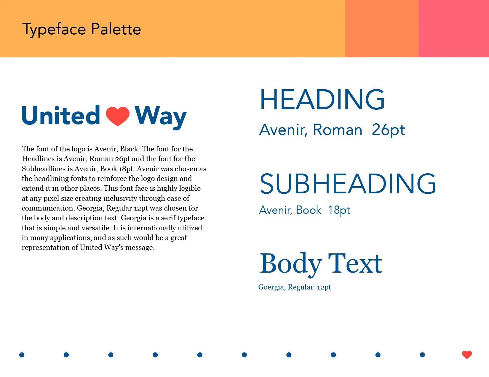
Typeface Palette
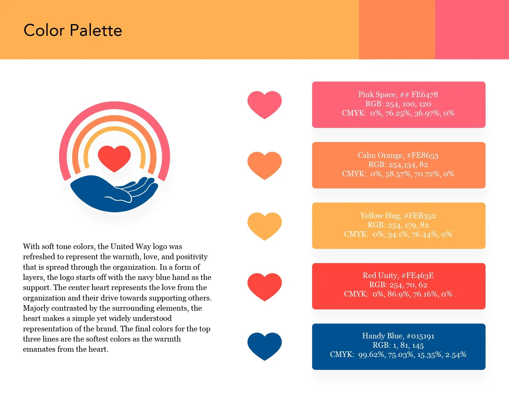
Color Palette
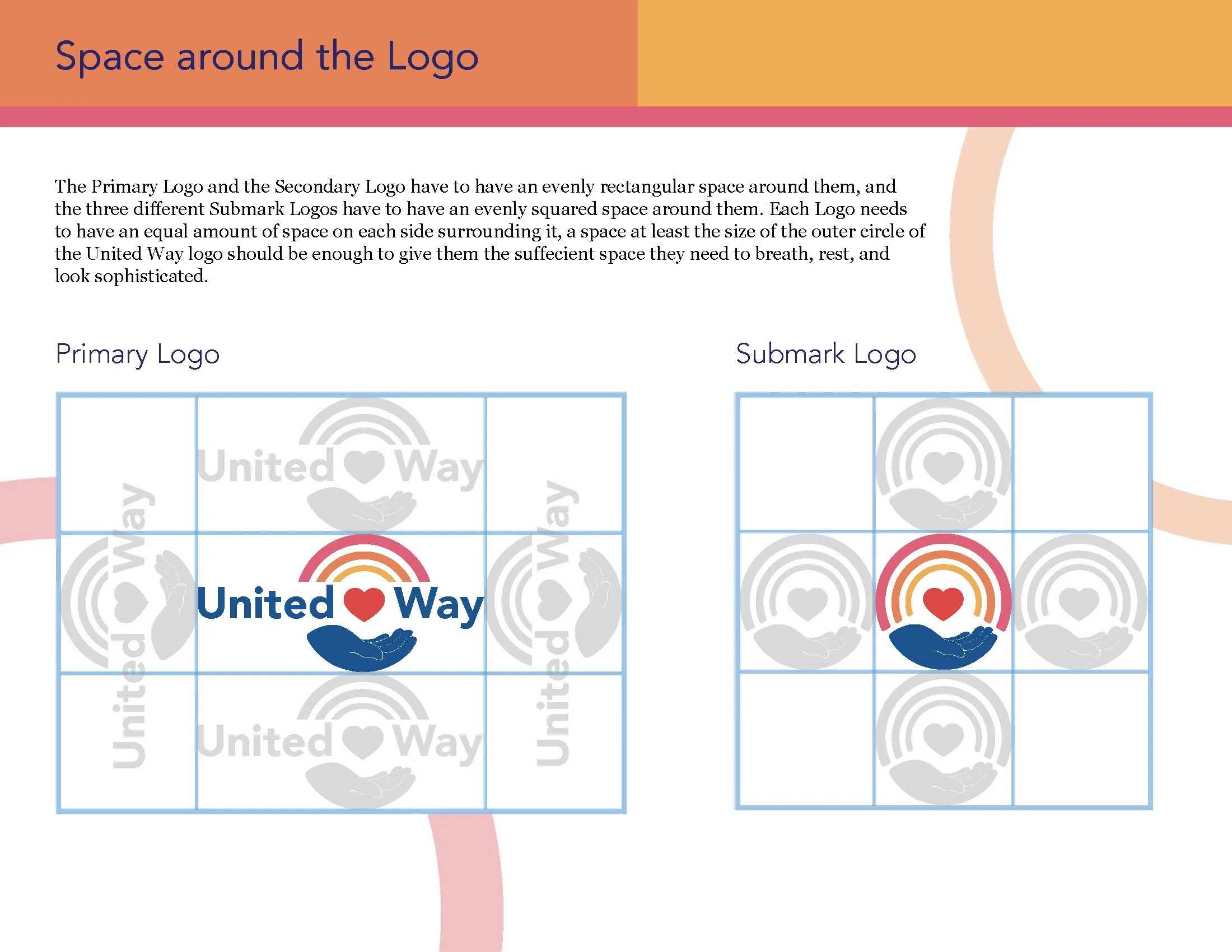
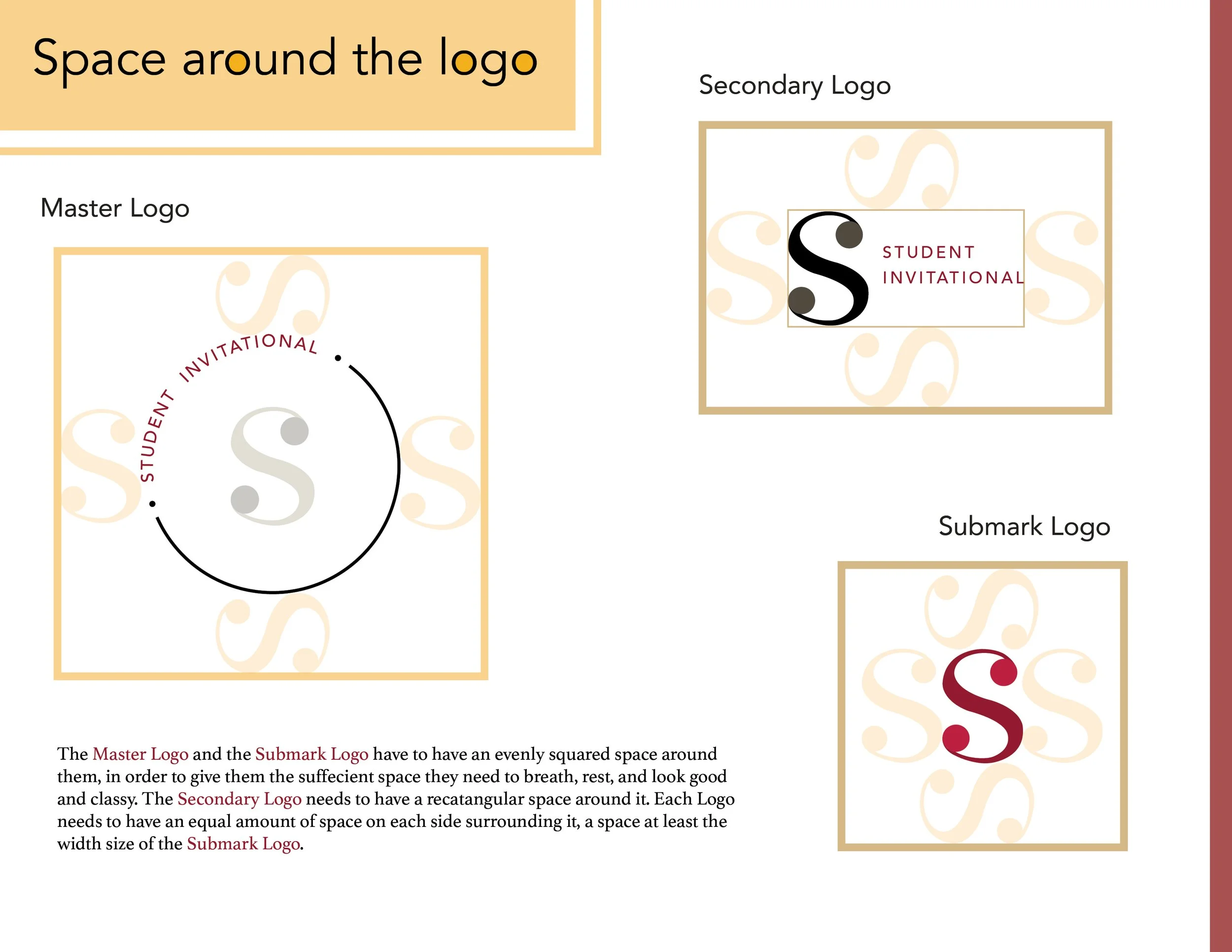
The spacing it needs
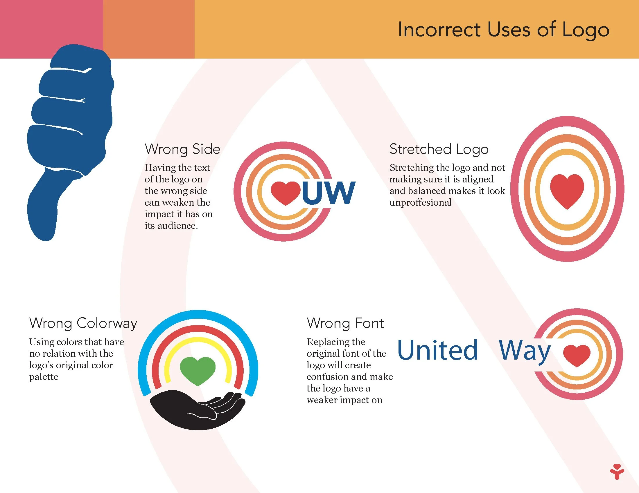
The dumbs downs
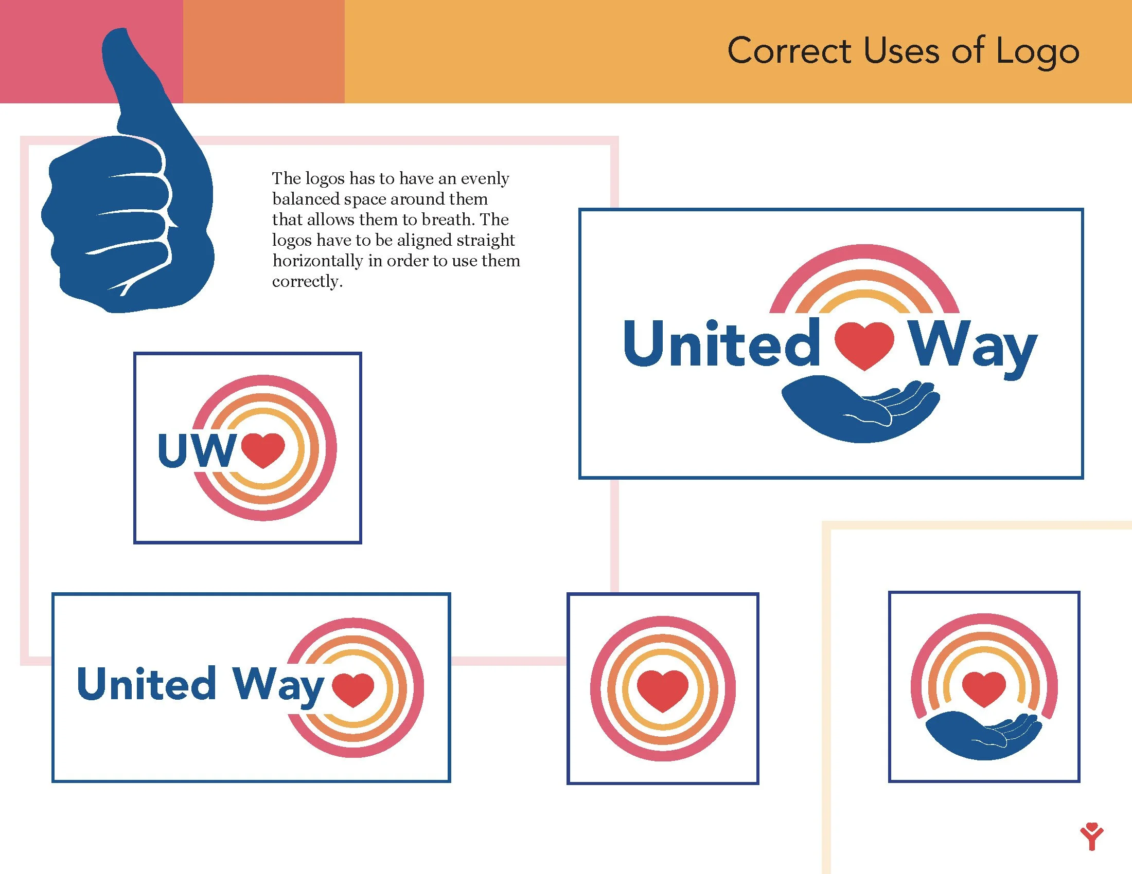
The correct use
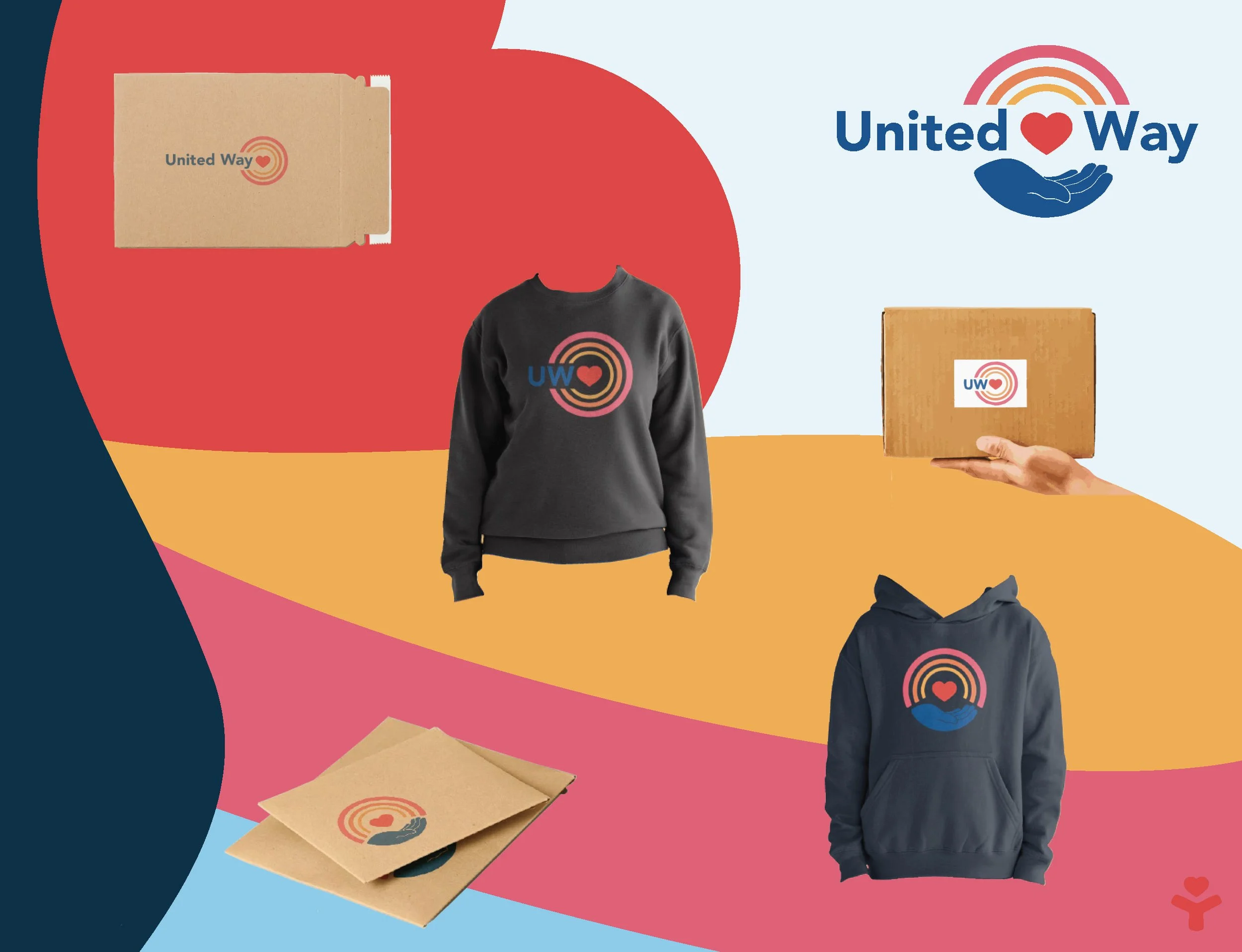
the pruduct
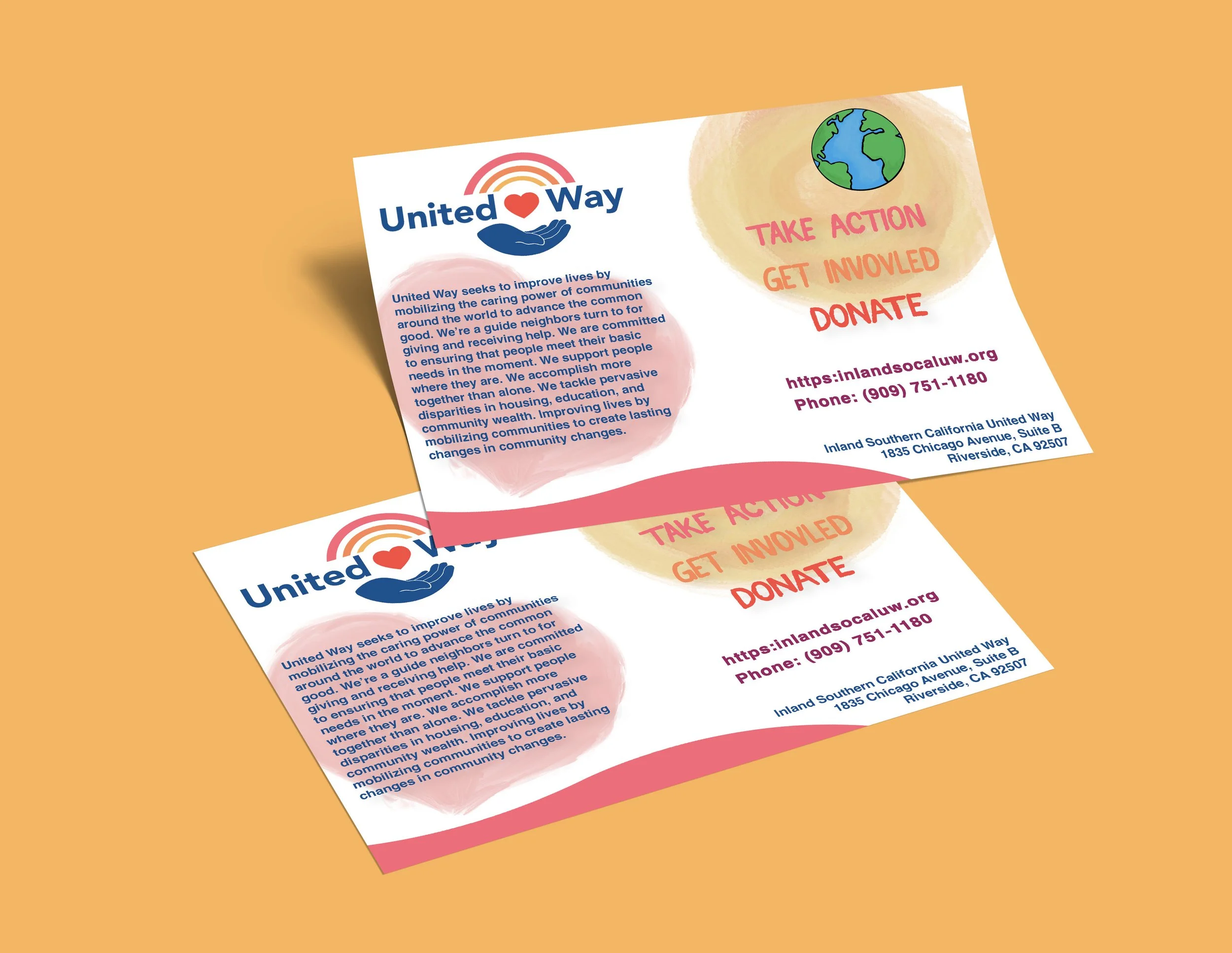
flyers
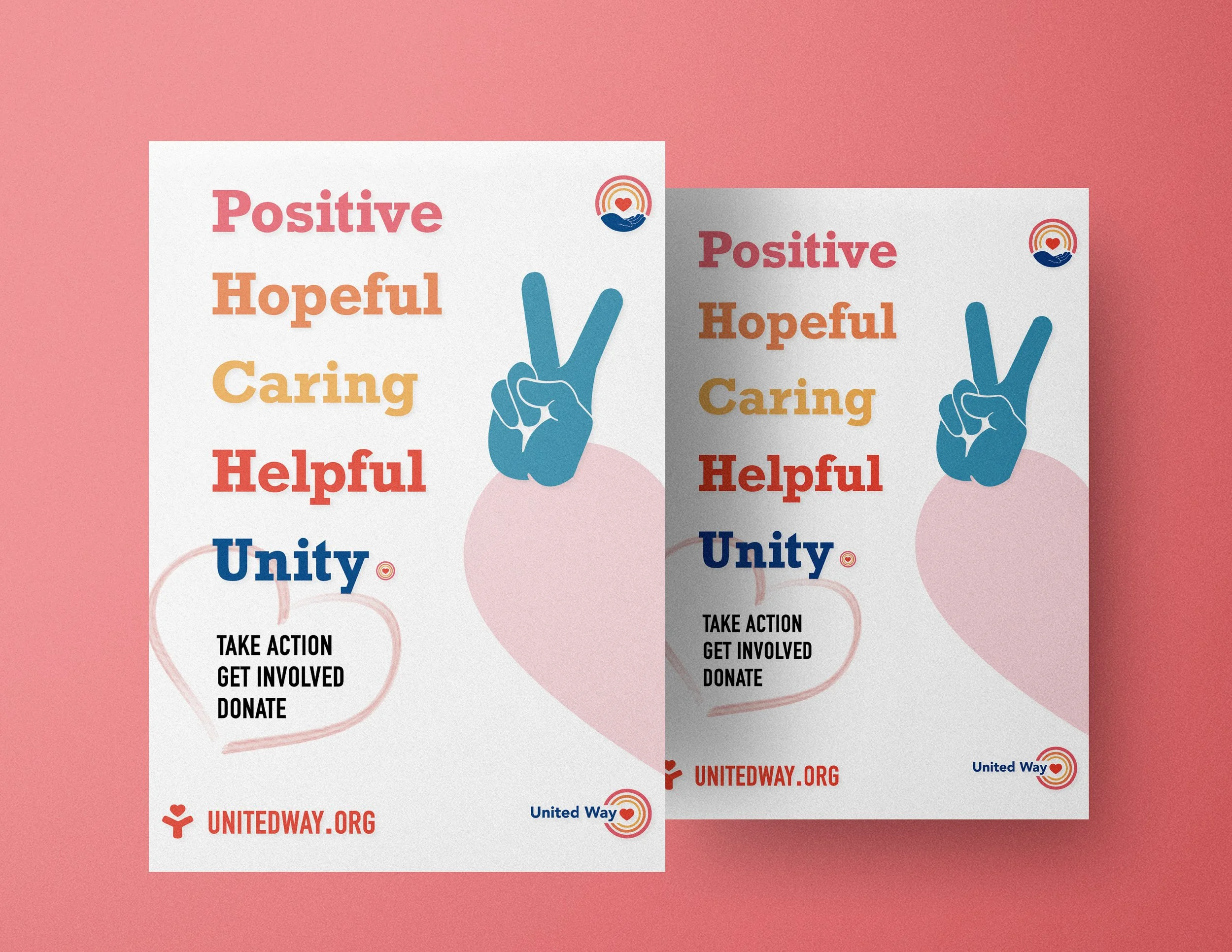
Poster 1
Poster 2
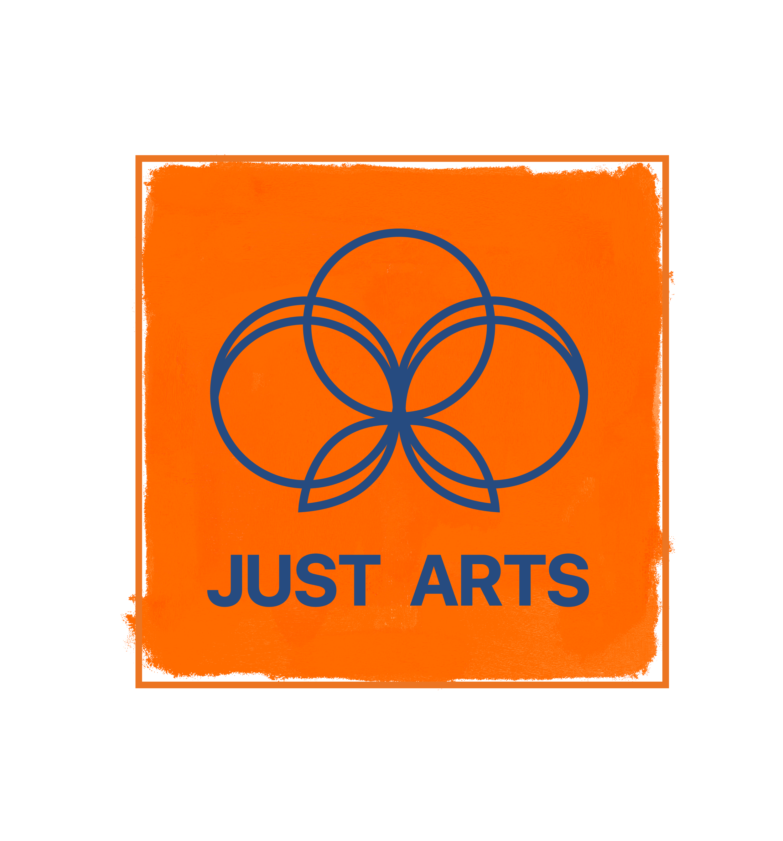
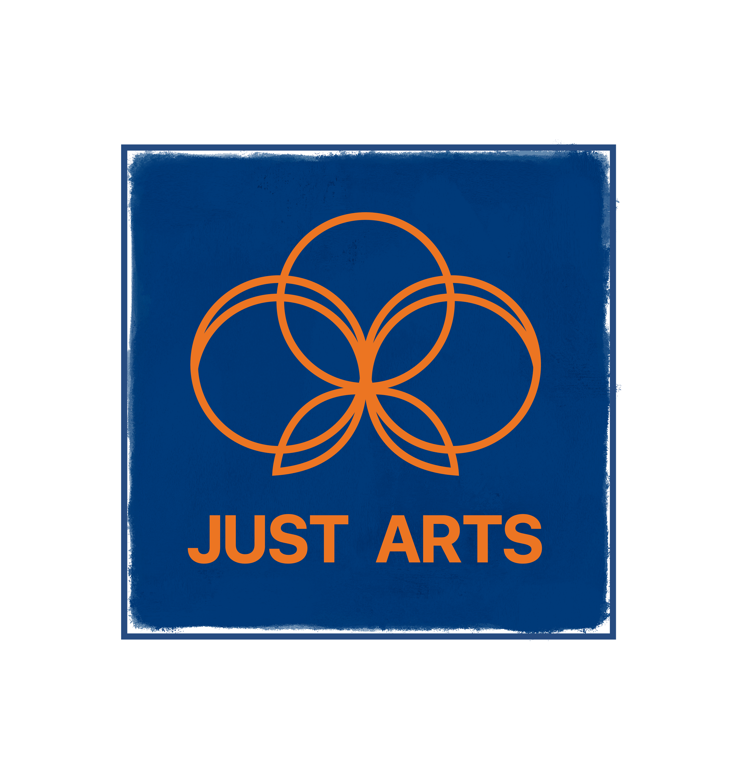
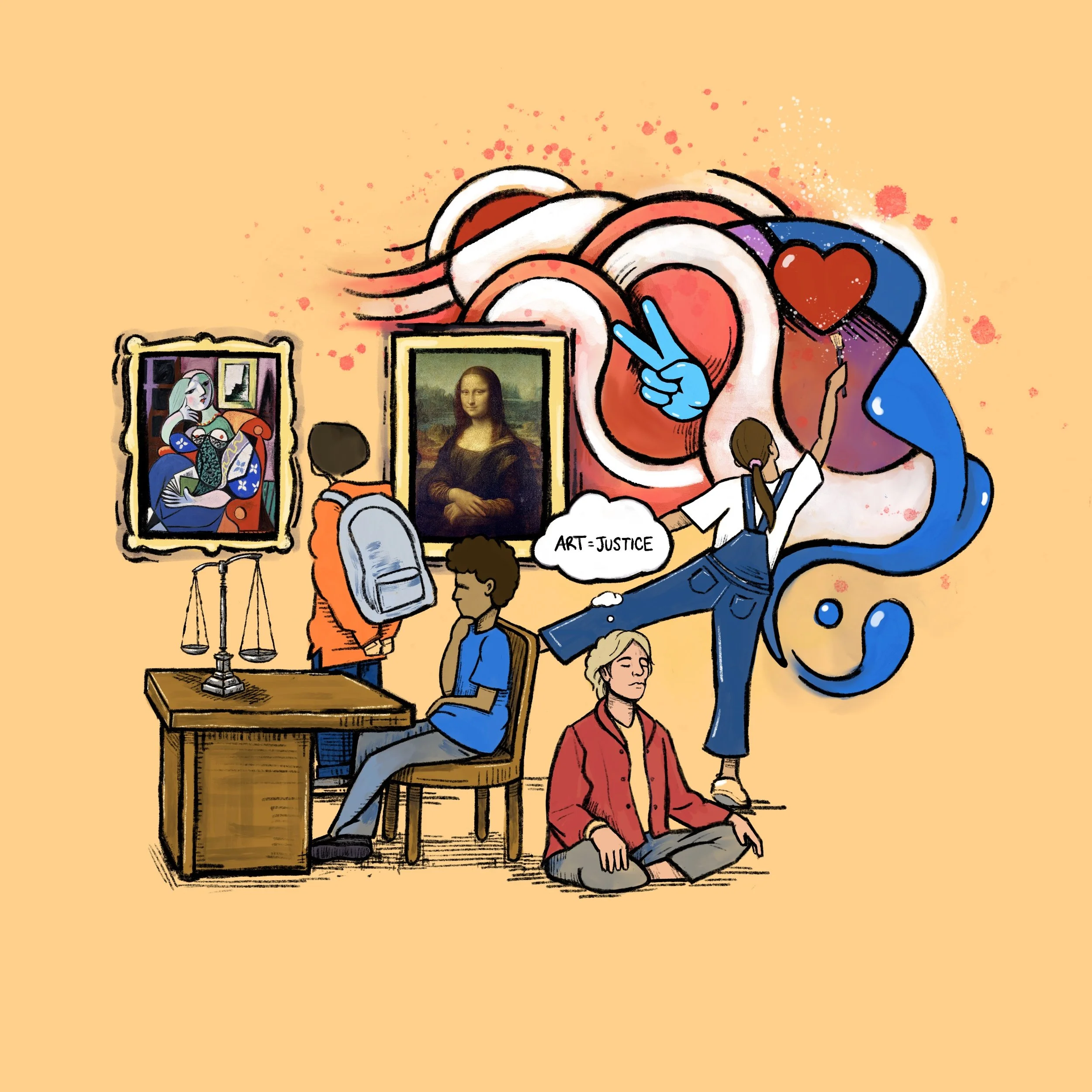
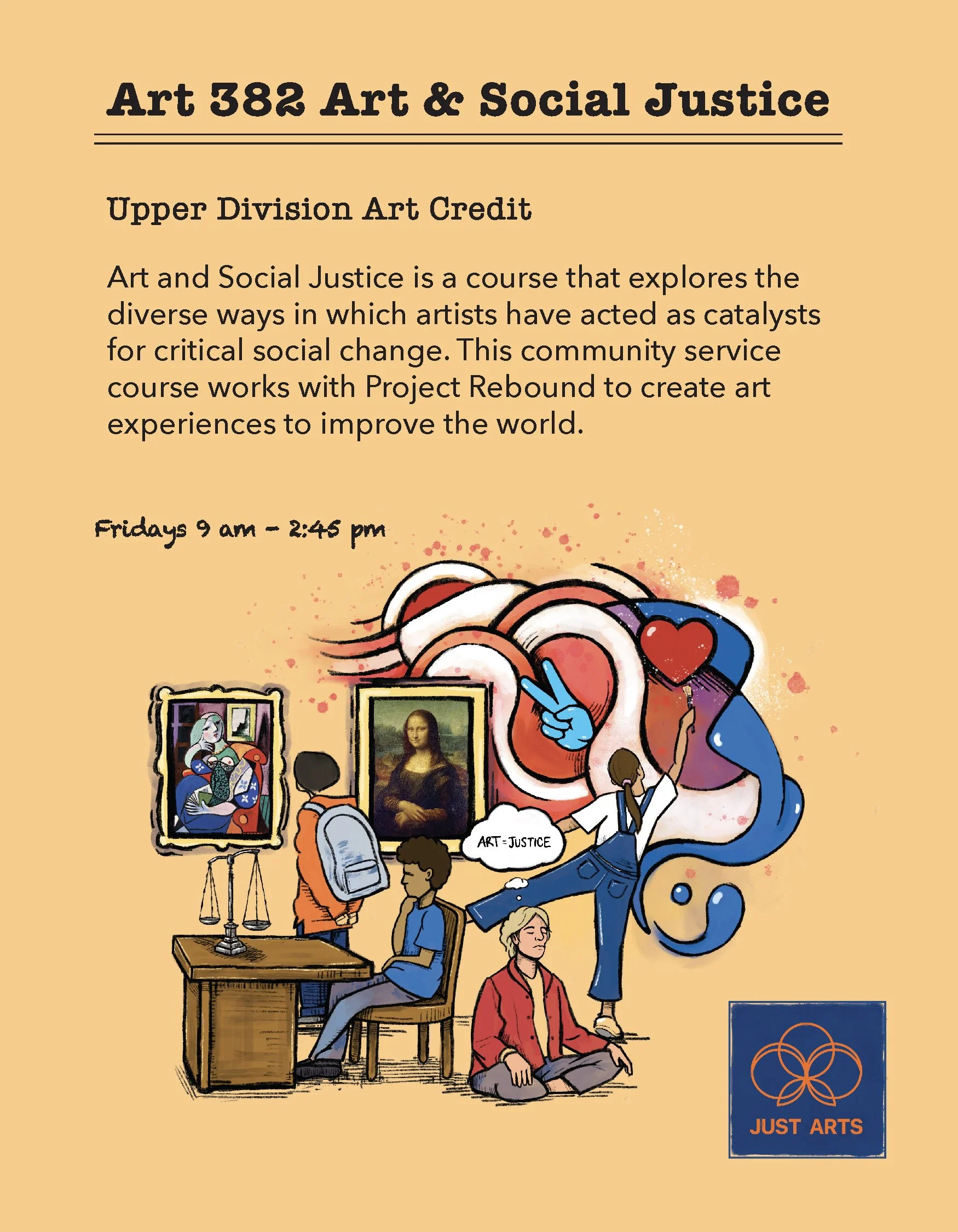
Mary Anna Pomonis is a well known profound artist and teacher at Cal Sate University of Fullerton. I did these logos and flyers for my professor and her program of Just Arts that works with Project Rebound to create art experiences to improve the world.
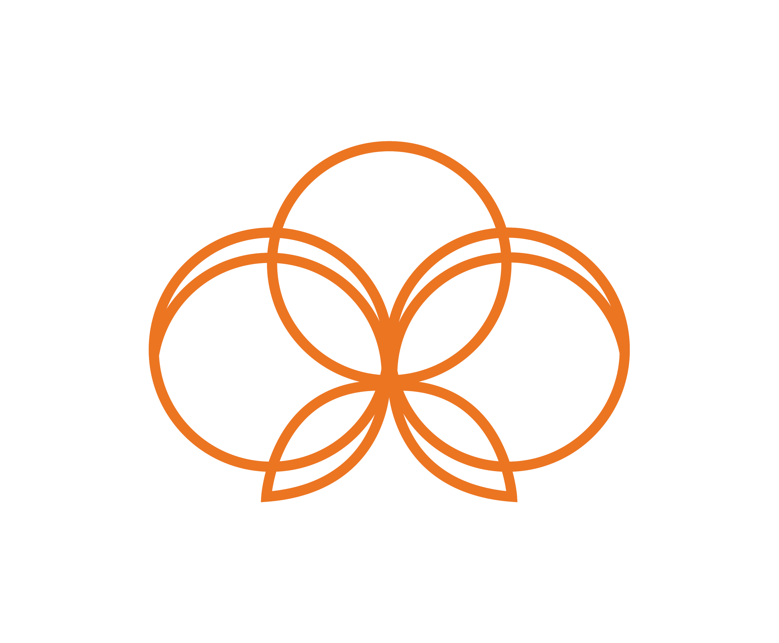
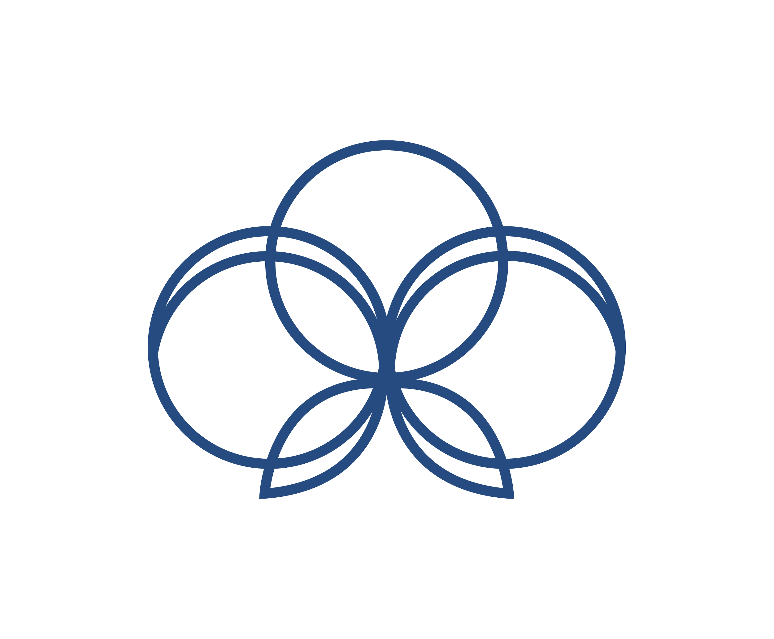
The logo was inspired by her style of art combined with the colors of CSUF, and an organic shape that displayed strength and liberation. Like the sun, butterfly, and lotus flower.
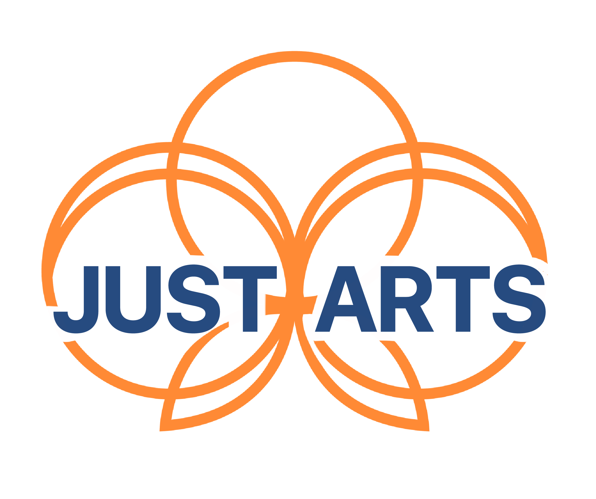
Just Arts Logo 1
Just Arts Logo 2
Just Arts Logo 3
Orange Submark/Favicon
Navy Blue Submark/Favicon
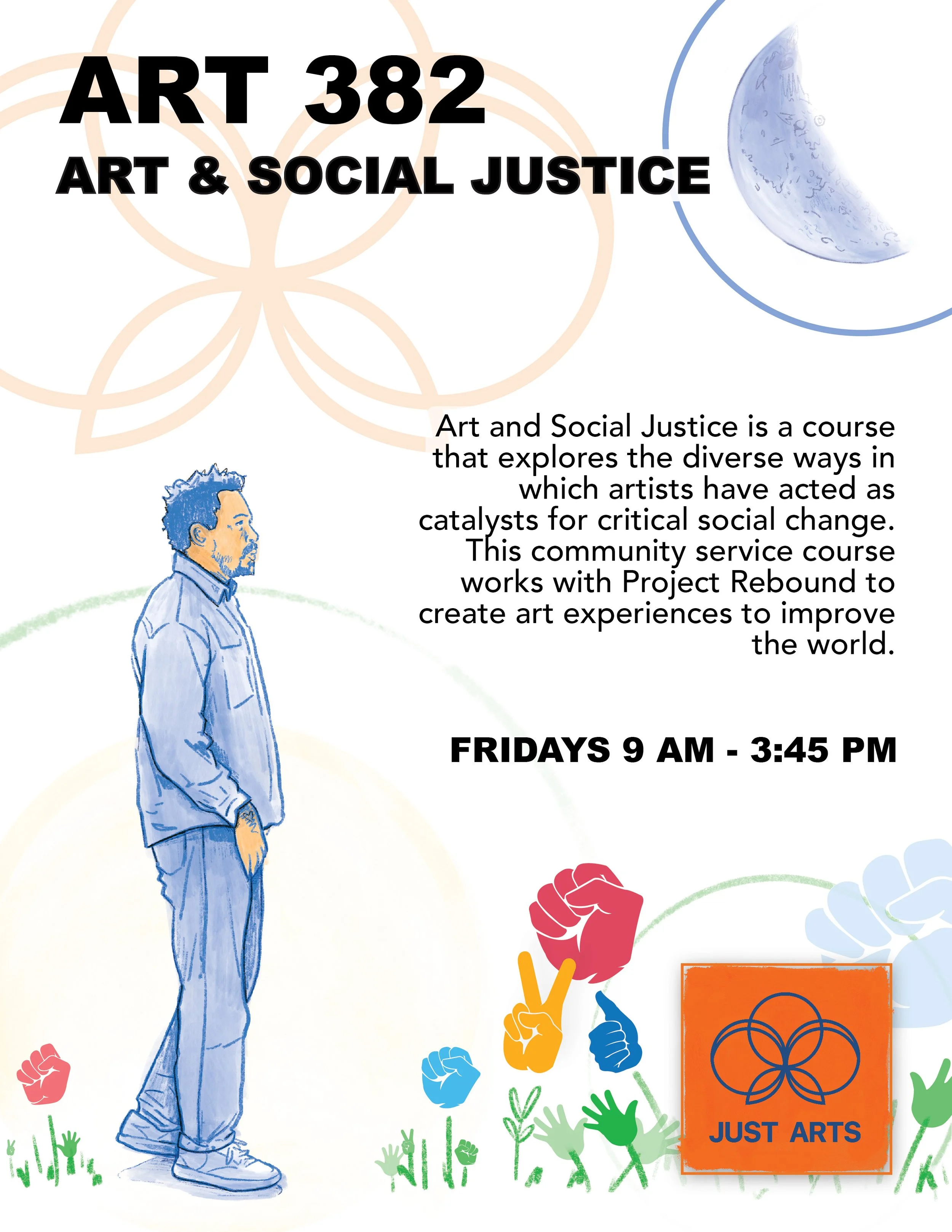
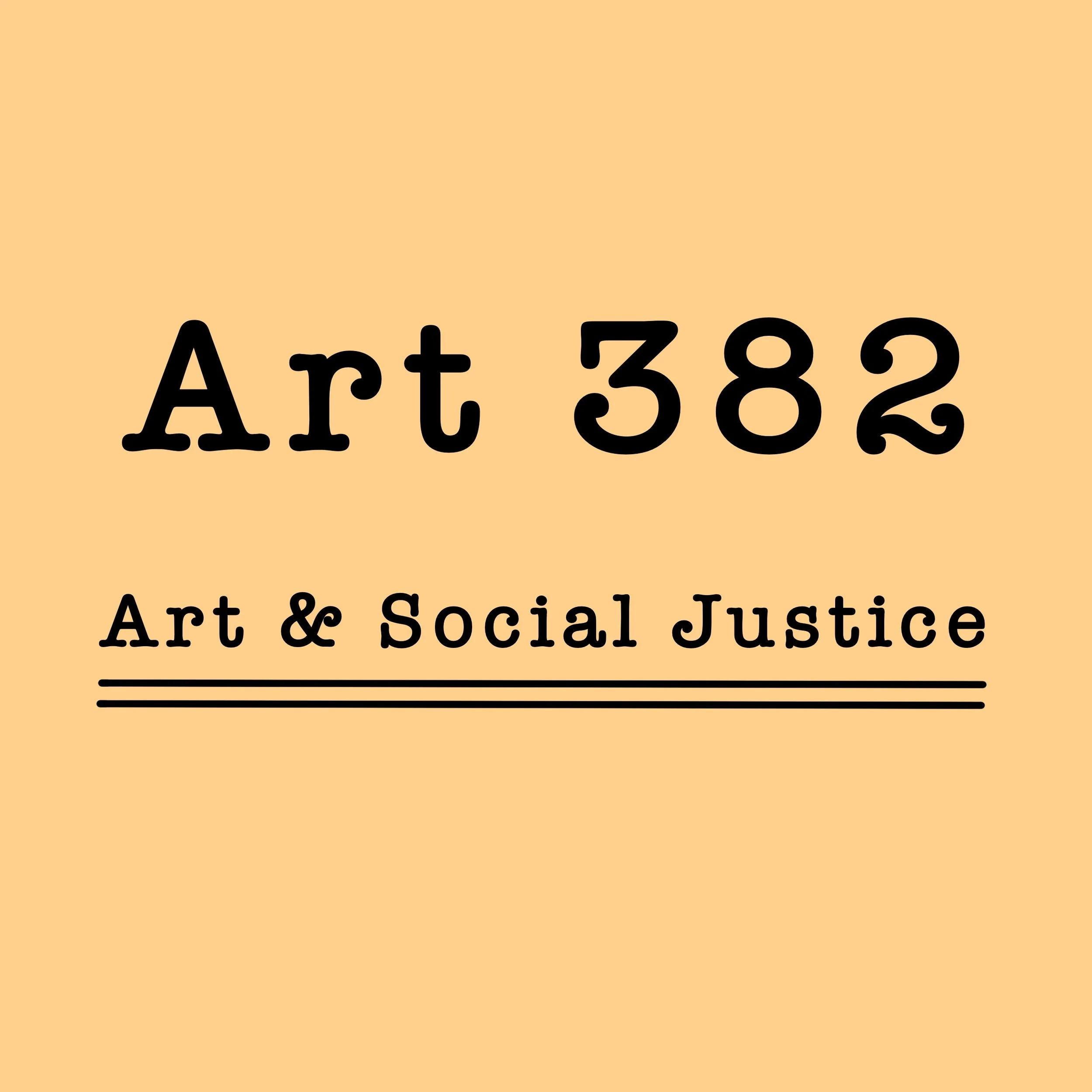
Art 382; Art & Social Justice class Flyer
Art 382, Social Post
Art 382, Social Post #2
Art 382, Flyer #2
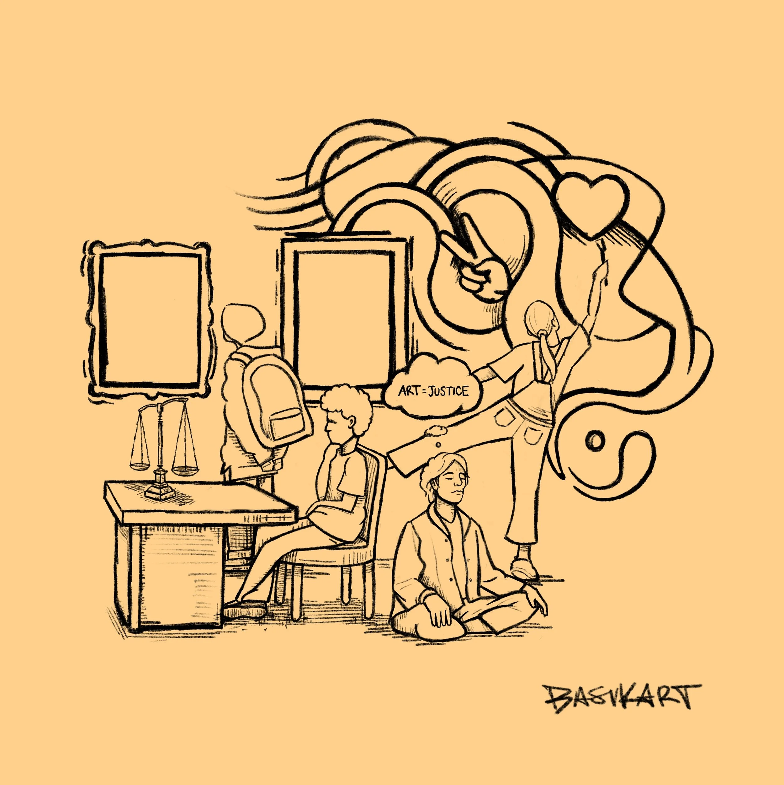
Art 382, sketch
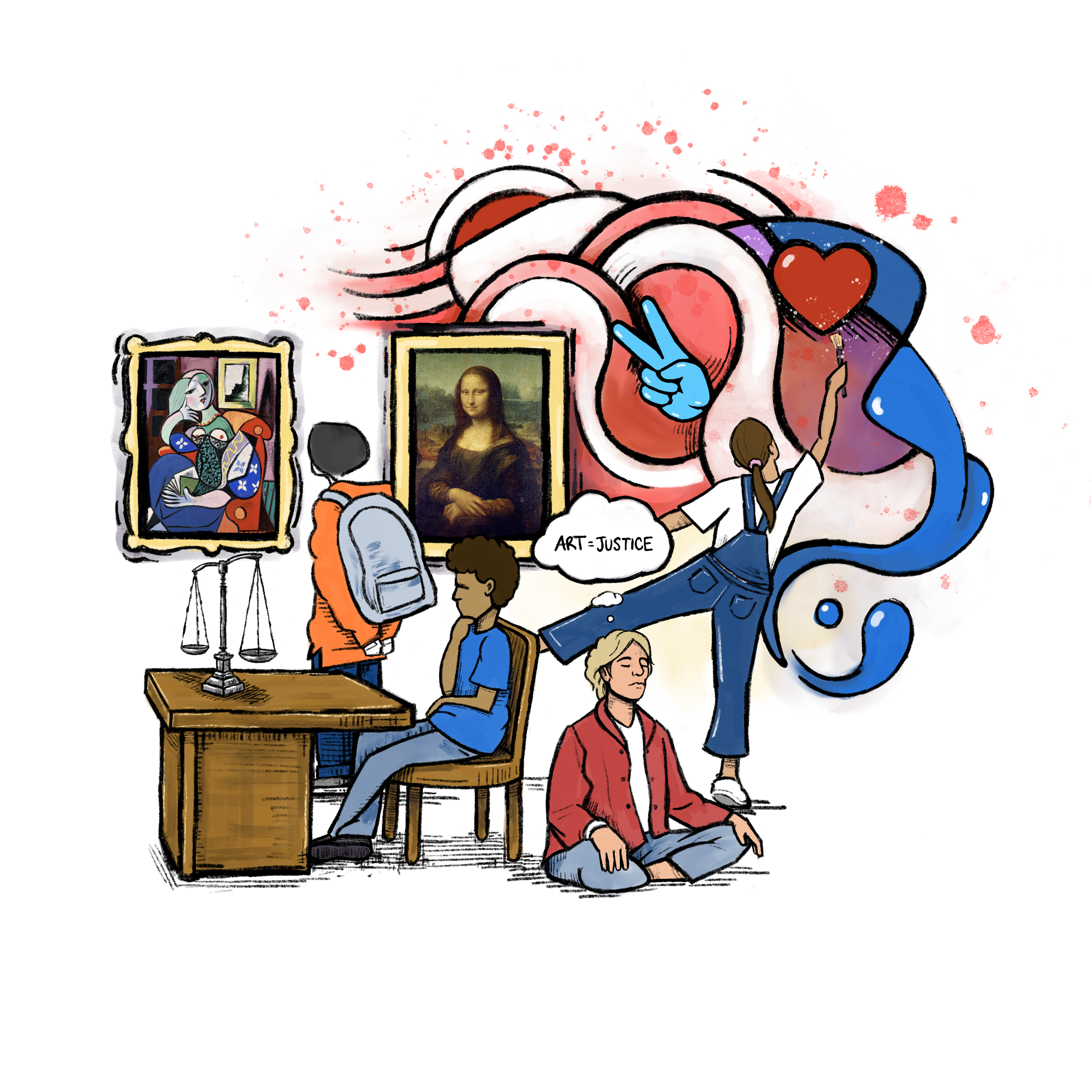
Art 382, illustration
Designs of a business card and a flyer my mom to help her expand her cleaning business.

Front Side

Back Side

Flying with flyers
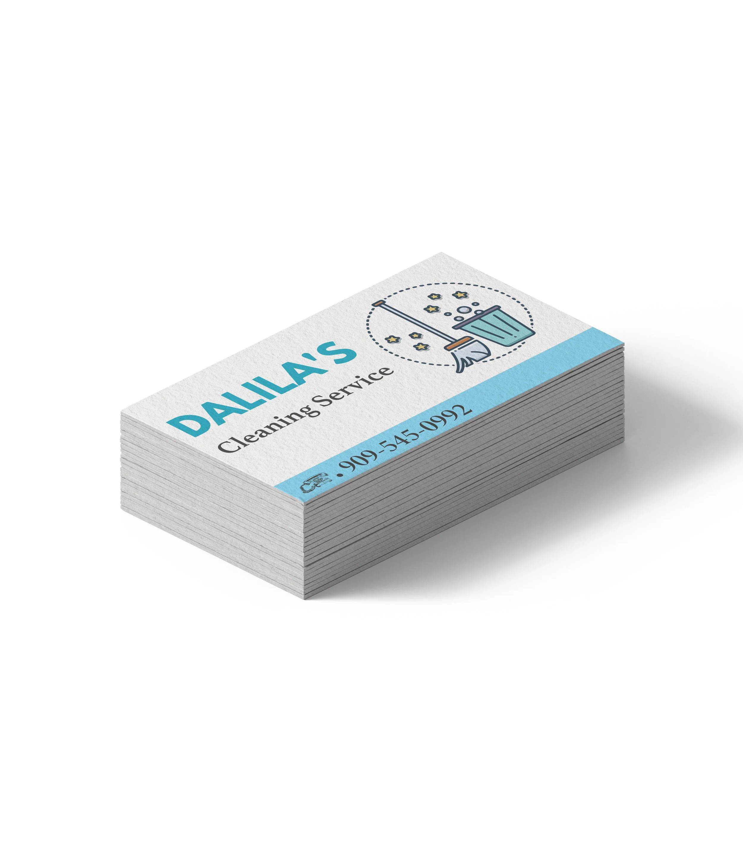
Dalila's stack
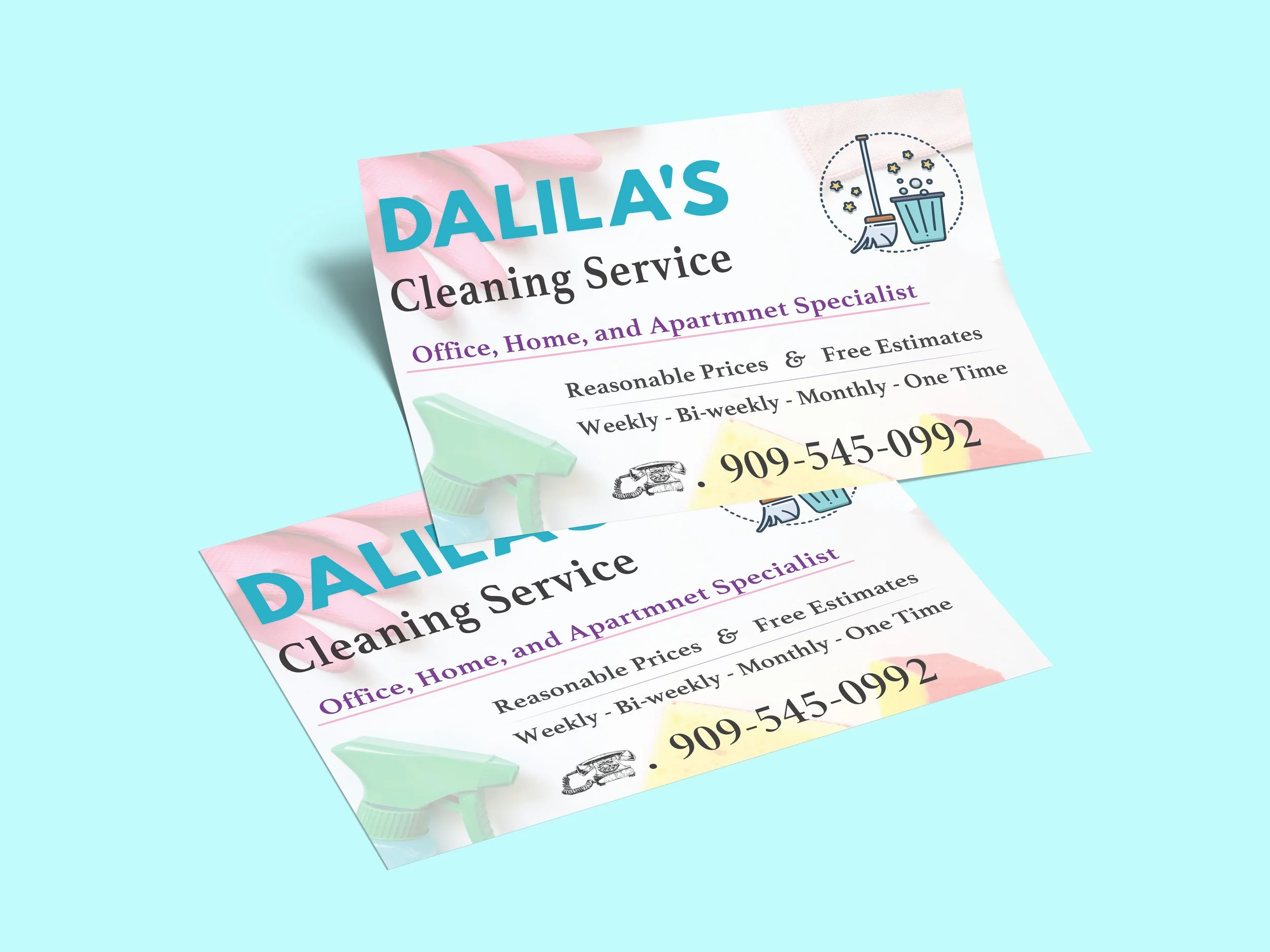
Ready for business
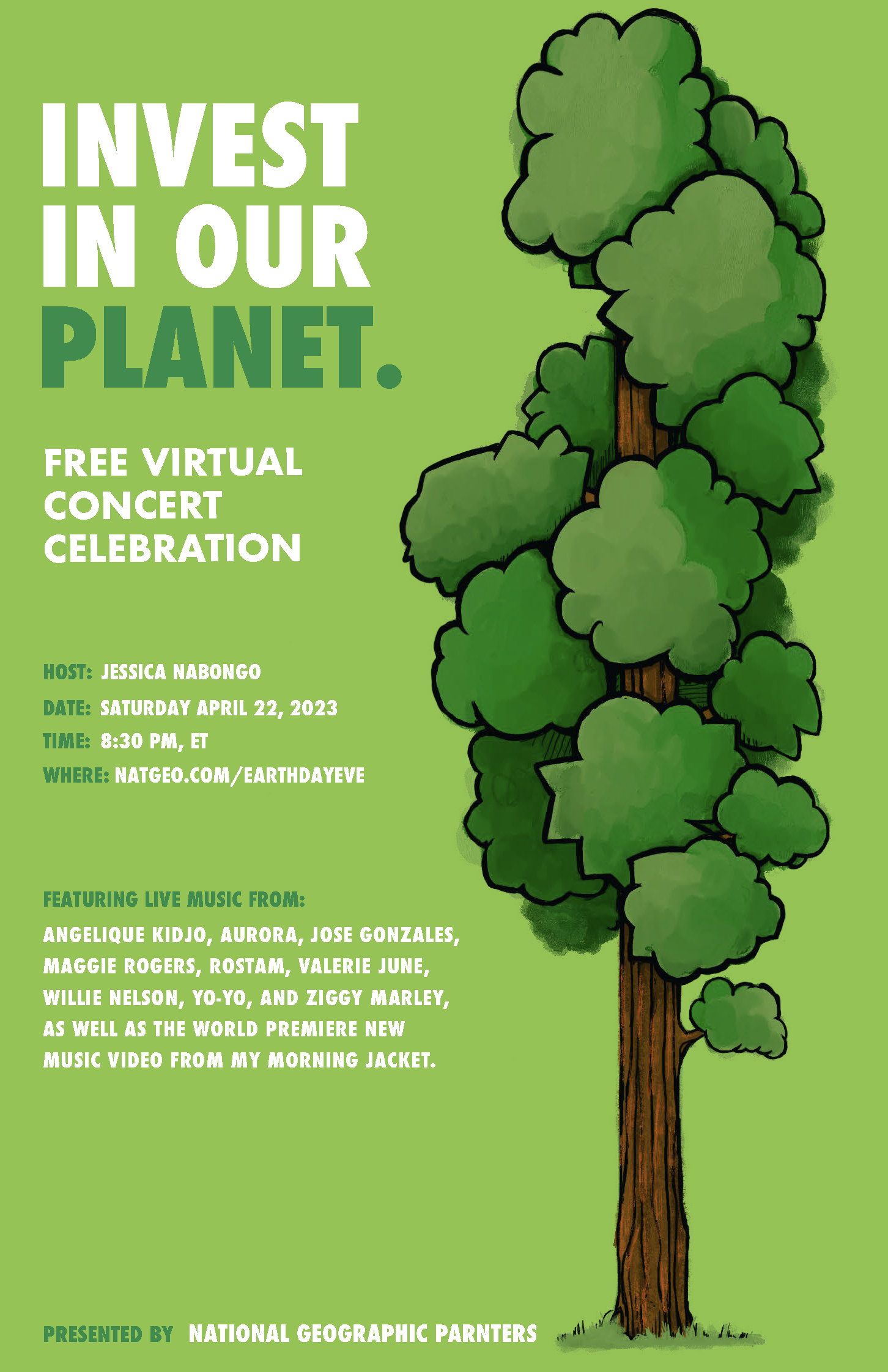
Three posters for Earth Day focusing on the balance in hierarchy of text and image.
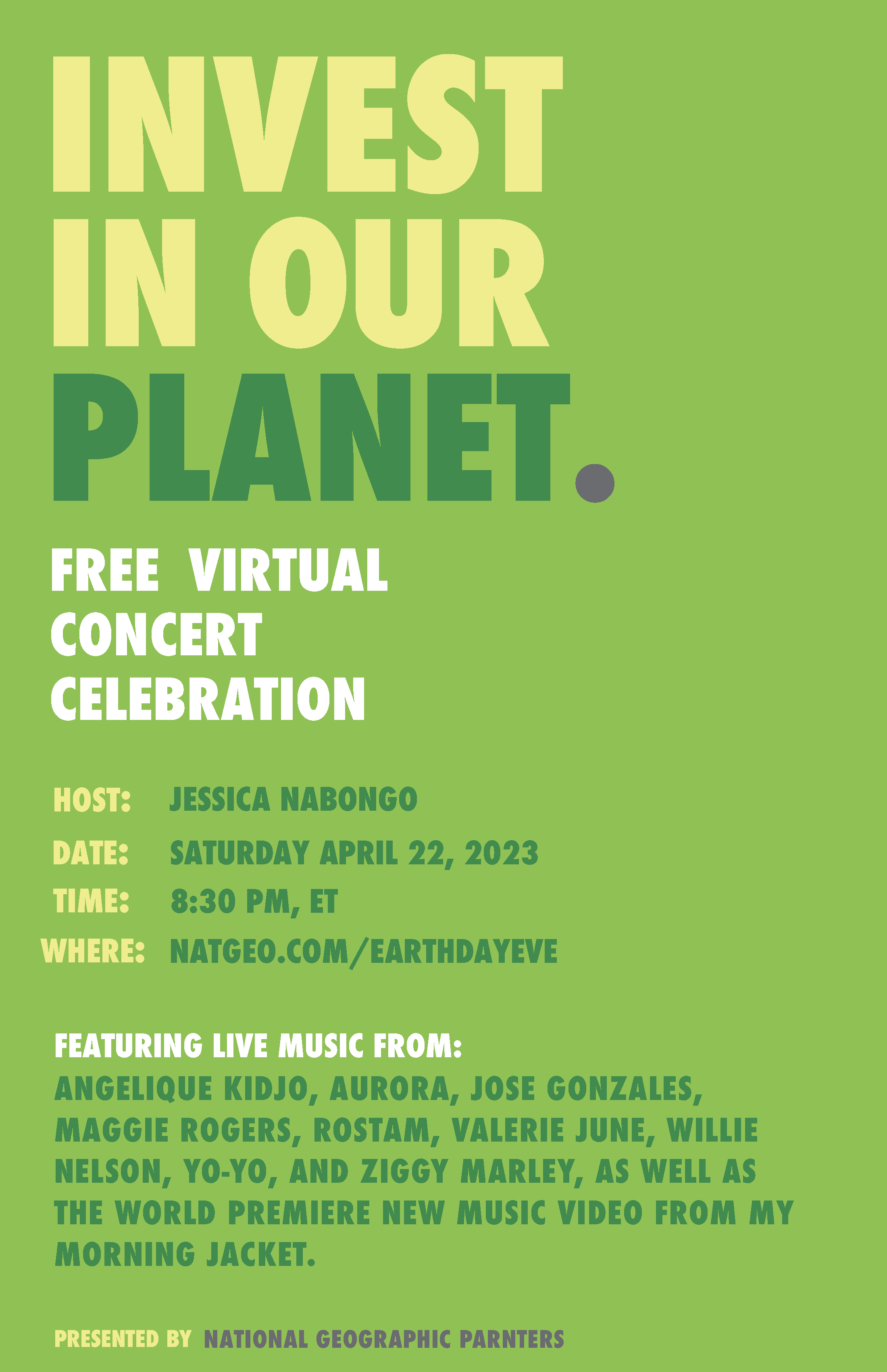
Only text
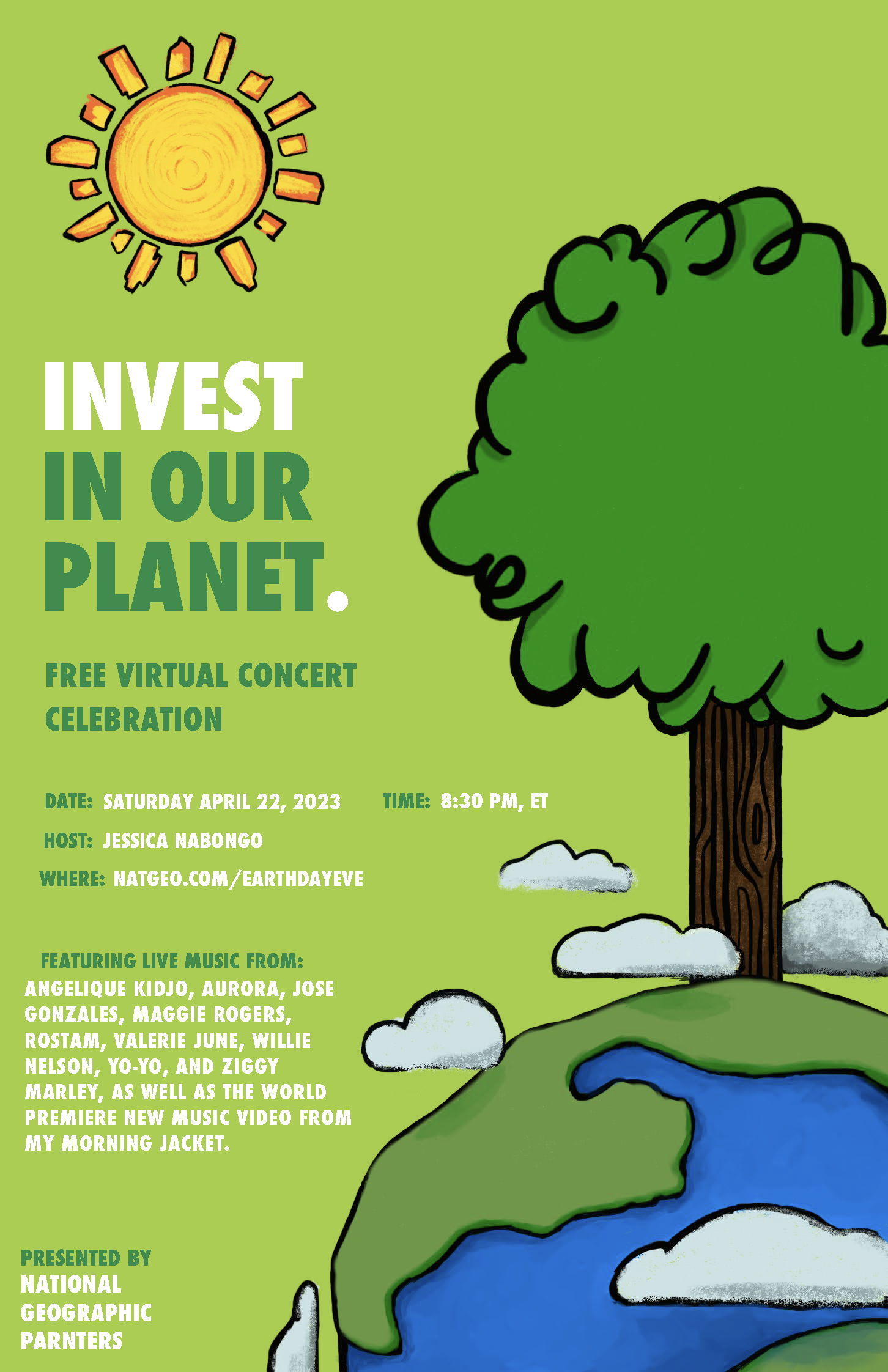
Image dominance
A balance, between text and image.
I call this series of digitally designed abstraction Triangling, a theme based on triangular movement with the purple and gold.
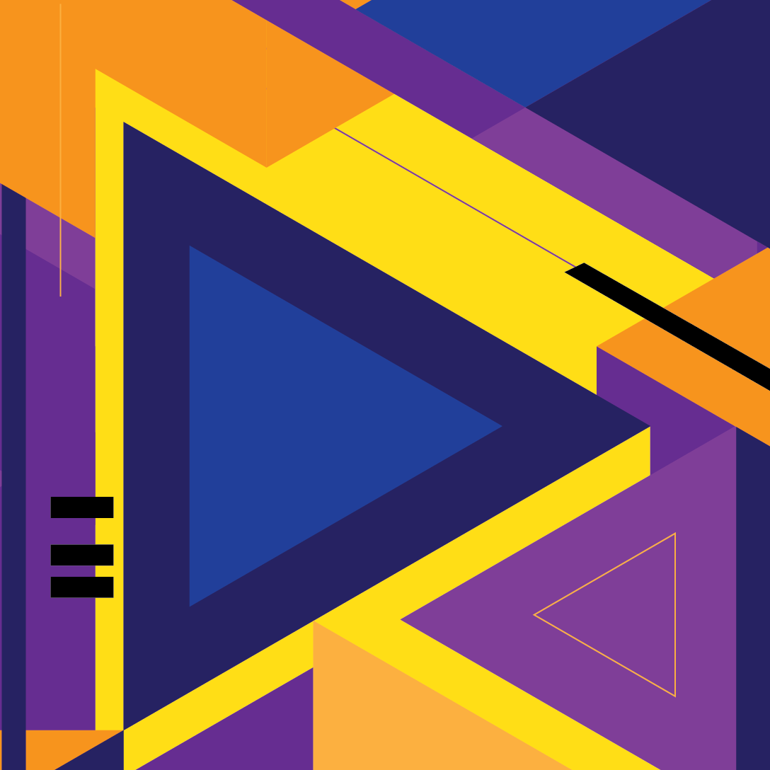
Triangled weight.
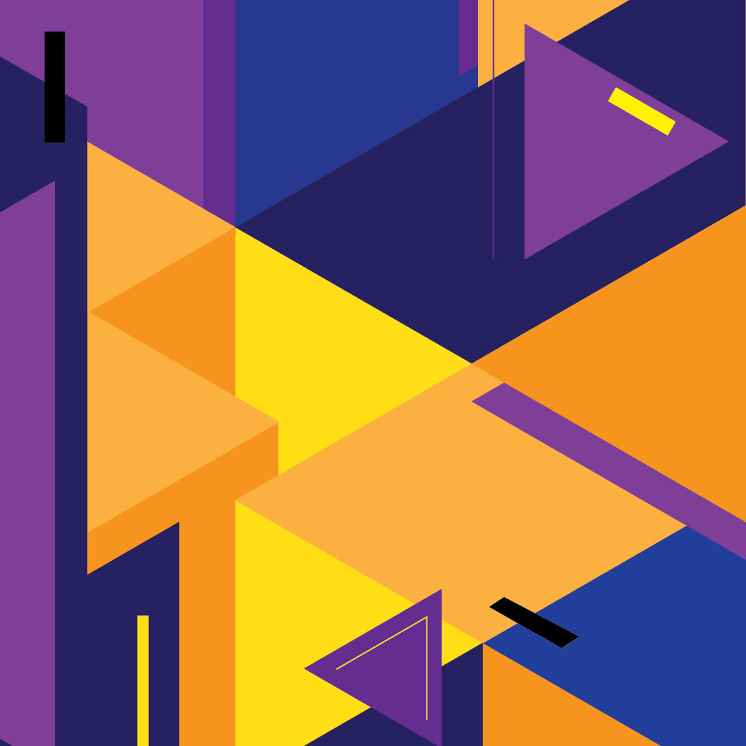
Storied colored plains.
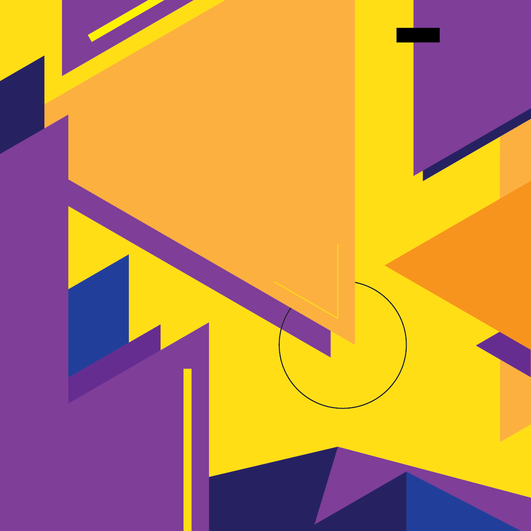
At the tip of the mountain.
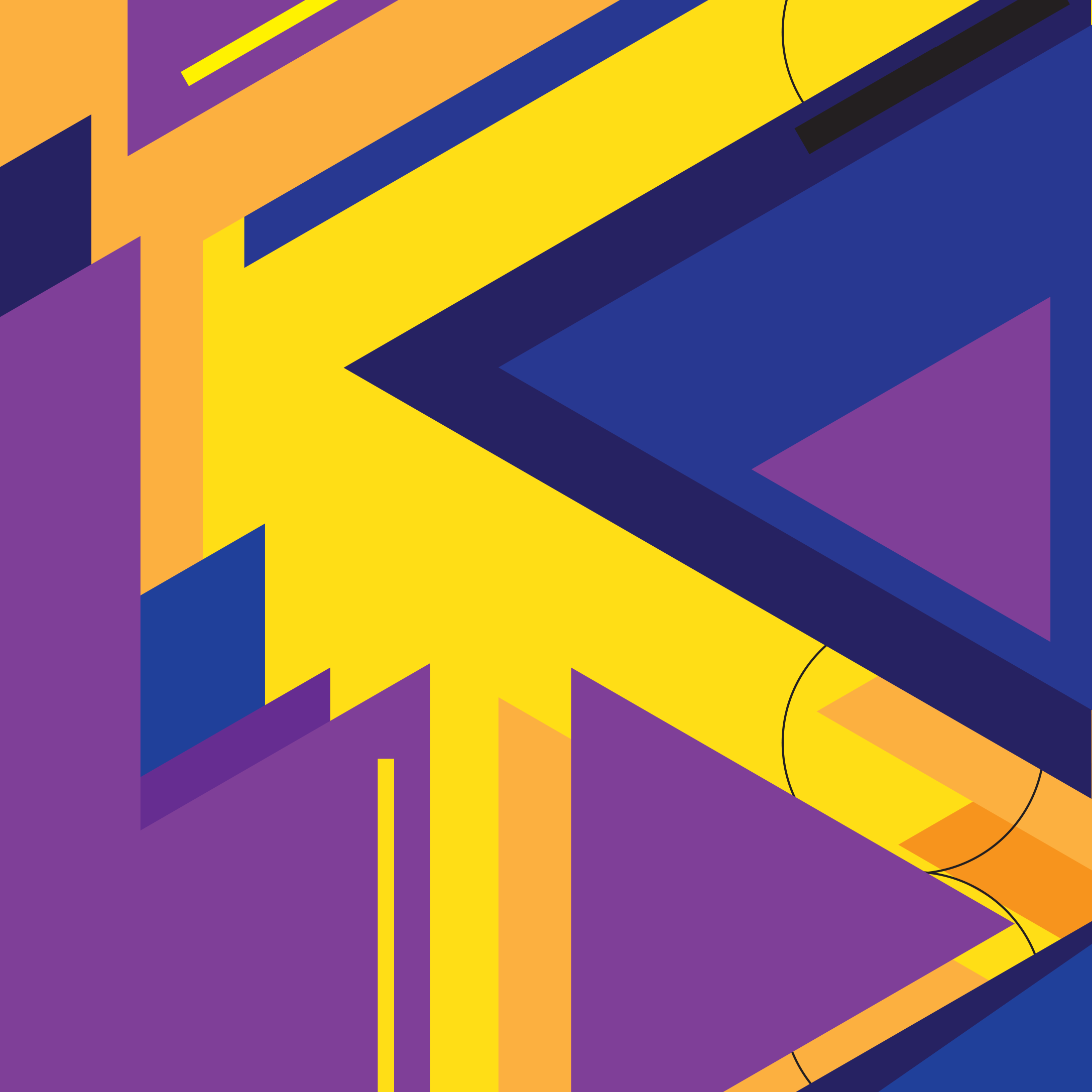
Purple lift.

Motion graphics displaying the love and culture of VANS.
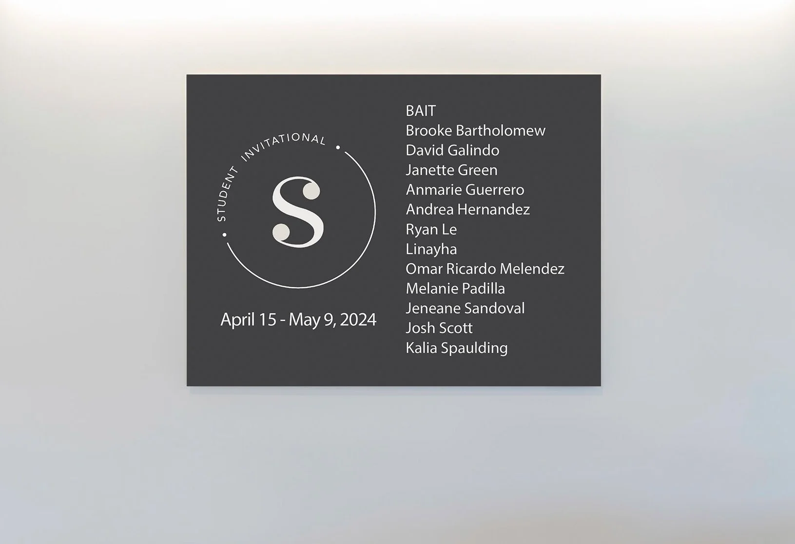
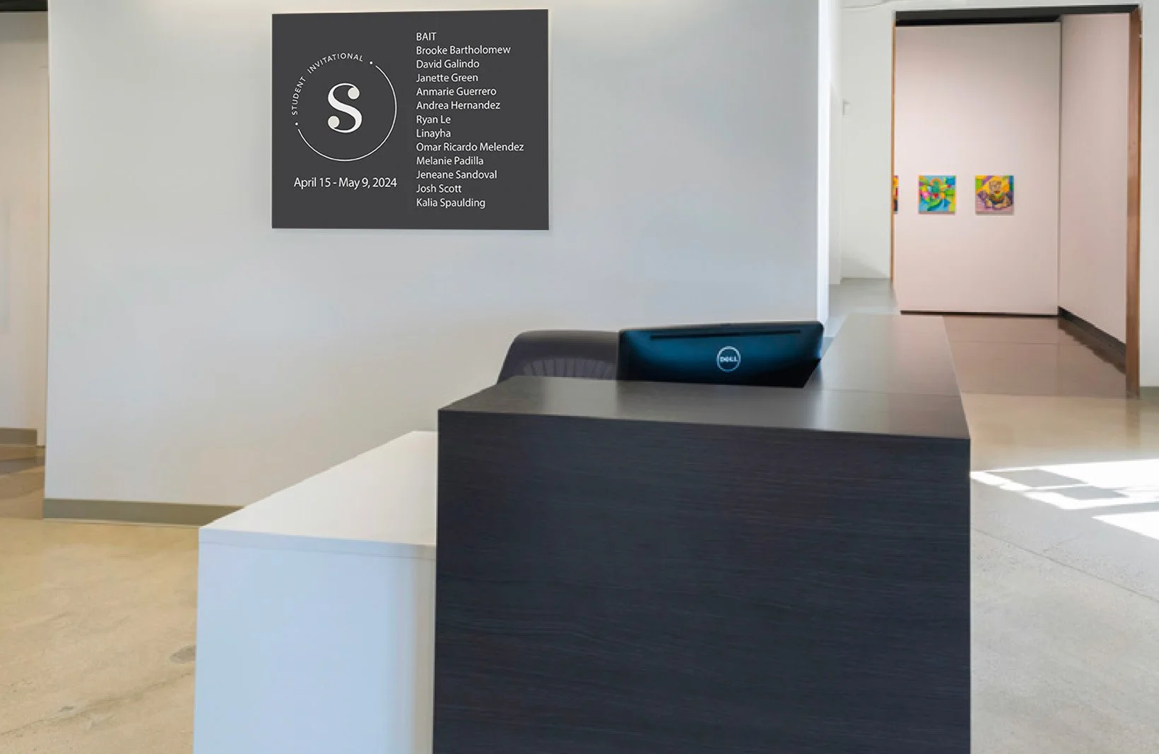
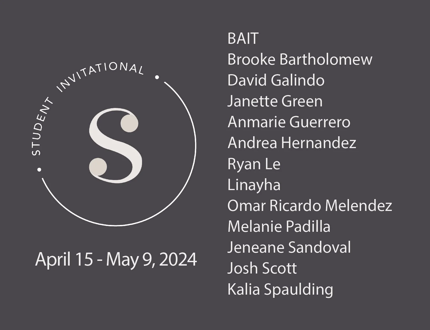
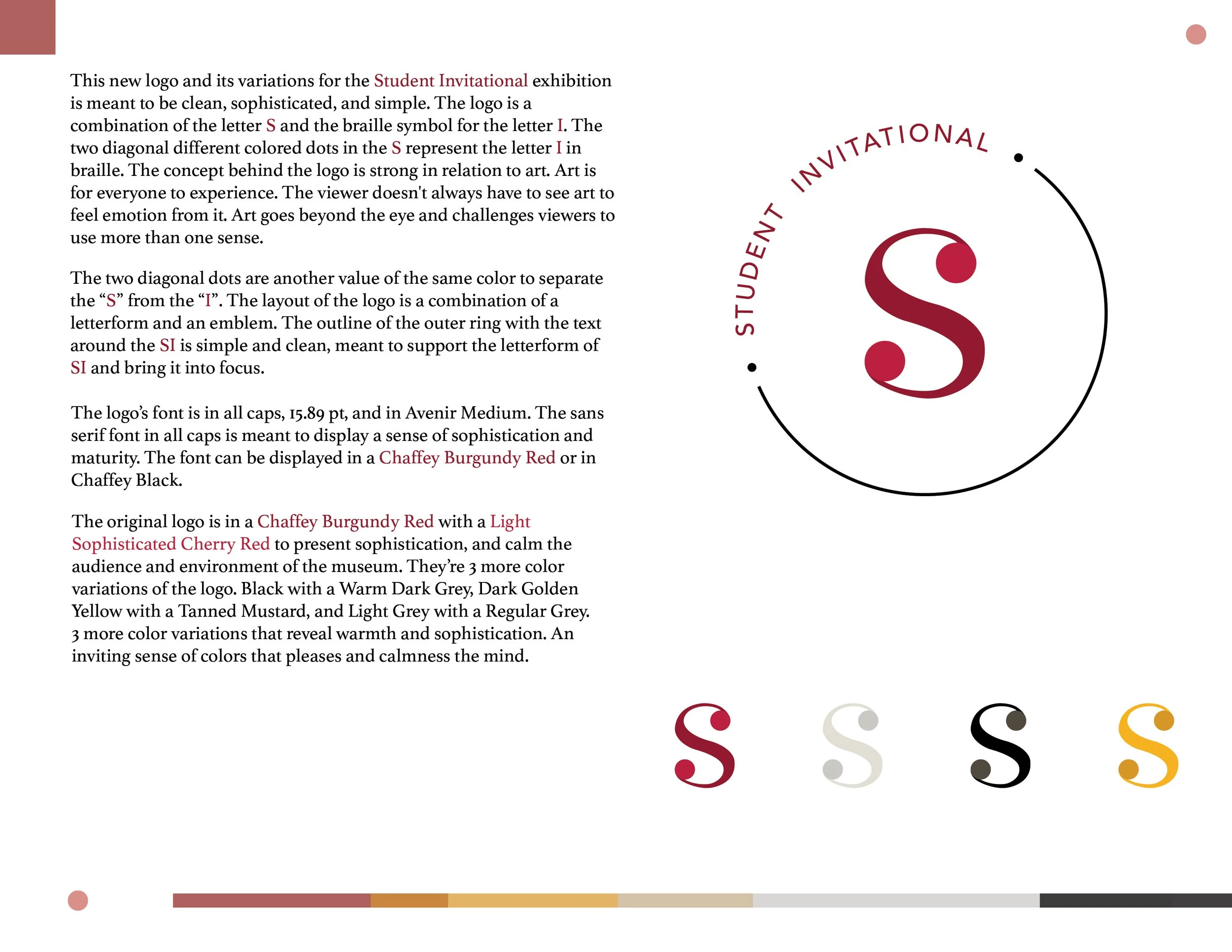
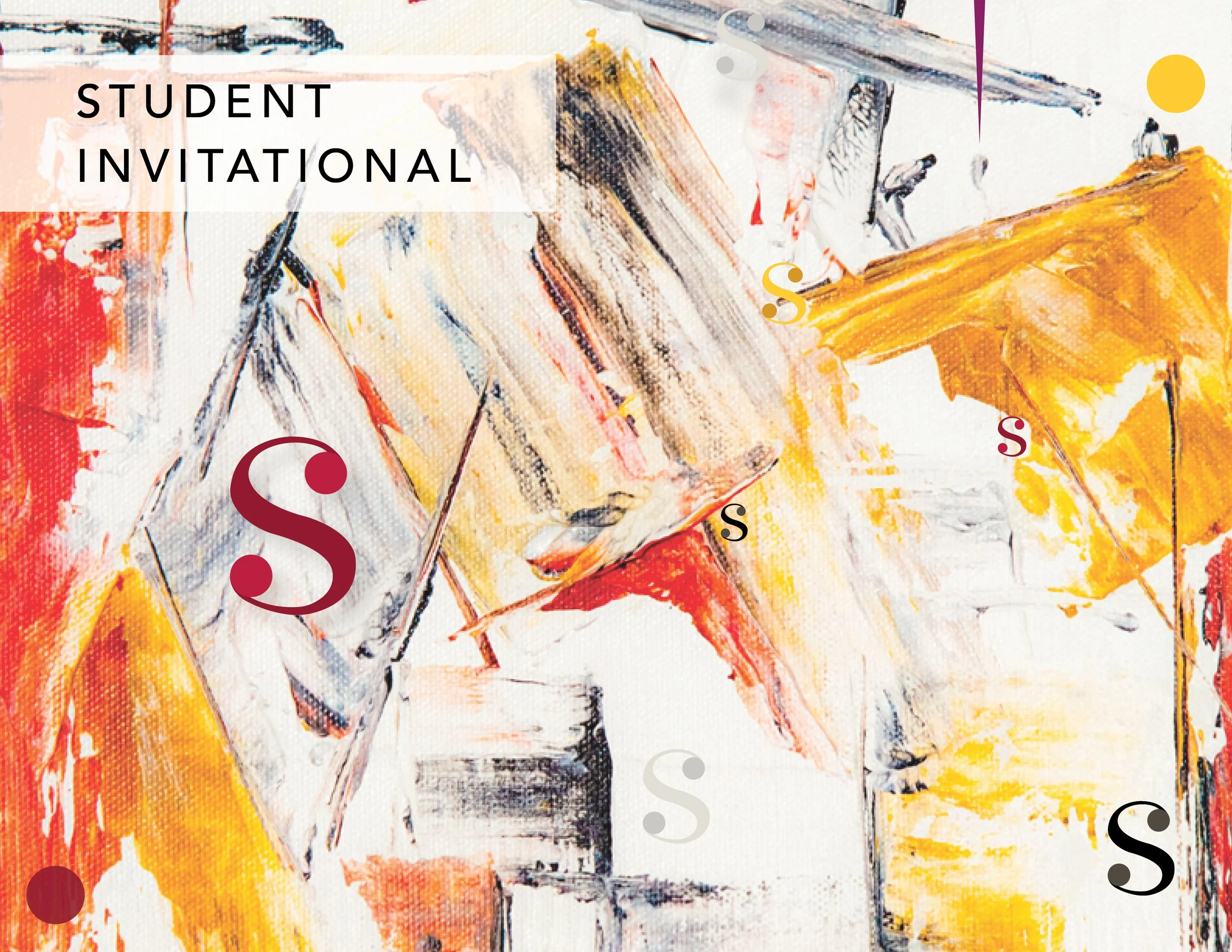
I created this logo for the Student Invitational Exhibition. I took pride in creating this logo, because I participated in the S.I. Exhibition of Spring 2024 for the Wignall Museum of Contemporary Art in Chaffey College.
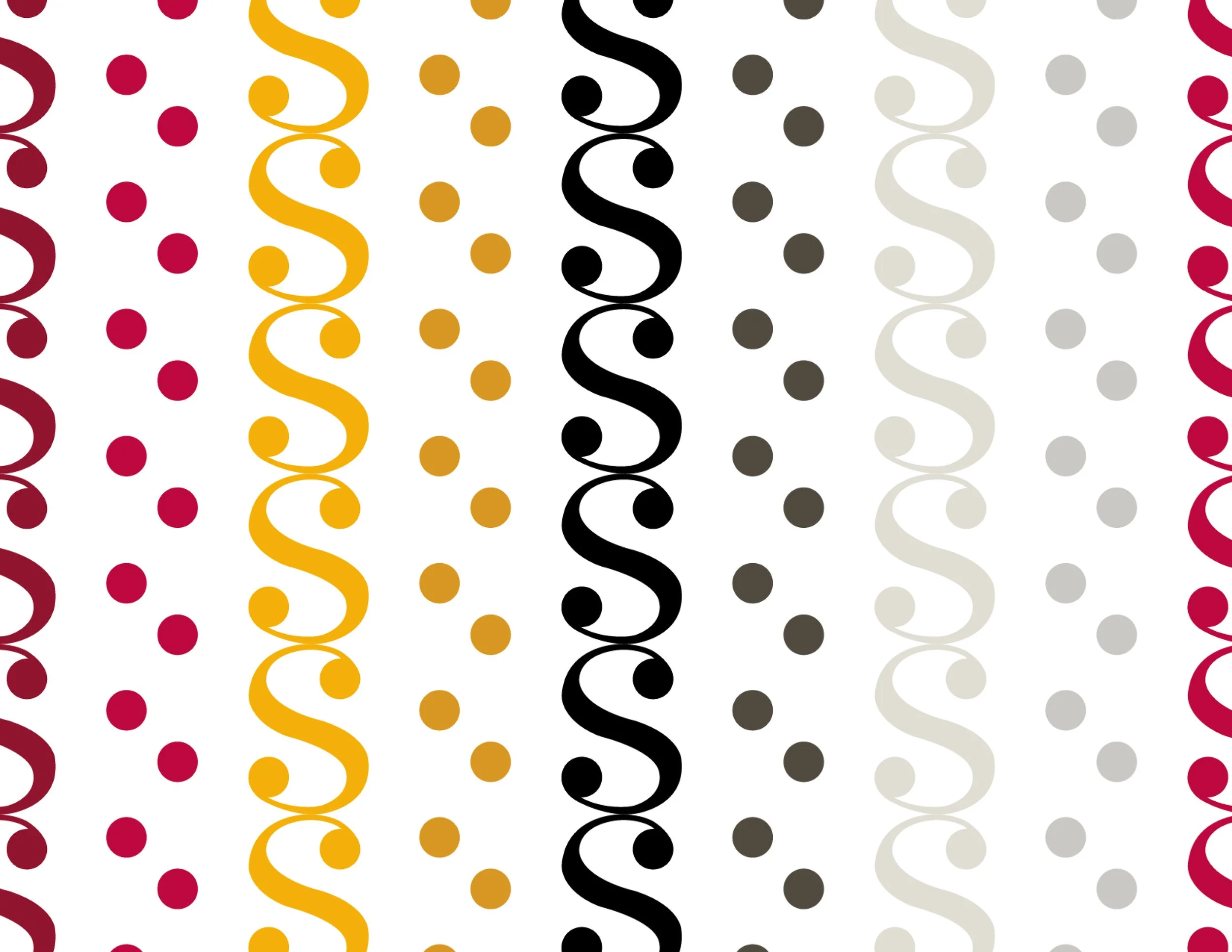
The concept behind the logo was connecting the letter S with the letter I in braille, which is two dots diagonally apart ⚁ This logo is meant to display how art can go beyond the eye.
Wignall Museum
Introducing S.I.
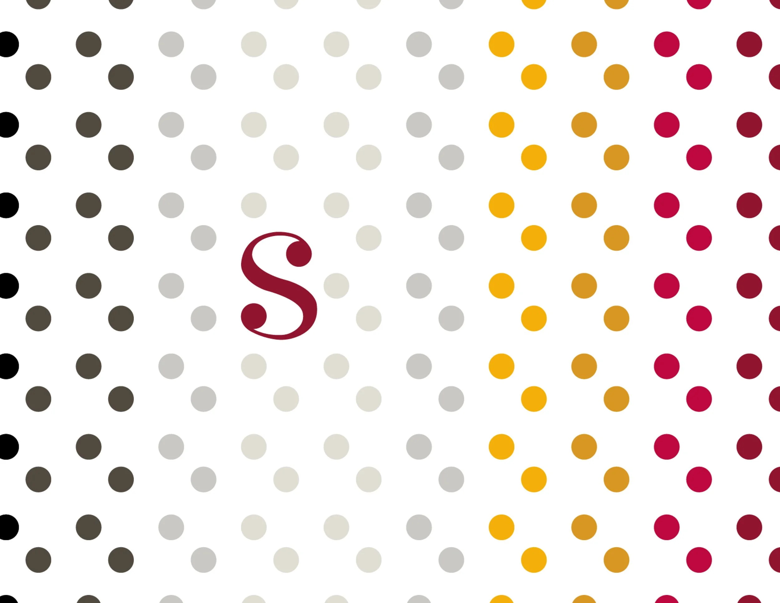
Blind dots
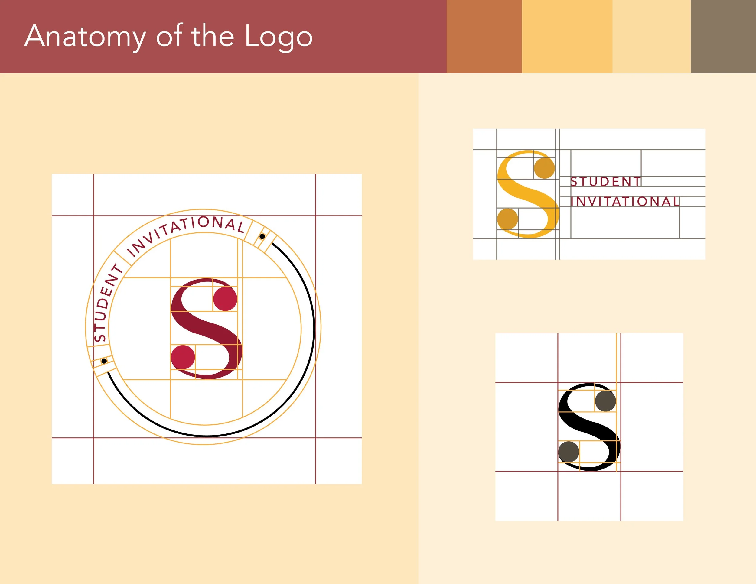
Anatomy
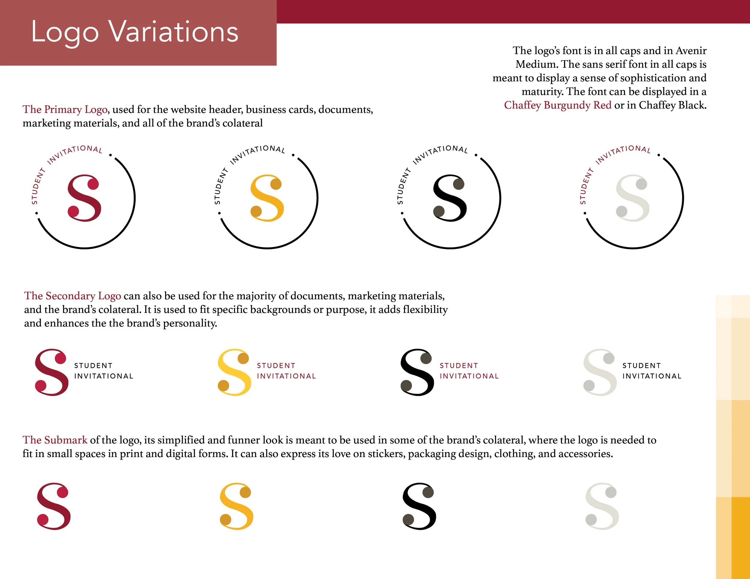
Variations
S & I
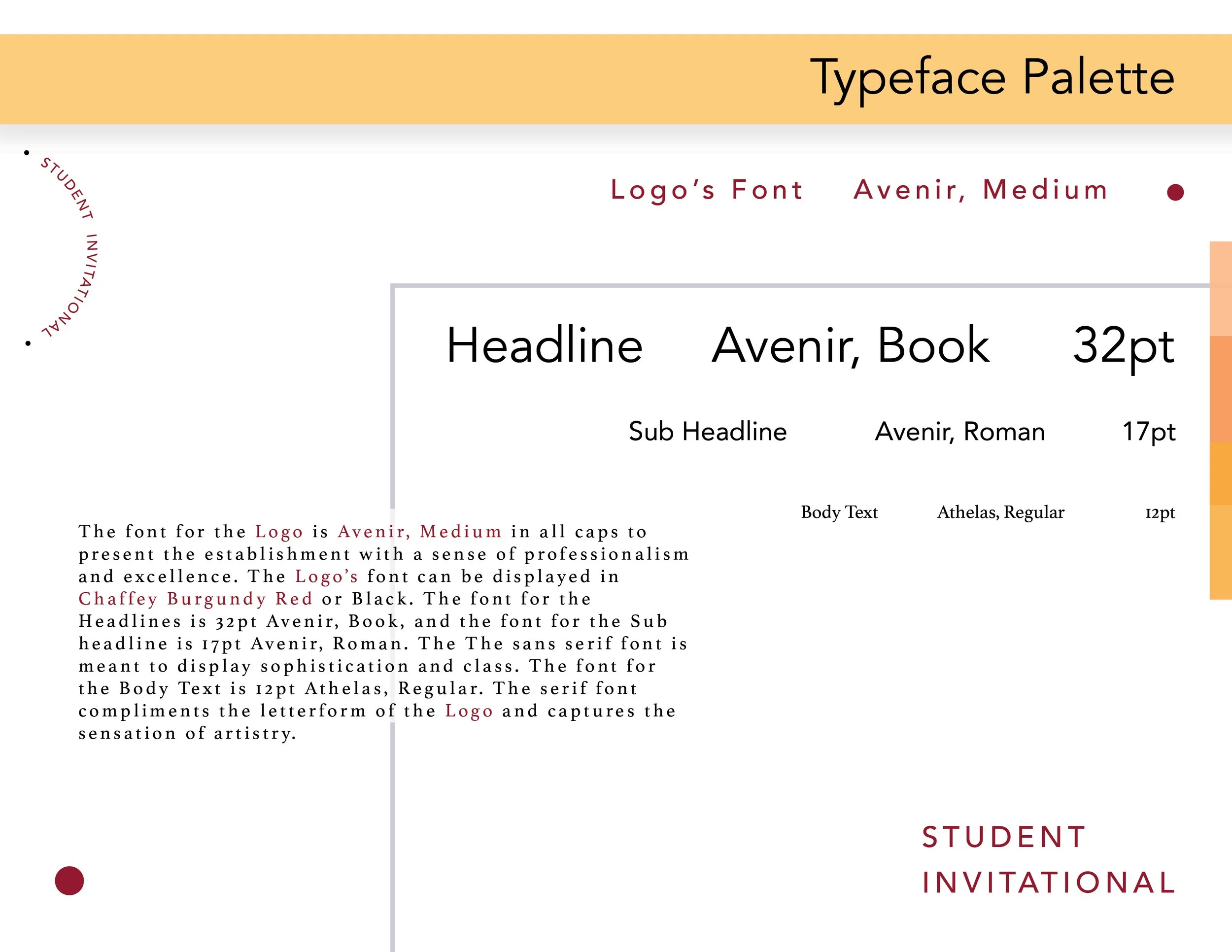
Typeface Palette
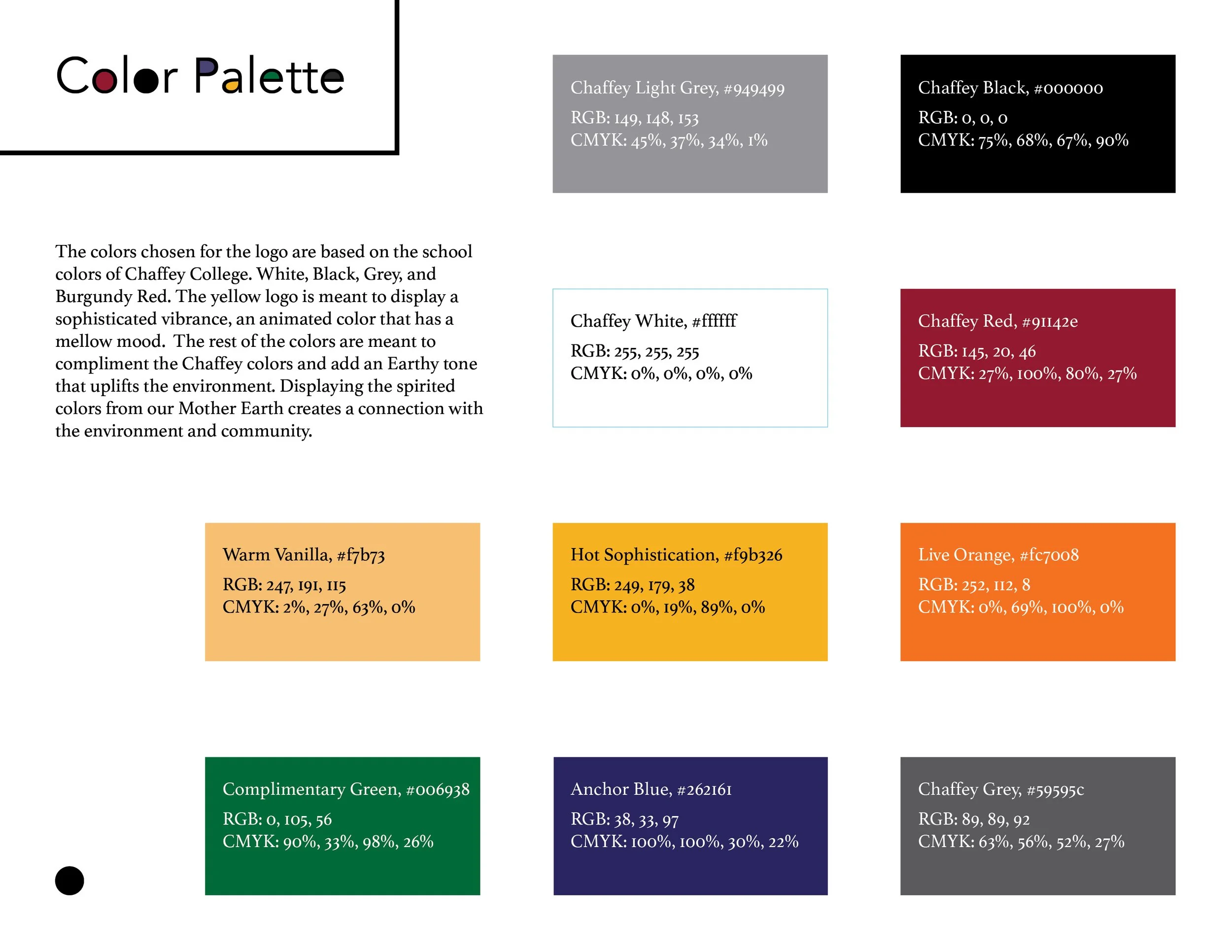
Color Palette
The space S.I. needs
Student Invitational Exhibition
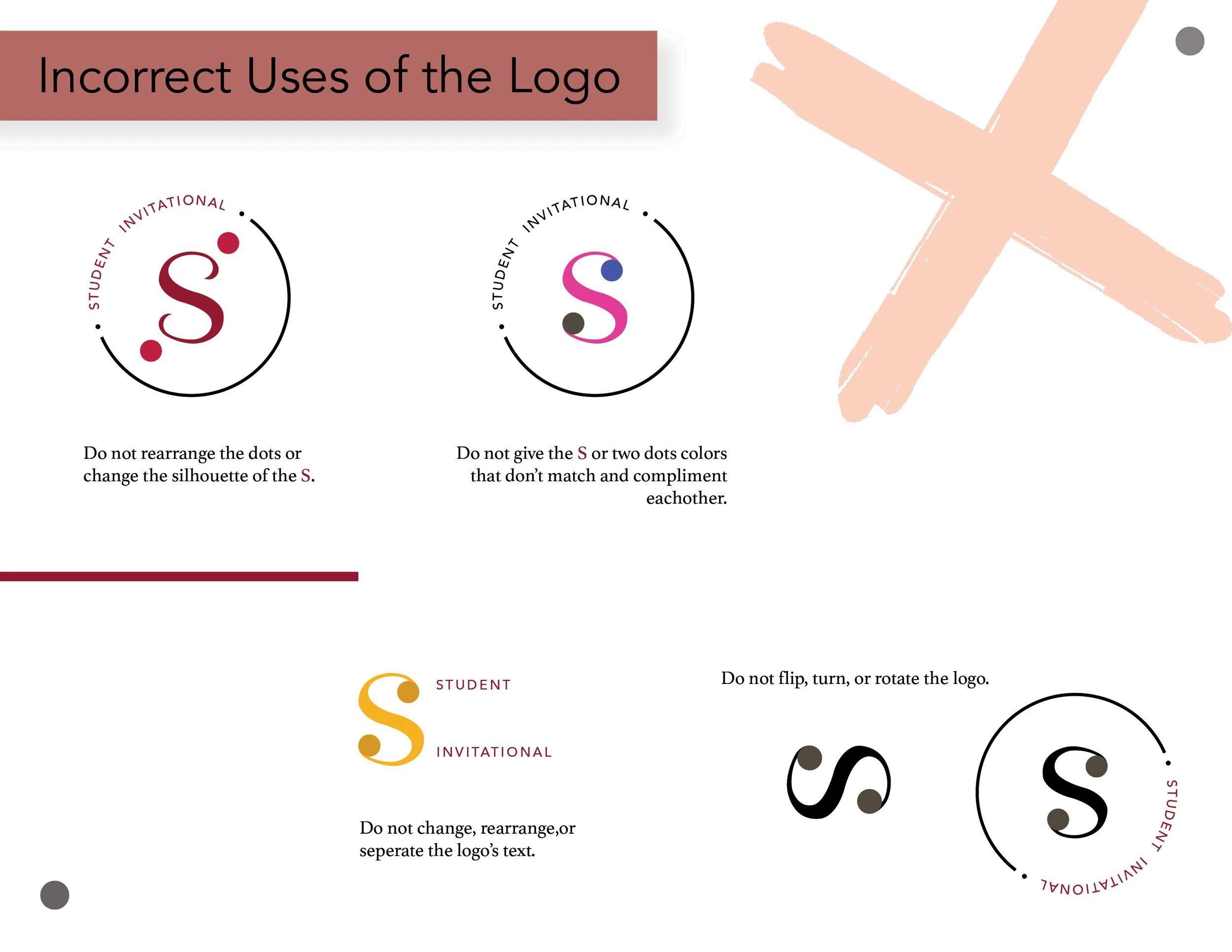
The No's
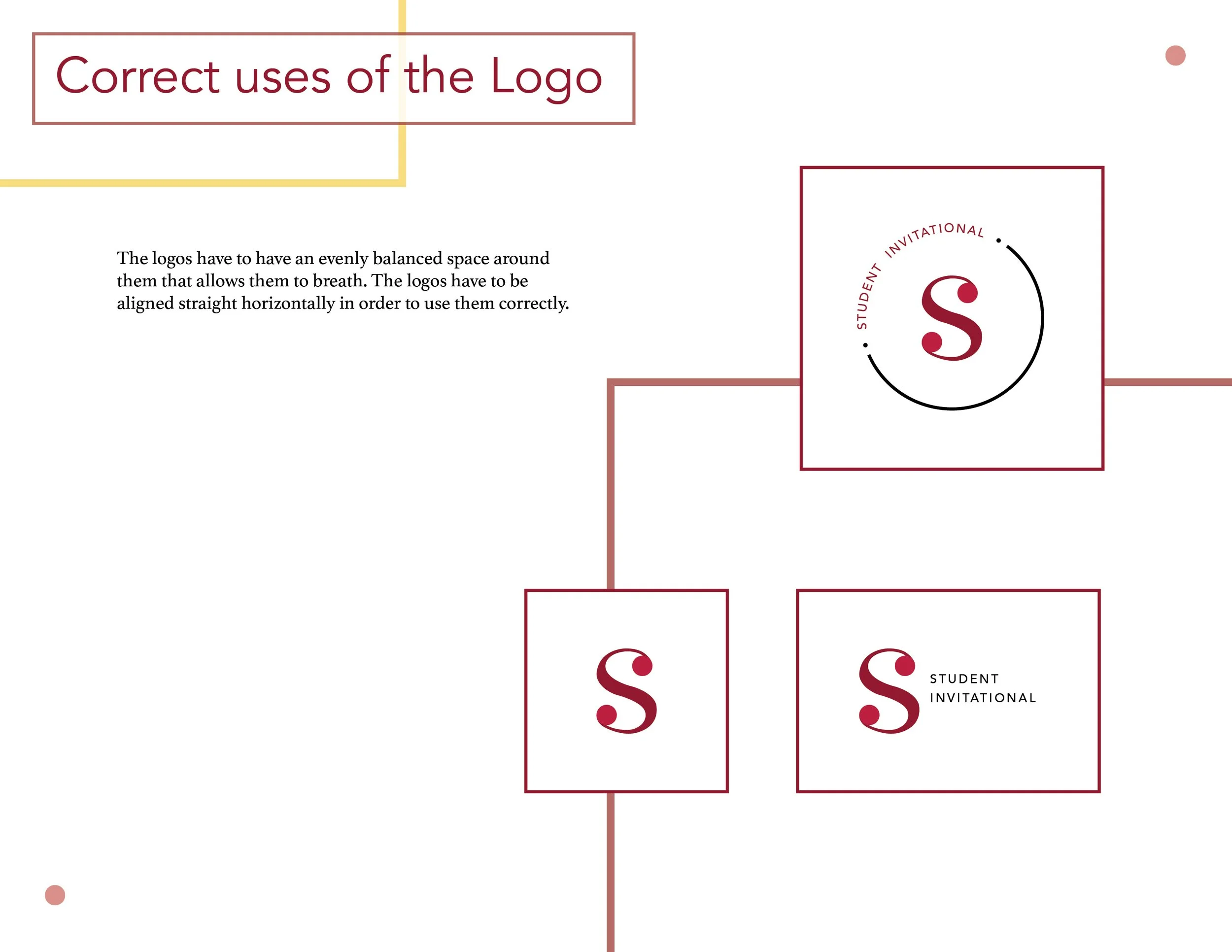
The correct way